
Snapback Hat Embroidery: A Complete Buyer’s Guide for 2026
You're probably here because you've reached the same point a lot of first-time hat buyers hit. T-shirts feel crowded, mugs feel disposable, and you want one piece of merch people might keep wearing after the event, launch, or staff rollout is over.
That's where snapbacks usually enter the conversation. They look established right away, they fit a wide range of people without turning your order into a sizing headache, and they give your logo a surface that can look sharp when the artwork is built for embroidery instead of just pasted onto a cap and hoped for.
The part most buyers miss is that snapback hat embroidery is a production job first and a design job second. Good hats come from good decisions made before the machine ever starts. Cap structure, seam placement, logo width, stitch type, thread weight, and even where the back closure sits all affect the final result. If you get those calls right, the hats look clean and intentional. If you get them wrong, even a good logo can look crowded, distorted, or cheap.
Your First Step to Awesome Branded Hats
A common first order starts like this. A coffee shop owner wants staff hats that don't feel like uniforms. A gym wants merch that members will buy. A startup wants a small run for a trade show, but they also want the design to hold up if they reorder later.
In all three cases, the snapback usually stays on the shortlist because it already solves a few practical problems. It has a recognizable shape, it works across a lot of audiences, and the front panel is built for decoration in a way that didn't happen by accident. The modern cap shape took a major turn when New Era's 1954 redesign shifted the baseball cap from eight-panel to six-panel stitching, which helped standardize the front panel area for consistent logo placement and scalable decoration, as noted in this history of the snapback cap's development.
That history's significance is often underestimated. Shops don't like snapbacks just because they're popular. Shops like them because they're repeatable. A design that sews well on one structured snapback blank can usually be produced again with far fewer surprises than a floppy, unstructured cap with less support in the crown.
Practical rule: If you want your first branded hat order to look polished, choose a cap style that gives the embroidery the best chance to succeed before you start debating colors or special effects.
This is also why businesses that plan for growth often start with hats. A clean front logo on a stable blank is easier to reproduce when you're scaling your embroidery production and trying to keep results consistent from one batch to the next.
A good snapback order doesn't begin with “What's the cheapest hat?” It begins with “What hat construction gives this logo the best chance to look right every time?”
Choosing the Right Snapback Canvas
The blank hat is your canvas, but in embroidery, not all canvases behave the same. A snapback can look nearly identical on a product page and still sew very differently once it's on the machine.
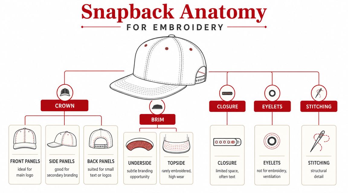
Start with crown structure
For embroidery, the crown matters more than the color. A structured snapback gives the machine a firmer surface to work on, especially on the front. That extra support helps the design hold its shape and makes the stitching look cleaner.
An unstructured cap can still be embroidered, but it asks more from the digitizing and the hooping. Soft fronts tend to show distortion faster, especially with dense logos or fills.
If you're browsing plain snapback cap options for embroidery, look at product photos with an embroiderer's eye. Don't just ask whether the hat looks good. Ask whether the front panel looks firm, tall enough for your logo, and stable enough for the level of detail you want.
Panels and seams change what works
A lot of buyers don't think about panel count until they see a proof. Then they notice the center seam running right through the most important part of their artwork.
Here's the practical version:
- Five-panel snapbacks give you one broader front area with no center seam. That can be helpful for wider logos.
- Six-panel snapbacks split the front with a center seam. That's normal, common, and workable, but tiny text or very fine interior detail can become a problem if it lands across that seam.
- Higher-profile crowns generally give you more room for larger front designs.
- Lower-profile styles force more restraint. The same logo may need to be simplified or reduced.
Don't choose the hat first because it looks trendy, then try to force the logo onto it. Match the logo to the cap construction.
Other parts buyers overlook
The brim and closure matter too, just in different ways. A snapback's flat brim supports the style people expect, but most embroidery projects still live on the crown because that's where readability is strongest.
The back closure is where many first-time buyers get too ambitious. The adjustable snap is convenient for fit, but it limits what can be placed above it cleanly.
A few quick buying rules help avoid trouble:
- For bold front logos: choose a structured crown.
- For small side branding: keep it secondary, not your main message.
- For back text: stay short and simple.
- For premium-looking results: pick a blank that supports the logo instead of fighting it.
When clients get the blank right, the rest of the job gets much easier.
Getting Your Artwork Ready for Embroidery
A clean logo file doesn't automatically become clean embroidery. This is the part clients often underestimate, especially if the artwork looks crisp on screen.

A logo file is not a stitch file
Your PNG, JPG, or even vector file is still just artwork. The embroidery machine needs a digitized file, which tells the machine where stitches start, where they stop, what direction they run, how dense they should be, and how the design should compensate for the way thread behaves on fabric.
That's why a logo that prints beautifully can fail as embroidery. Ink can reproduce tiny detail. Thread can't. Thread has width, pull, direction, and texture. Once stitches start stacking on a hat's curved surface, every design choice becomes physical.
If you want the technical side explained in plain language, this guide on how to digitize a logo for embroidery is useful background before you approve a hat proof.
The size rules that save most orders
Snapbacks are friendly to embroidery, but they still have limits. For front embroidery, one industry sizing guide recommends a maximum area of 5.5 inches wide by 2.1 inches high, and notes that many logos look most balanced around 2.5 to 3 inches wide on the structured front panel, as outlined in this hat logo sizing guide for embroidery.
That's one of the most helpful numbers a first-time buyer can keep in mind.
Bigger isn't always better. On a hat, oversized artwork can crowd the panel, ride too close to seams, or make the cap look top-heavy. Smaller can be just as risky if the design depends on thin outlines, tiny gaps, or narrow lettering.
What usually works well
The designs that sew best on snapbacks usually share a few traits:
- Bold shapes: clean outlines and solid forms hold up better than intricate illustrations.
- Limited fine detail: tiny interior lines often close up once thread builds.
- Readable text: if the wording has to be squinted at on screen, it probably needs to be reworked.
- Clear contrast: thread color and hat color need enough separation for the logo to read at a glance.
One production guide also advises keeping front snapback artwork to five or fewer colors and low detail for cleaner results on embroidery, discussed in this snapback embroidery design overview.
Shop-floor reality: The best hat logos usually look slightly simpler than the original brand file. That's not a downgrade. That's what makes them wearable.
What buyers should send first
If you're placing a first order, send the cleanest version of the logo you have and expect some adjustment. Good prep usually includes:
- A vector file if available. AI or EPS is easier to work from than a flattened image.
- A note on intended placement. Front, side, or back changes how the file should be prepared.
- Any brand color requirements. Especially if thread matching matters.
- Permission to simplify where needed. That one saves more projects than people realize.
If your logo only works when every tiny detail stays intact, it may be a strong brand mark for print and a weak candidate for embroidery. That's a hard truth, but it's better to hear it before production than after a full run.
Flat Stitch vs 3D Puff Embroidery
The design may be ready, but the stitching style still changes the feel of the hat. Most buyers are deciding between flat embroidery and 3D puff embroidery, and the right answer depends less on trend and more on what the logo can support.
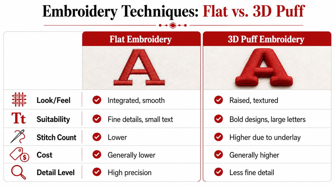
Flat embroidery is the safer choice
Flat embroidery is the standard for a reason. It handles more logo types, supports finer detail, and usually gives you fewer surprises during production.
If your design includes small text, narrow spacing, thin outlines, or layered elements, flat stitch is usually the right call. It sits cleaner on the cap and gives the digitizer more room to preserve detail without forcing thickness where it doesn't belong.
Shops also rely on material choices that buyers never see. One expert guide recommends 40-weight thread for general embroidery, 60-weight thread for lettering under 1/4 inch, and slower machine speeds of 600 to 800 SPM on hats for better detail and less distortion, as explained in this technical guide to hat embroidery settings.
3D puff needs the right logo
3D puff adds foam under the stitching to create a raised effect. It can look great on block letters, simple monograms, and bold shapes with enough width to cover the foam cleanly.
What it does not like is delicate detail.
Fine serif letters, thin script, intricate line art, and tight internal spaces tend to fight the technique. Puff has presence, but it asks for restraint. Buyers often assume raised embroidery is automatically more premium. It can be. But on the wrong design, it just makes the flaws more visible.
A lot of shops that offer raised embroidery also run standard cap programs, patch work, and specialty machine setups. If you're comparing options, even a supplier page for a 3D embroidery machine and puff-ready setup can help you understand why some logos are better suited to that process than others.
Here's a quick visual if you want to see the technique in action.
Side-by-side comparison
| Feature | Flat Embroidery | 3D Puff Embroidery |
|---|---|---|
| Look | Smooth, integrated into the cap | Raised, textured, more pronounced |
| Best use | Fine details, smaller text, mixed elements | Bold shapes, larger letters, simpler forms |
| Setup tolerance | More forgiving | Less forgiving |
| Detail handling | Better for precision | Better for impact than precision |
| Cost direction | Generally lower | Generally higher |
Backing matters too, even though buyers rarely ask about it. Stabilizer supports the fabric during stitching and helps reduce puckering. You don't need to micromanage that part, but you should know it's one reason two hats with the same logo can finish differently depending on cap construction.
Raised embroidery isn't an upgrade by default. It's a style choice. If your logo needs clarity more than texture, flat stitch usually wins.
Mastering Logo Placement on Your Hat
Most first orders default to front center, and that's usually smart. But placement becomes tricky the moment you add side logos, back text, or a second decoration point.

Front is easiest, but not every front works
Front-center placement gets the most attention because it's the main branding zone. It's also the most forgiving area on a structured snapback.
That doesn't mean any front design will work. A logo can still run too wide, sit too high, or crash into the center seam in a way that makes the hat feel awkward. Good placement looks natural. Bad placement looks like the art was forced to fit.
Side and back placement need more discipline
Side embroidery works best as support branding. A short wordmark, icon, initials, or small secondary logo can add a lot without overloading the cap.
The back of the hat is where buyers often get into trouble. It seems like a small add-on, but it's one of the harder areas to run cleanly. A technical guide on back-of-hat embroidery notes that decorators often need to account for the curve, avoid the snap closure, flip the design 180 degrees, and position the hat carefully so the machine's presser foot doesn't hit the plastic band, covered in this back-of-hat embroidery techniques guide.
That's why long slogans over the back arch are usually a mistake. The space is limited, the surface curves, and the closure interrupts the clean line clients imagine.
A better approach is usually one of these:
- A short name or phrase
- A simple icon
- A small web address or handle, if it stays readable
- Nothing at all, if the front logo already carries the hat
The best placement plan feels intentional
A strong snapback usually has one clear focal point and one supporting detail at most. Once you start treating every panel like ad space, the hat stops feeling like merch people want to wear.
Placement decisions should answer three questions:
- Where will people notice the brand first?
- What part of the cap can hold stitching cleanly?
- Does the extra decoration improve the design, or just add cost and risk?
If the answer to the third question is weak, leave that area blank.
Your Ordering Workflow From Quote to Delivery
The ordering process goes smoother when the buyer knows what the shop needs before asking for a quote. Most delays come from missing files, unclear placement notes, or artwork that hasn't been adapted for embroidery yet.
What to send with your quote request
A useful quote request is simple and complete. Include the logo file, the hat style you want, your expected placement, thread color preferences, and quantity.
If you don't know the exact blank yet, say that. A shop can usually point you toward a better match once they know whether your logo needs a taller crown, a cleaner front panel, or room for side branding.
One reason snapbacks stay popular for merchandise programs is practical. Modern embroidery can be applied to fully assembled hats, and snapbacks, first popularized in the 1950s, became a staple partly because the adjustable closure fits a wide range of wearers and simplifies inventory for buyers, as described in this overview of snapbacks in collectible and merchandise use.
Proofs and sew-outs are where problems get caught
A digital proof shows the placement concept. It helps confirm size, location, and thread color direction. It does not tell you everything about how the stitching will behave on the actual cap.
That's why a physical sew-out matters for anything important. It reveals issues a screen preview can't. Lettering may fill in more than expected. A seam may interfere with detail. A dense fill may look heavier on the actual hat than it did in the mockup.
When a shop recommends a sample, that isn't upselling. It's quality control.
If the hats matter to your brand, approve the proof carefully and ask for a sew-out when the design has any complexity at all.
What usually affects cost and timing
Pricing usually moves based on a few practical factors:
- Logo complexity: more detail usually means more setup attention.
- Placement count: front only is simpler than front plus side plus back.
- Stitch style: flat and puff don't run the same way.
- Order size: small runs and bulk runs create different production choices.
- Blank availability: stock can speed up or slow down the job.
Turnaround also depends on whether the design is production-ready. The fastest jobs usually come from buyers who submit clean files, stay decisive during proofing, and avoid changing artwork after digitizing starts.
Final Tips for a Perfect Snapback Order
The best snapback orders are rarely the busiest ones. They're the ones where the buyer picked the right blank, kept the logo honest, and let the production method shape the final design instead of fighting it.
A short checklist that prevents expensive mistakes
- Keep the front logo readable: hats are seen at a distance. If the design depends on tiny detail, simplify it.
- Match the logo to the cap structure: a strong blank makes embroidery look better before the first stitch goes down.
- Use special techniques selectively: puff works for bold artwork, not every artwork.
- Treat back embroidery carefully: that area is tighter and less forgiving than it looks.
- Approve with discipline: proofs catch layout issues, and sew-outs catch production issues.
What experienced decorators wish buyers asked sooner
Clients often ask which hat color is most popular or whether metallic thread is available. Those are fine questions. The more useful ones are better:
- Will this logo hold up on a structured front?
- Is the text too small for thread?
- Should this be flat stitch instead of puff?
- Is the back hit worth adding?
- Would a simpler version of the mark look stronger on the cap?
Those questions usually lead to better hats.
If you remember one thing, make it this. Snapback hat embroidery works best when the design respects the cap. The cap has seams, curves, limits, and strengths. Work with those, and you'll get a hat that looks like it belongs on someone's head, not just in a product mockup.
If you're ready to price out a run, compare blanks, or get help turning a logo into something that will sew cleanly, Dirt Cheap Headwear offers wholesale hats and custom embroidery services for small and large orders.