
Photoshop Screen Printing Workflow for Hat Artwork
The loudest advice in Photoshop screen printing is usually the weakest advice. A single halftone recipe, one magic angle set, one universal bitmap setting, those are comfort blankets for tutorials, not production rules for real hats, real mesh, and real ink.
Screen printing predates Photoshop by a long time, and Photoshop only became a serious prepress tool after it started replacing older halftone and separation methods in the early 1990s, when designers could finally prepare screens digitally instead of relying on photomechanical workflows, photostats, and hand-built stencils (Adobe Photoshop timeline, screen printing history). That shift matters, because a lot of modern advice still sounds like it was written for a lab bench, not a press with tired mesh, varied tension, and a curved hat front.
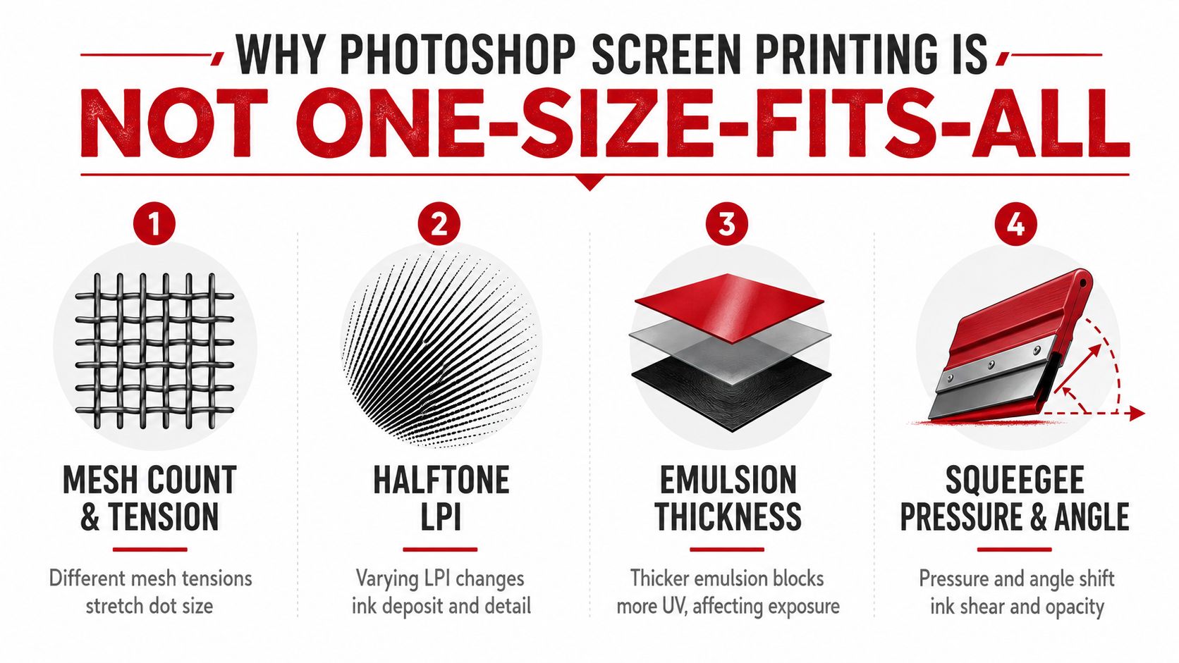
A good workflow starts by accepting the variables. Mesh count and tension, garment surface, ink behavior, and emulsion setup change the result more than any single Photoshop preset, which is why two shops can run the same file and still get different prints. If you need a broader hat decoration reference alongside this, Dirt Cheap Headwear keeps a practical overview of screen printing methods for headwear, and that kind of shop-level context is exactly what many Photoshop tutorials leave out.
Practical rule: build the file to fit the press, not the other way around.
Why Photoshop Screen Printing Is Not One-Size-Fits-All
Two decorators can open the same art file and still end up with different dots, different edges, and different color holdout. That is not a Photoshop skill gap. It comes from the press setup, and Photoshop only gets the file ready for those conditions.
The variables that actually decide the print
Mesh count controls how much dot detail survives exposure and ink transfer. Tension changes how stable that mesh stays under the squeegee, which affects dot shape and registration. Ink matters because a softer, thicker deposit behaves differently from a thinner, more transparent one. Garment texture matters too, especially on caps, where curved panels and seams can distort artwork before the ink even lands.
That is why Photoshop screen printing works as prepress, not as a cure-all. You are building separations, halftones, traps, and files the shop can output without guessing. The trade-off is simple, if you ignore the press variables, Photoshop can still give you a clean file that prints poorly.
A curved front panel on a cap behaves differently from a flat tee front, and that changes how you prep the art. Dirt Cheap Headwear's overview of screen printing methods for headwear is useful here because it keeps the decoration choice tied to the actual surface instead of the software menu.
Start the file like a production job
Set the document to the actual print area for the hat front panel, not a vague canvas size. Work at 300 DPI or higher, because low-resolution art is hard to rescue once you start converting to halftones or separations. Choose grayscale when you are building a single-image halftone, or CMYK when you are preparing multi-color separations, then keep your layers labeled before any conversion starts.
Do not jump to Bitmap on the first pass. That step belongs at the output stage, after you have checked the tone curve, the separation, and the print intent. If you need a working habit that saves time, set rulers, turn on the pixel grid, and build a stack with names like art base, underbase, spot red, and registration before you do anything destructive.
Save this setup checklist
- Document size: match the hat print area, not the whole artboard.
- Resolution: keep it at 300 DPI or higher.
- Color mode: use grayscale for halftone builds, CMYK for color separations.
- Guides: turn on rulers and the pixel grid before you place art.
- Layers: label every channel and keep a backup copy untouched.
One beginner-friendly note matters here. If you are comparing decoration methods for hats, a service like Dirt Cheap Headwear also offers custom screen printing on headwear, which makes the file-prep decisions in this article easier to connect to an actual production path. The more the setup resembles the final press order, the less cleanup you will need later.
A practical workflow note belongs here too. If you need a quick refresher on the order of file prep, workflow guidance is useful for checking the sequence before you start pulling channels or setting halftones.
For a shop-specific example, the gifted collaboration at High Country Quilts shows how a design choice can shift once the decoration method changes, even when the art stays the same.
Building Spot Color Separations Manually and Fast
Spot separations are the part of the job where speed can help, but only if you don't wreck edge control. A clean three-color hat logo usually starts with a logo in RGB or CMYK, then gets broken into ink channels, one for each spot color and one for the underbase if the garment needs it.
The careful route in Channels
Open the Channels panel and duplicate the channel that gives the cleanest contrast for each ink. Clean the edges with a hard brush or a precise mask, then rename each channel after the ink, not after a vague color idea. Pantone-style naming keeps the shop from wondering whether your “red” is meant to print as maroon, scarlet, or something in between.
Keep the channel name tied to the ink can, not the screen color on your monitor.
The faster route for a deadline
If the art is simple and the logo uses obvious brand colors, Select > Color Range and Select > Same can grab matching shapes fast. For a three-color cap logo, I'd usually isolate the biggest flat color first, then clean the leftovers manually rather than spending forever perfecting a mask that nobody will notice after exposure. That approach is especially useful when the deadline is tight and the art doesn't need fine tonal treatment.
The point is not to skip cleanup. It's to spend cleanup time where the screen will show it. If a shape sits under a seam, a button, or a panel break, perfect vector logic won't save a bad placement.
Keep the file readable
A sharp separation file is boring to look at, and that's a good sign. Build each ink as its own channel, keep the background transparent where possible, and label the order you expect the printer to pull it. If you need a handoff model for digitizing art in another decoration workflow, the structure on turn handmade art into embroidery is a useful reminder that clean production files always beat clever-looking ones.
Halftone Settings That Match Your Mesh
Halftones stop being mysterious once you stop treating them like a Photoshop effect and start treating them like a mesh decision. The usable dot size depends on the screen, not a universal preset, which is why the common advice to copy one frequency into every job falls apart fast on real presses.
Pick frequency from mesh, not from habit
A useful rule of thumb is to divide mesh count by 4 to 4.5 to get a starting point for halftone frequency. That does not replace testing, but it does keep the dot structure from getting too fine for the screen. The same workflow guidance also warns that starting with low-resolution art, converting too early, or choosing a frequency that is too fine can cause dot loss and moiré during exposure and printing.
| Mesh Count | Halftone LPI (mesh ÷ 4 to 4.5) | Suggested Angle Set |
|---|---|---|
| 156 | About 35 to 39 | Offset the channels away from 0°, 45°, 90° |
| 200 | About 44 to 50 | Use separated angles, test before burn |
| 230 | About 51 to 58 | Keep the screen angles controlled and distinct |
| 305 | About 68 to 76 | Fine detail possible, but still test for moiré |
The exact angle choice is where many guides overpromise. Offset printing habits like 0°, 45°, and 90° can fight the mesh, so screen printers usually choose safer, separated angles instead of copying offset conventions. That is why one shop's working formula can look wrong on another shop's press.
Shape and angle matter as much as size
For full-color separations, expert tutorials commonly set Cyan at 15°, Magenta at 75°, Yellow at 0°, and Black at 45°, with the file prepared in CMYK and kept at 300 DPI minimum. That angle control is there to reduce visible moiré, but it still assumes the press setup can support it. If you are comparing how those separations are built for apparel, Dirt Cheap Headwear custom screen printing is a useful reference point for how cap decoration choices affect the file before it ever hits the screen.
Bottom line: the screen decides how far you can push dot detail, and the garment decides how ugly a bad angle looks.
When you are working on hats, I would rather see a slightly less ambitious halftone that prints clean than a pretty file that stars out on the crown. The right Photoshop move is the one that matches the mesh you are burning.
Underbase, Trapping, and Stacking Colors on Hats
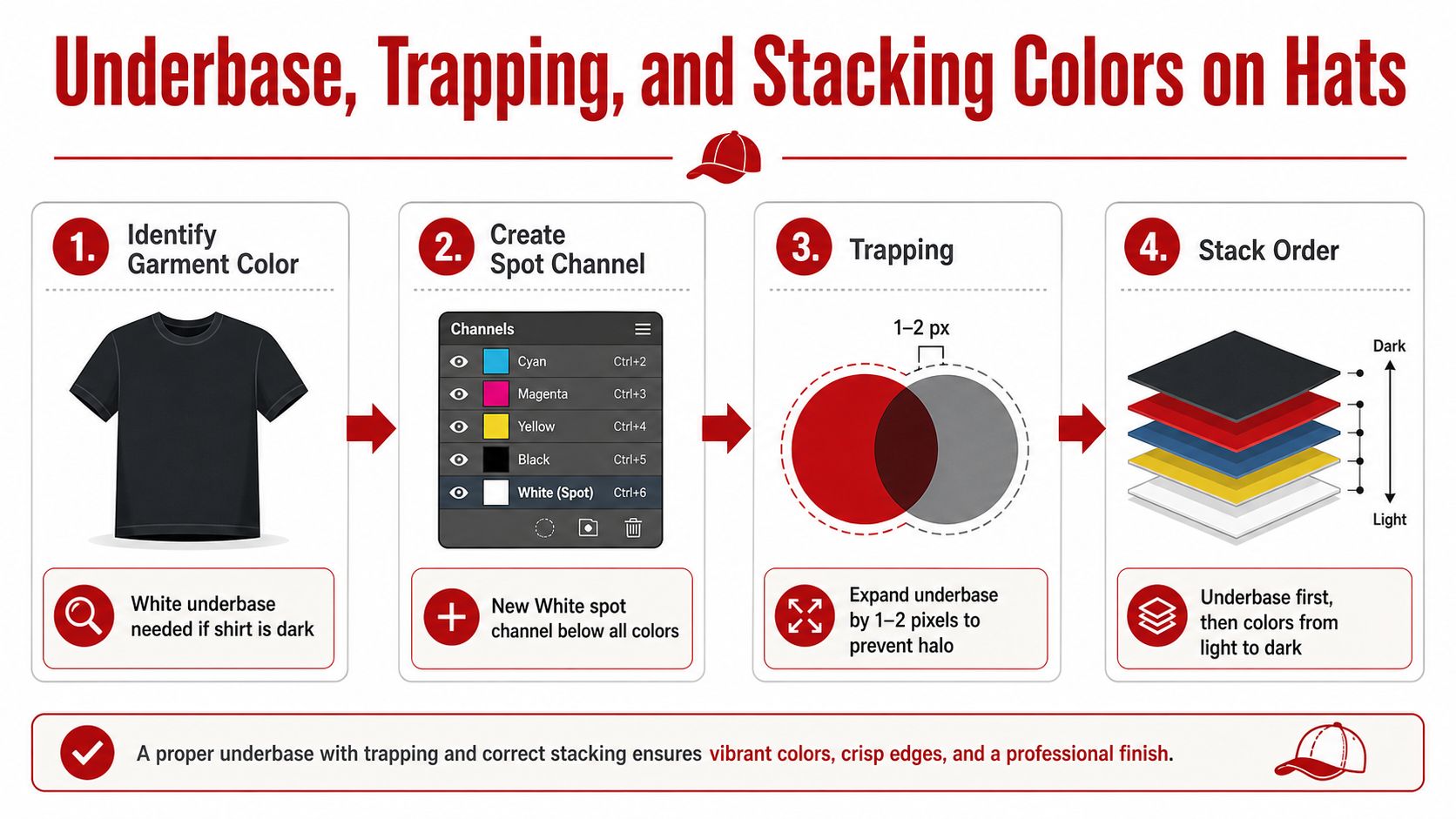
Dark caps change the job fast. On a dark garment, a white underbase usually carries the print, because the top inks need an opaque base to stay bright and readable. Keep that underbase in its own spot channel, placed under every color that needs support.
Build the underbase like a production layer
In Photoshop, make the white layer clean, slightly generous, and easy to separate from the art above it. If the cap front has texture, seams, or heavy curvature, the base needs enough edge coverage so the top colors are not hanging over empty space. A cap is not a flat tee panel, and the file should respect that.
I usually keep the underbase simple and readable on press. If the shape gets too fussy, the operator spends time correcting a file that should have been stable from the start.
Trap for the press environment, not the monitor
Trapping is controlled overlap. In pixel terms, that usually means letting the underbase expand a touch so the top colors do not show a white halo if registration shifts a hair during press. For hats, that small safety margin matters because the panel break and the seam can make misalignment look worse than it really is.
The goal is not to make every edge huge. It is to give the print a little forgiveness where the cap construction fights you.
Stack order should match the shop's press order
Most small shops want the file to read in the same sequence they will print it. Underbase first, then lighter colors, then darker colors that can cover earlier passes. If a flash cure sits between layers, the file still needs to make sense as a stacked workflow, because the art order affects the print order and the print order affects the finish.
For a practical reference on how cap decoration gets handled in production, the silk screen technique overview is useful alongside your own separation prep. If you also need concept work tied to headwear art, AI-generated hat tattoo concepts can help frame the kind of bold, compact imagery that tends to survive on curved surfaces.
When the stack is wrong, the print looks muddy or out of order before anyone notices the artwork itself. That is a Photoshop problem only in the sense that the file has to match the press sequence you plan to run.
Exporting Film-Ready Files Without Surprises
Film output is where a lot of good Photoshop work gets wasted. The file can look perfect on screen, then fail because somebody left live layers, used the wrong image mode, or sent a scaled file that no longer matches the burn size. Good export habits stop those errors before they reach the exposure unit.
Export each channel as if a tired operator will open it
Start by flattening the artwork that belongs on film, then convert the final separation to Bitmap with the halftone settings you already tested. Keep the output resolution aligned with the document, because the workflow guidance points out that many shops use 300 ppi for bitmap output, and some tutorials use 600 while still aiming at the same print workflow (bitmap workflow guidance). Add registration marks and any printer marks the shop expects, then save each separation as a 1-bit TIFF at 100% scale.
That last part sounds obvious until a rush job goes sideways. If the printer opens a file and sees grayscale instead of bitmap, or a file that's been resized after separation, you've forced them to guess. Guessing is how clean files turn into expensive re-burns.
Confirm positive or negative film before you send it
Different shops expect different film output depending on their exposure setup. Some want positive film, some want negatives, and some want both labeled clearly for review. Ask before delivery, because re-separating after the fact burns time nobody wants to spend.
If you're building the handoff package for a shop, keep every file in a folder named by ink order, not just by art name. Include a contact sheet or proof image that shows the stack, the colors, and the intended print order. A printer should be able to open the folder and know what each film does without calling you.
Photoshop is useful, but it's not always enough
For one-off jobs, creative runs, and small minimums, Photoshop is still a strong tool because you can control every layer by hand. For repeat production, a RIP like Wasatch or AccuRIP can do a better job of keeping halftones, underbases, and output settings consistent across runs. The trade-off is simple, manual control versus repeatability.
Use Photoshop when the job is custom. Use a RIP when the job has to repeat the same way every time.
That decision matters for small shops more than most tutorials admit. If your bottleneck is creative file prep, Photoshop actions may be enough. If your bottleneck is rework on the press, software that automates the repeatable parts is a better investment.
Dirt Cheap Headwear also offers custom screen printing for decorated hats, which makes the Photoshop-versus-RIP decision easier to evaluate against a real order path instead of a hypothetical one.
Fixing the Three Biggest Production Failures
The expensive mistakes are usually boring ones. Dot loss, moiré, and registration drift show up over and over because they're tied to the same three failures, too fine a screen setup, bad angle choices, and channels that were cleaned carelessly before output.
Dot loss on coarse mesh
If dots disappear, the mesh is often too coarse for the halftone frequency you chose, or the art started too low-res. On the Photoshop side, the fix is to back off the frequency, keep the source at 300 DPI or higher, and rebuild the separation with a more forgiving dot structure. On the press side, check tension and exposure, because weak mesh and sloppy burns make good dots vanish fast.
Moiré from bad angle combinations
When the print has a strange ripple or pattern interference, the channel angles are usually fighting each other or fighting the mesh. Photoshop's fix is to reassign the halftone angles and clean the channels so no extra noise is sitting in the file before output. On press, confirm the screen tension and off-contact, because unstable screens make angle problems worse.
Registration drift across colors
If one color creeps away from the next, the issue might be the file, the screen alignment, or the way the artwork was trapped. The Photoshop-side fix is to clean channel edges, preserve registration marks, and export each separation with a clear file name that prevents mix-ups. On press, the shop has to check screen alignment and the actual order of the stack, because even a good file prints badly if the screens are out of sync.
If you want a creative parallel for planning imagery, AI-generated hat tattoo concepts can be a useful visual starting point, but they still need the same disciplined separation logic before anything goes near a screen.
Hat Printing Tips and a Pre-Flight Checklist
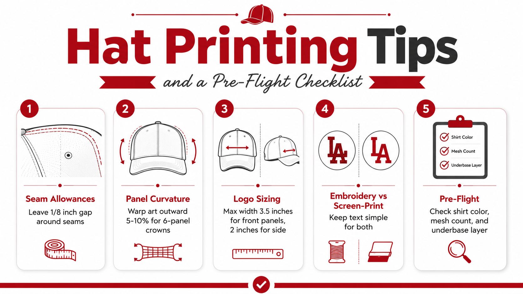
Hats punish lazy sizing. A 6-panel crown curves more aggressively than a flat panel, seams interrupt art faster than many expect, and small logos can look crowded if they're forced too close to the stitch lines. If the design has to live on the same hat family as embroidery, keep the artwork simple enough that both decoration methods fit the same usable front area.
Size for the panel, not just the logo
Leave room around seams and panel breaks so the print doesn't visually collide with the cap construction. On a curved front, a design that looks centered in Photoshop can drift once the cap is mounted and the film is exposed. I'd rather shrink a logo slightly than force a print that fights the crown shape.
Use one pre-flight sheet for every job
- Resolution: confirm the artwork is still at 300 DPI or higher.
- Color mode: check whether the job is still in grayscale or CMYK as planned.
- Halftones: verify the frequency and angle set match the mesh choice.
- Underbase: confirm dark garments have the white layer built in.
- Trap: make sure the overlap is present where colors touch.
- Registration marks: check that every film has the same marks in the same spot.
- File names: label each separation so the shop can't mix the order.
If a file needs explanation before it can be burned, it isn't ready yet.
That's the key divider between a clean Photoshop job and a messy one. Photoshop can absolutely carry the prep, but it won't fix a workflow that ignores mesh, tension, or the physical shape of the hat. If your shop is still fighting repeat errors, move the repeatable parts into a RIP and keep Photoshop for what it does well, art control and custom cleanup.
Dirt Cheap Headwear can help you source blank hats and arrange decorated headwear with a production-minded approach, so if you're ready to turn a prepared file into a real run, visit Dirt Cheap Headwear and compare the hat styles, decoration options, and custom order path against the workflow you've got in hand.