
New Era 9TWENTY Cap: A Guide to Fit, Style, & Customizing
You've got a logo ready, a team order to place, and a cap choice that needs to look good on real heads, not just in a mockup. That's where the New Era 9TWENTY cap earns attention, because it gives you the relaxed feel customers expect without looking sloppy when it's decorated well.
Why the New Era 9TWENTY Is More Than Just a Dad Hat
A lot of buyers start with the same problem. They want something softer than a rigid snapback, less formal than a fitted cap, and easy for staff, fans, or event guests to wear without thinking about it. The new era 9twenty cap lands in that middle space, which is why it keeps showing up in teamwear, merch tables, and everyday brand programs.
New Era's background helps explain why this silhouette carries so much weight. The company traces its origins to 1920, when Ehrhardt Koch founded it in Buffalo with a reported initial investment of about $2,000 borrowed from family members, and it produced 60,000 caps in its first year. By 1993, it had secured MLB's first exclusive license to manufacture caps for all teams, which is a big reason the brand still feels like a standard-setter in headwear, not just another cap label. New Era's company history
That history matters for a buyer because people trust names they already recognize. A 9TWENTY doesn't try to shout the way a structured on-field cap does, but it still carries the credibility of a brand that's closely tied to baseball and retail headwear. In practice, that makes it a smart choice when you want the product to feel familiar, comfortable, and easy to wear across a wide audience.
Practical rule: If your brand wants approachable, casual, and wearable, the 9TWENTY makes more sense than a cap that stands tall and rigid on the shelf.
For businesses, that relaxed look can work in your favor. A coffee shop crew in matching 9TWENTYs reads differently from a formal corporate uniform, and that's the point. The cap gives you a soft, everyday aesthetic without losing the structure needed for a clean logo or team mark.
Anatomy of the 9TWENTY A Breakdown of the Fit

A 9TWENTY works well for a client who wants a cap that feels broken in from day one, but still leaves room for clean decoration. The silhouette is built with an unstructured crown, a pre-curved visor, and an adjustable strapback or cloth-strap closure, so it sits low and relaxed instead of standing up like a firm retail cap. Spec sheet measurements for the NE215 9TWENTY variant
The fit details explain why this style behaves the way it does on a press or embroidery machine. The NE215 variant shows about 6 5/8 in of crown height, 7 3/4 in across the front panel, and about 2 3/4 in of visor length. It is designed for roughly 22 to 23 7/8 in head circumference, which makes it a practical one-size-fits-most option for staff gear, event programs, and team orders. The lower crown keeps the cap close to the head, so the profile feels softer and less formal than a structured style. The pre-curved bill also helps it look ready to wear without extra shaping.
What the fit means for decoration
The soft front panel changes how a logo sits. A structured cap gives embroidery a firm base, while the 9TWENTY moves more with the wearer, so the same design can settle a little differently from one person to the next. That is part of the appeal for casual branding, and it also means the artwork has to be chosen with care.
A decorator has to respect the crown instead of forcing it. Small to medium left-chest style marks, clean type, and moderate stitch density usually hold up better than a heavy, filled design that wants a stiffer panel underneath it. When the logo matches the shape of the cap, the result looks intentional. When the design is too large or too dense, the front panel can pucker or lose its clean read.
Why the crown matters for embroidery
That soft crown is the main trade-off. It gives the cap a comfortable, worn-in feel, but it also means the front panel does not behave like a hard board. A bold logo can still work, but it needs smarter setup, especially if you want the stitching to sit flat and the cap to keep its shape after repeated wear.
For branded headwear, I usually steer clients toward simpler art on this model. A clean mark with enough open space tends to embroider more predictably than a logo packed with tiny details. If the design needs a very rigid presentation, a structured style will do that job better. If the goal is an easygoing cap that still carries a logo well, the 9TWENTY gives you that balance without asking the wearer to break it in first.
9TWENTY vs Other New Era Caps The Key Differences
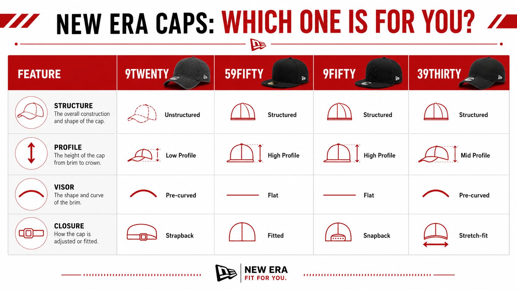
| Cap Model | Structure | Profile | Visor | Closure |
|---|---|---|---|---|
| 9TWENTY | Unstructured | Low profile | Pre-curved | Strapback |
| 59FIFTY | Structured | High profile | Flat | Fitted |
| 9FIFTY | Structured | High profile | Flat | Snapback |
| 39THIRTY | Structured | Mid profile | Pre-curved | Stretch-fit |
The 9TWENTY makes sense when the goal is comfort first and polish second. The 59FIFTY is the brand's flagship style, it debuted in 1954 and became the official on-field MLB cap in 1993, so it's built for a more rigid, iconic baseball look. New Era's own scale also shows how central these silhouettes are commercially, with 142 caps sold per minute globally across its core styles. New Era's baseball history and product scale
That context helps when you're choosing for a project. If you want a cap that stands tall and gives the front panel a firm, uniform surface, the 59FIFTY or 9FIFTY is usually the cleaner pick. If you want something with more give, softer lines, and a ready-to-wear look, the 9TWENTY is the better fit.
The 39THIRTY sits in a different lane. It keeps a more structured shape than the 9TWENTY while staying easier on the head than a fitted cap, which is why some buyers compare it to a bridge between performance comfort and baseball styling. If you want to compare that silhouette in more depth, this New Era 39THIRTY guide is useful background.
How to choose the right one
- Choose the 9TWENTY when you want a relaxed, soft, adjustable cap that looks casual on purpose.
- Choose the 59FIFTY when you want a true fitted cap with a sharper, more traditional on-field look.
- Choose the 9FIFTY when you want a snapback with a structured front and a flat visor.
- Choose the 39THIRTY when you want stretch-fit comfort with a more shaped profile.
For buyers, the important question is simple. Do you want the cap to make a statement through structure, or do you want the decoration and brand message to do the talking? The 9TWENTY is usually the better answer when the design should feel easy, wearable, and less staged.
Styling the 9TWENTY for Your Brand or Team
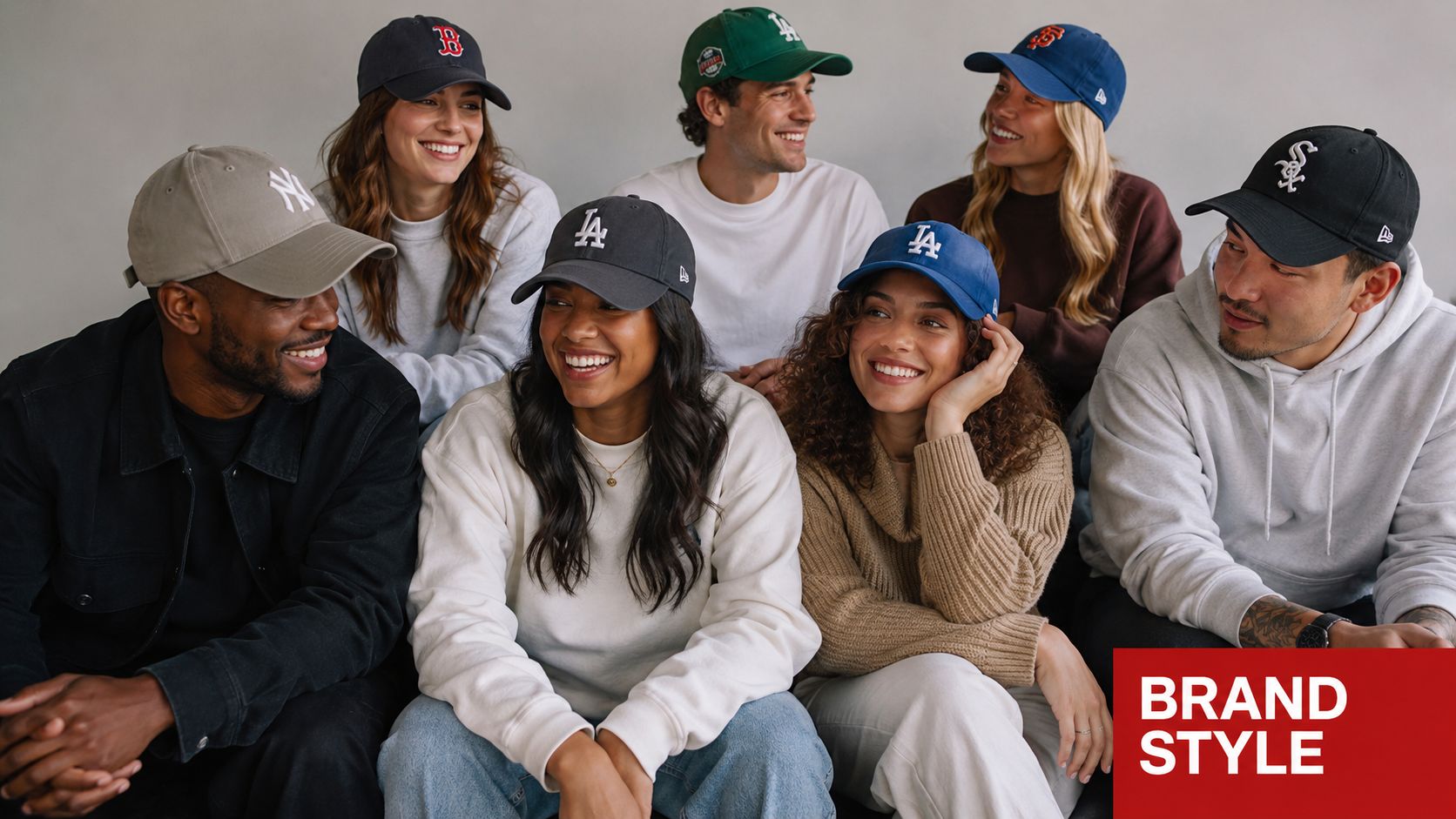
The 9TWENTY has moved well beyond the old “dad hat” label. New Era's own silhouette guide treats it as an active part of the modern lineup and even points to variations like the 9TWENTY A-FRAME to keep the style fresh for current merchandising needs. New Era 9TWENTY silhouette guide
That evolution matters because buyers don't shop silhouettes in a vacuum. A neighborhood coffee shop might want a soft cap with a small chest-style logo that feels easy for staff to wear all day. A brewery might want a patch that gives the merch line a casual retail feel. A school league or rec team might want a simple letter mark that looks good on a cap people will keep wearing after the season ends.
The 9TWENTY works in all of those cases because it doesn't demand attention before the branding does. It supports the logo instead of overpowering it, which is useful when the identity itself is the thing you want customers to remember.
Where it fits best
- Staff uniforms: Good for casual front-of-house teams that need a consistent look without feeling overdressed.
- Event giveaways: Easy to size and easy to hand out when you don't want to deal with individual measurements.
- Retail merch: Strong option for brands that want a laid-back cap people can wear outside the event.
- Teamwear: A solid choice for coaches, sidelines, and community leagues that want something less rigid than a fitted game cap.
You can also see why so many decorators keep this style in the mix. Its shape feels current without chasing a trend too hard, and that makes reorders easier because the cap doesn't look locked into one narrow fashion moment. For a lot of brands, that balance is exactly what keeps a 9TWENTY in rotation.
Getting Custom Embroidery Right on a 9TWENTY
The biggest mistake with a 9TWENTY is trying to decorate it like a structured cap. The front panel has give, so a big dense design can wrinkle, shift, or sit awkwardly when the hat is worn. New Era's own guidance points out that the soft crown affects embroidery placement and makes the style better suited to smaller, left-chest-style logos or flat embroidery rather than large, rigid designs. New Era Australia 9TWENTY silhouette guide
What usually works
Keep the logo simple. Clean lettering, a compact icon, or a small patch usually looks sharper on the 9TWENTY than a wide badge packed with detail. If the artwork needs a lot of fine lines or stacked elements, the hat may not give the embroidery the stable surface it needs.
Use the crown shape to your advantage instead of trying to flatten it out. On an unstructured cap, a modest front mark often looks more intentional than a large center-heavy design because the cap itself stays relaxed. That's one reason many buyers choose tonal stitching, small chest-style marks, or understated patches for this silhouette.
Practical rule: If the logo looks great on paper but depends on a perfectly flat surface, it probably needs to be simplified before it goes on a 9TWENTY.
What to avoid
3D puff embroidery can be tricky here. The soft front panel doesn't give the same rigid lift you get on a structured front, so heavy puff designs may feel out of place or sit unevenly. Large fills can also make the hat feel stiffer than it's supposed to be, which works against the whole appeal of the 9TWENTY.
That's why a digital proof is essential. A proof lets you check size, placement, stitch direction, and how much of the front panel the logo will use before anything gets sewn. For a cap like this, that step isn't just a formality, it's the difference between a clean casual hat and a decoration that looks forced.
If you're ordering decorated blanks, a shop like Dirt Cheap Headwear's custom stitching service can help match artwork to the cap style instead of guessing after the fact. That kind of fit-aware setup is especially useful when you're balancing brand visibility against the softer structure of the hat.
A simple production checklist
- Choose smaller artwork when the cap will be worn by different people with different head shapes.
- Ask for a proof before production starts.
- Match stitch density to the panel, not just to the artwork file.
- Favor flat or lightly raised decoration over bulky designs.
- Test placement on a sample if the order is going to be repeated.
The hat rewards restraint. When the design fits the crown, the whole piece feels more premium because it still looks soft and wearable instead of overbuilt.
Sizing and Caring for Your 9TWENTY Caps
A 9TWENTY takes a lot of guesswork out of group ordering. Its adjustable cloth strap and one size fits most setup make it a practical choice for staff programs, clubs, and event teams that need a single cap style to work across different head shapes. For buyers comparing fits, the hat sizing chart is a useful way to line up head measurements with common cap ranges before you place an order.
The soft fit still has limits, so it helps to check the adjustment range before you commit to a bulk run. If your team includes a wide spread of head sizes, the 9TWENTY usually works well because it can cover a lot of wearers without sorting by individual size. If you need a firmer, more locked-in fit, another adjustable style may be a better match.
Keep it looking right
Care is straightforward, but the soft crown needs a little respect. Spot clean the crown gently, keep the front panel from getting crushed, and store the cap so the bill holds its curve. The unstructured build is part of why people like this hat, yet it also means you should not toss it in a bag under heavy gear if you want the front shape to stay clean.
That advice matters even more on decorated pieces. Embroidery and patches sit best when the cap is handled like finished apparel, not like a throwaround promo item that can take rough treatment without showing wear. If the front panel gets flattened often, the decoration can start to look off even when the stitching is fine.
For branding, the trick is pairing the right artwork with the soft crown. Smaller logos, lighter stitch coverage, and careful placement usually age better on a 9TWENTY than crowded artwork that fights the panel. That is the trade-off with this cap, easy wear and relaxed structure on one side, a need for cleaner decoration choices on the other.