
Most advice about a two tone hat starts with color drama. That's the wrong place to start if you're buying for a business, team, event, or merchandise line. A loud crown-and-brim combination may grab attention in a product photo, but branded headwear has to work on staff, customers, athletes, and repeat orders. The question is whether the contrast supports your logo, photographs cleanly, and remains wearable after the novelty fades.
A commercially useful two tone hat creates a visual frame around the decoration. Choose the silhouette, fabric, and contrast level as carefully as you choose the artwork, then use a proof to confirm that the finished cap looks like a branded product rather than a color experiment.
Why Subtle Contrast Beats Loud Colors in Branded Merch
Louder isn't automatically more visible. In practice, a fluorescent crown paired with a saturated brim can compete with the logo, dominate group photos, and limit when customers feel comfortable wearing the cap. That creates a weak merchandise asset: people notice it, but they don't necessarily keep reaching for it.
Recent 2026 coverage emphasizes contrast-driven headwear while making an important distinction. Neutral crowns with bold accents, along with combinations such as light blue and white, white and kelly, and khaki and navy, are described as easier to wear and more photo-friendly than highly saturated color clashes. See the spring 2026 hat style guidance for that palette direction.
Build the palette around the logo
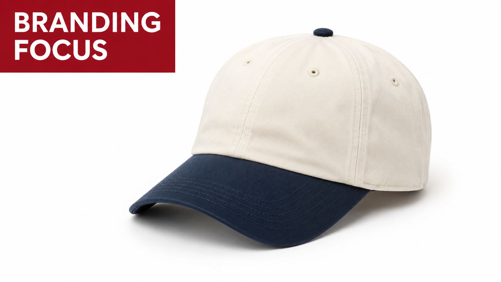
Start with the decoration, not the blank cap. A dark navy brim and a cream crown can give a small embroidered mark enough separation without creating a harsh block of color. Khaki and navy work particularly well for outdoor brands, trades, clubs, and hospitality concepts because the combination feels intentional without looking theatrical.
Use one color as the visual anchor and let the second color act as an accent. If both colors demand equal attention, the front panel has no clear hierarchy. That becomes a problem when the logo includes fine lettering, multiple thread colors, or a compact emblem.
Practical rule: If the hat looks memorable before the logo is added, reduce the color intensity before you reduce the logo size.
Test the hat in real images
A product photo on a white background tells you very little about commercial versatility. Review the cap in staff portraits, outdoor event photos, team group shots, and close-ups where the brim casts a shadow across the decoration. A pairing that looks balanced on a flat lay may appear overly bright under direct sunlight or disappear against branded apparel.
For a coordinated content or merchandise program, accessories can help you keep the visual language consistent across products. Nim's guide to AI video accessories is a useful reference when your branded cap needs to appear alongside other on-camera items.
Choose durable contrast over novelty
Subtle contrast doesn't mean boring. It means the hat can carry the brand through multiple seasons, apparel combinations, and customer preferences. Neutral crowns with a defined accent usually give wholesalers more room to replenish inventory without having to redesign the entire decoration program.
For small businesses, that flexibility matters more than a brief burst of visual impact. A two tone hat should earn its space in the merchandise assortment by making the logo easier to notice while still looking like something people would wear away from the event or workplace.
The Evolution of Two Tone Headwear
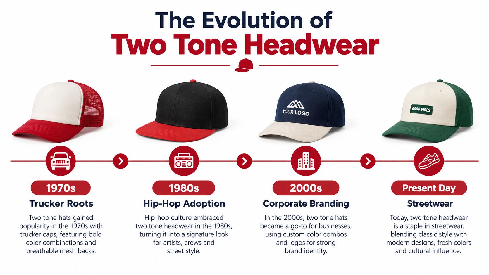
The two tone look carries more history than a simple split-color construction suggests. Its cultural identity is closely tied to the late-1970s British Two Tone ska revival, which drew from Jamaican Rude Boy style associated with Kingston and later influenced UK Skinhead fashion. The Victoria and Albert Museum's record of the pork-pie hat associated with the Two Tone aesthetic documents the visual relationship between the hat, black-and-white styling, check patterns, and the movement's sharp tailoring.
Jerry Dammers, founder of The Specials and the 2 Tone label, helped establish the movement's recognizable black-and-white identity. A secondhand 1960s single-breasted Mod suit became part of that visual language, while pork-pie and Trilby hats gave the look a defined headwear shape. For a merchandise buyer, that history creates useful positioning. A cap can signal ska heritage, Mod references, vintage streetwear, or a retro sports mood, but the story should match the product and audience.
Sports made the construction familiar
Two-tone headwear also has a documented place in early baseball uniform design. The St. Louis Browns popularized a two-toned bill, and the Washington Nationals used a similar navy-blue bill with white trim from 1912 to 1915, a run lasting three seasons, according to this history of baseball hat styles.
That sports precedent matters because modern buyers already understand the visual logic. The crown carries the primary field for decoration, while the bill supplies contrast and helps the cap read from a distance. The design feels established rather than arbitrary.
Modern blanks borrow from both traditions
Today's decorated blanks combine heritage cues with manufacturing choices made for branding. The Frame two-tone cap described by Silverstein Music uses mid-weight 100% cotton, a structured front, plastic snapback, curved peak, and tonal eyelets. A related five-panel version uses cotton with a flat contrast peak and contrast dome, as shown in the Frame two-tone cap product details.
Cotton twill and stable crown fabrics help preserve panel shape during embroidery and patch application. That makes the two tone hat especially practical when your selling point is not only the color split, but also a clean, repeatable decoration program.
Choosing the Right Silhouette for Your Audience
A two tone hat can look premium, casual, athletic, or promotional depending on its silhouette. Don't choose the blank from a color chart alone. Decide where the hat will be worn, who has to fit it, and whether the decoration needs a firm front panel or a softer surface.
Structured caps are the safest starting point for logos that need a crisp presentation. The Frame example uses a structured front, curved peak, snapback closure, and tonal eyelets, a combination that gives the cap a defined shape and a broad decoration area.
Compare the main options
| Hat Style | Profile and Structure | Best Business Use Case |
|---|---|---|
| Trucker cap | Structured front, mesh back, adjustable closure | Outdoor promotions, food trucks, workwear brands, summer events |
| Snapback | Structured crown, adjustable plastic closure, often flat or curved peak | Retail merchandise, streetwear drops, music and lifestyle branding |
| Dad hat | Usually lower profile and unstructured, with a relaxed fit | Corporate giveaways, casual staff wear, community events |
| Beanie | Soft, flexible knit construction with no rigid front panel | Cold-weather teams, winter promotions, lifestyle labels |
| Visor | Open crown with a projecting bill | Golf events, running clubs, tennis programs, warm-weather activities |
A hat style guide can help you compare profile, closure, and construction before you request samples. Use it as a screening tool, then inspect a physical blank before committing to a decorated run.
Match structure to decoration
A structured snapback gives a logo a controlled surface and makes the cap feel like a retail product. It's a strong choice when customers will pay for the hat rather than receive it as a giveaway. A trucker cap adds ventilation and a more casual workwear signal, but the mesh can shift the visual balance between the front decoration and the back of the cap.
Unstructured dad hats are easier to wear across mixed audiences, yet their flexible front can soften fine embroidery. Keep artwork simpler and avoid designs that rely on perfectly straight baselines. Beanies and visors require a different decoration strategy entirely, so don't force a standard front-panel logo onto them.
Use the audience as the filter
For a sports team, adjustable closures help accommodate varied head sizes and make distribution easier. For retail, the cap needs a deliberate shape that supports the product's price and brand story. For a trade event, comfort and broad wearability usually matter more than a fashion-forward profile.
Order samples in the proposed color combination. A two tone hat's proportions can change dramatically between a high-profile snapback and a low-profile casual cap, even when the crown and brim colors remain identical.
Maximizing Embroidery and Patch Placement
The contrast between crown and brim gives you a built-in frame, but it doesn't eliminate decoration limits. The front panel still has to support the artwork, and the thread or patch has to remain legible against the specific fabric color.
Place the strongest mark on the strongest panel
Use the main front panel for the primary logo. On a structured cap, that panel provides the most stable foundation for dense stitching and dimensional effects. Keep the decoration clear of seams, curved edges, and the transition where the crown meets the brim.
Choose thread with contrast against the crown, not merely contrast against the brim. A cream crown may support navy, black, forest, or burgundy thread, while a dark crown may need a lighter thread or a controlled tonal treatment. If the logo already contains several colors, let the hat provide the visual variety and simplify the embroidery.
Decoration rule: The hat's panel contrast should frame the logo. It shouldn't become a second logo competing for attention.
Use 3D puff selectively
3D puff embroidery can add depth to bold lettering, compact symbols, and athletic marks. It works best when the artwork has clean shapes and enough spacing for the raised foam to form properly. Fine script, tiny interior gaps, and intricate linework can lose clarity when the decoration becomes dimensional.
A patch can solve a different problem. Woven patches suit detailed marks and small text, while leather-style labels can reinforce a heritage or premium positioning. Keep the patch proportionate to the front panel. An oversized patch may cover the crown's color story and make the two tone construction feel incidental.
For a more detailed review of location, clearance, and decoration scale, use this embroidery placement guide before finalizing artwork.
Review the production approach with your decorator before approving the order. This short video offers a visual reference for embroidery considerations:
Protect the contrast hierarchy
Place secondary marks on the side or back only when they add a clear function, such as a founding year, location, or short slogan. Don't scatter small graphics across every available panel just because the blank allows it. Two tone caps already contain a strong visual division, so excessive decoration can make the final product feel crowded.
Ask for a digital proof that shows the actual crown and brim colors, decoration location, thread palette, and patch dimensions. A proof won't replace a physical sample, but it catches avoidable errors before production and gives your team a shared reference for approval.
Navigating Wholesale Minimums and Lead Times
Wholesale ordering gets easier when you separate three decisions: how many blanks you need, who will decorate them, and when the finished hats must arrive. Unit price matters, but a rushed schedule, unavailable colorway, or fabric that cannot support the chosen decoration can erase the savings.
Define the order's job first. A small test run should answer practical questions about fit, color contrast, logo scale, and customer response. A replenishment order should use the approved color combination and decoration file, so proven branding reaches customers without restarting the design process.
Treat minimums as a testing tool
Minimum order policies vary by supplier and decoration method. Ask whether the minimum applies per style, color, logo, or decoration method. Confirm setup charges, proof approvals, blank substitutions, and the process if the requested color sells out.
This guide to minimum orders for custom hats helps you prepare specific questions before requesting a quote. Keep the first order focused. One silhouette and a controlled palette reveal more about product-market fit than a scattered order across unrelated cap styles.
Plan the production path
You have three practical routes:
- Use distributor decoration: This reduces handoffs by keeping the blank, embroidery, patch, and proof process with one production partner. It suits teams and businesses that need finished merchandise rather than loose inventory.
- Buy blanks for local decoration: An established decorator may offer better control over specialty techniques, but you must manage shipping, inventory, artwork transfer, and quality checks between suppliers.
- Hold approved blanks for replenishment: Stored inventory can shorten response time after a proven colorway sells. Protect the caps from crushing, dust, and moisture, and track the quantity on hand.
Lead time includes proof approval, blank availability, decoration, quality inspection, and shipping. Do not promise an event date based on decoration time alone. Request a written production schedule, then confirm that the supplier will contact you before substituting fabric or color.
Inspect fabric before scaling
Cotton twill and stable structured panels give embroidery a predictable base. Washed cotton can have a softer, uneven surface that affects stitch definition, while mesh may need a backing to prevent distortion. Soft unstructured fronts can flex under a patch, and adhesive may bond differently to textured or treated fabric.
Order a sample and test the actual decoration method. A logo that looks clean on a stock mockup may warp on a flexible panel, or a patch may lift at the edges after handling. A physical check protects the larger order and gives staff or team managers a clear sample to approve.
Matching Headwear to Specific Use Cases
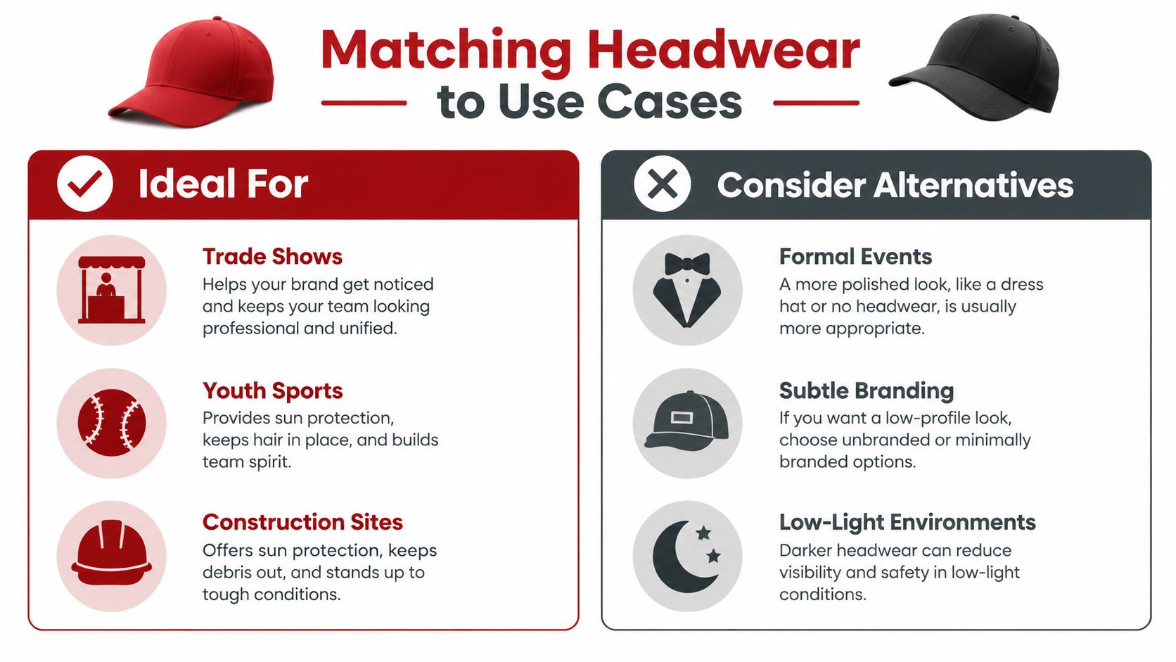
Two-tone styling works best when the contrast has a job. It can make a team look more unified, help a seasonal promotion stand out, or give a streetwear product the visual break customers expect. It can also undermine a premium uniform if the color split feels too casual or makes the logo harder to control.
The buying decision should follow the environment, not the trend. The 2026 hat trend discussion notes that formalwear, premium corporate merchandise, and highly regulated team programs often favor cleaner, more restrained colorways, while trend-focused pieces fit streetwear and seasonal promotions more naturally.
Choose two tone when visibility supports the job
Trade shows, youth sports, construction-related promotions, and outdoor events can benefit from a defined crown-and-brim contrast. In these settings, the cap often needs to read quickly from a distance and look coherent in group photos. A neutral base with a team, school, or brand accent usually delivers energy without making the merchandise difficult to wear.
Streetwear and limited merchandise drops can take more visual risk, especially when the colorway is part of the product identity. Even there, preserve a clear logo zone. A memorable hat still needs a readable mark.
Choose a quieter alternative when trust matters more than energy
Formal events and premium hospitality programs often need headwear that recedes into the uniform. A tonal cap, monochrome embroidery, or restrained neutral may communicate polish more effectively than a strong color division. The same applies to corporate merchandise intended for broad, long-term use across departments and dress codes.
Regulated team or uniform programs need another layer of caution. Match approved colors exactly, confirm whether contrast affects compliance, and make sure staff can distinguish the branded cap from required safety or operational gear. A stylish option isn't useful if supervisors reject it or employees avoid wearing it.
Merchandising judgment: If the audience needs to look polished first and branded second, reduce the contrast. If the audience needs to be spotted, remembered, or grouped quickly, use contrast with discipline.
Consider the photo environment
Light-colored crowns can wash out under direct sun, while dark brims can cast shadows across the front logo. Ask for images in the lighting your audience will encounter. A landscaping crew, youth league, and indoor retail team may all need different two tone decisions even if they share the same logo.
The most durable option usually has one restrained base color and one recognizable brand accent. That balance protects visibility without turning every use case into a novelty launch.
Ordering Custom Hats and Caring for the Finish
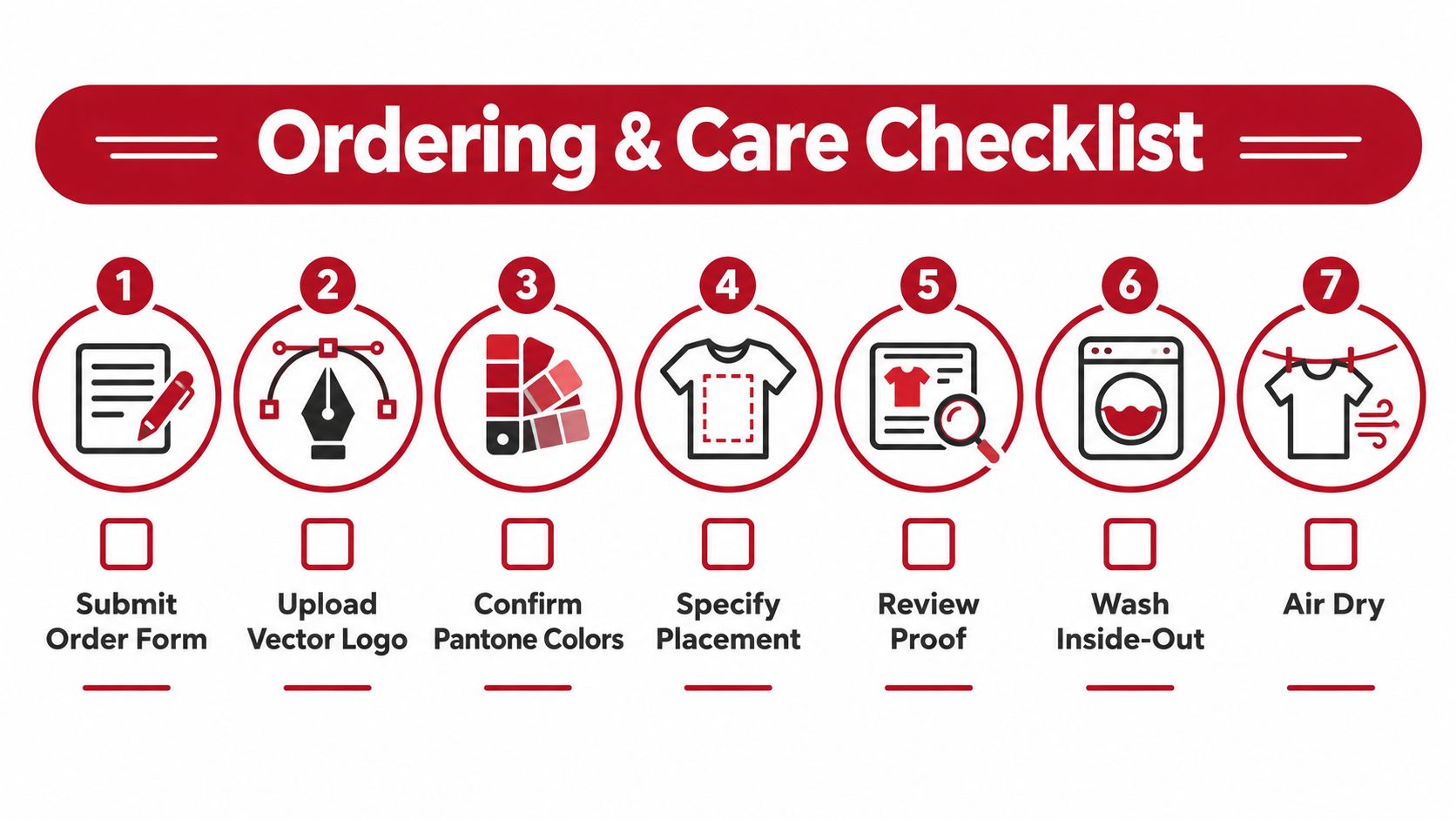
A custom hat order fails through small ambiguities, not dramatic design mistakes. Submit clean vector artwork, name the decoration method, mark each placement, and provide exact brand color references. Two-tone construction adds separate crown, brim, thread, and patch variables, so vague instructions make reorders harder to match and can weaken logo visibility.
If the hat will become part of a branded merchandise line, settle artwork ownership, labels, packaging, and the reorder process before production. Knowing what a private label brand is helps distinguish a one-time promotional item from a product line that needs consistent presentation.
Use a disciplined approval sequence
- Submit the order form: List the style, colorway, closure, quantity, decoration type, and delivery requirements.
- Upload vector artwork: Supply a clean file with editable shapes and clearly defined colors.
- Confirm color references: Ask how the supplier will match crown fabric, brim fabric, thread, and patch materials.
- Specify placement: Mark the front, side, back, or other decoration locations and provide approximate dimensions.
- Review the proof: Check logo scale, alignment, thread colors, patch edges, and the contrast between the decoration and each panel.
- Approve a sample when needed: Request a physical sample for complex embroidery, dimensional decoration, unusual fabrics, or premium retail orders.
- Document the approved version: Save the final proof and decoration file so replenishment orders match the original run.
Color consistency matters as much as the first sample. Record the approved fabric, thread, patch, and trim references, then compare every reorder against that record. A slightly different brim or thread can change how the logo photographs and make an established brand look improvised.
Protect the finished decoration
Spot-clean the cap with a gentle cloth and mild solution instead of putting it through ordinary laundry. Avoid aggressive scrubbing across puff embroidery, woven patches, leather-style labels, or raised stitching. Excess moisture and heat can distort the fabric and decoration.
Let the hat air-dry naturally. Keep it out of a hot dryer and away from heavy objects that can flatten a structured crown. Store the cap with its front panel and brim supported so the original shape remains intact between uses. Give team members or customers the care instructions with the order. A short maintenance card prevents avoidable damage and protects the merchandise's useful life.
Dirt Cheap Headwear offers blank two-tone styles, custom embroidery, patches, and low-minimum production options for businesses, teams, and events. Review the available caps and custom ordering options at Dirt Cheap Headwear, then request a proof based on your logo, audience, and intended use.