
Embroidery Placement Guide: Perfect Logo Positioning
You can spot a rushed hat order from ten feet away. The logo sits too low on the crown, the curve eats part of the mark, or the whole thing drifts off center because nobody bothered to map the placement before the file went out. That's how decorators end up redoing work they already paid to produce, and it's why a solid embroidery placement guide matters long before the first stitch hits fabric.
A good placement decision isn't just about looking neat. It's about choosing the part of the hat that can hold the design without distortion, collision with the bill, or awkward scale. On shirts and jackets, that means leaning on body landmarks and seam offsets like the commonly used 7–9 inches down from the shoulder seam for adult left-chest embroidery and 7–9 inches below the neck seam for adult jacket backs, because real garments vary by size, seams, pockets, and closures maggieframes.com. On hats, the construction itself becomes the deciding factor.
Why Placement Decisions Matter Before You Hit Digitize
A proof can look clean on screen and still fail on the cap. The logo may fit the artwork box, then sit too low on a shallow crown, press into a curved brim, or crowd the front panel once the hat is on a head. By the time digitizing starts, those mistakes are expensive to fix because you are no longer adjusting art alone, you are working against the shape of the hat.
The hat construction changes the placement call
A deep crown gives you more room to place a logo high enough to read without looking cramped. A low-profile cap leaves less usable space, so the same mark often needs to sit lower and tighter to the front panel or it starts looking forced. Structured caps hold their shape and give the embroidery a firmer base, while unstructured caps collapse more easily, so the same art can read stiff or off-balance if you place it like it belongs on a rigid front.
If you want a clean cap program, start by understanding how structured vs unstructured hats change the way the front panel carries embroidery. Flat-front trucker caps sit flatter, but the eye still reads them differently from a curved-brim cap because the panel height, mesh break, and front edge all change the visual center. A logo that looks centered in a mockup can drift once it meets the actual crown and brim.
That is why placement has to be decided before digitizing. If the file is built first and the hat style is treated later, the stitchout may be technically correct and still look wrong in hand. I have seen good logos ruined by that mistake, especially when one measurement gets copied across hats with different crown heights and front-panel shapes.
Commercial consistency starts with the first placement choice
The practical payoff is repeatability. A placement plan gives you the same visual anchor every time a client reorders, which cuts down the drift that shows up when one run sits a little higher and the next creeps toward the bill maggieframes.com. Without that anchor, each cap can still be embroidered correctly and still look like it came from a different order.
That matters even more on hats with different constructions. A centered mark on a structured six-panel cap may need a different relationship to the seam and brim than the same logo on a soft dad hat or a shallow snapback, and the eye notices the mismatch fast. One bad assumption turns into a stack of hats that are all usable but none of them look quite right.
Practical rule: decide the placement on the actual hat style before you approve digitizing.
Embroidery history points the same way. Handwork was once guided by sampler traditions, then production became more repeatable as machine embroidery took over, which pushed the craft toward clearer placement habits and more consistent setup V&A history of needlework samplers. Modern hat embroidery still follows that same logic, only the reference points are crown height, front-panel shape, seam lines, and brim clearance.
Choosing the Right Placement for Your Hat Style
A generic cap rule will get you through a quick run, but it is a poor way to build a repeat order program. The front of a beanie, the face of a low-profile dad hat, and the panel structure of a snapback all behave differently, and each one changes where the logo naturally belongs.
Structured and unstructured caps don't read the same
Structured caps hold their shape, so a logo can sit a little higher and still look deliberate because the front panel gives the embroidery a firm surface. Unstructured caps, especially softer dad hats, drape more, so the same logo can start to look oversized or too stiff if you place it the way you would on a hard-front snapback.
That is where hat construction matters more than a generic chart. A flat-front trucker cap gives you a flatter face, but the mesh line behind it changes the visual balance, and a placement that looks centered on paper can still feel low once it is sewn. The safest reference points are still the cap's center seam and the bill clearance rule, which keeps embroidery at least 1/2 to 3/4 inch above the bill so the design clears the brim and the presser foot. For a quick reference on how those build differences affect placement, start with structured vs unstructured hats.
Match the style to the placement zone
Here is where a lot of good artwork goes wrong.
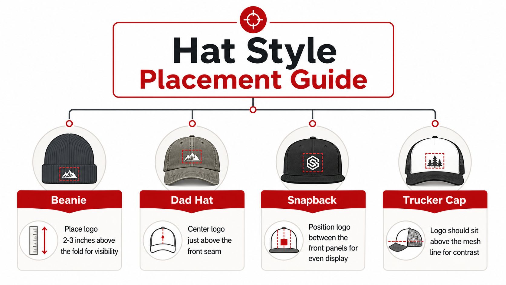
- Beanies: keep the mark above the fold line so it shows when worn, not buried in the cuff.
- Dad hats: put the logo just above the front seam, then check that it does not spread too far down the shallow crown.
- Snapbacks: the logo usually reads best centered between the front panels, where the crown supports a bolder front display.
- Trucker caps: keep the artwork above the mesh line so the stitch work does not fight the fabric transition.
A structured 5-panel or 6-panel cap can also shift the center point, since the front panel shape and seams change how the logo sits. That is why a construction-first approach works better than a one-size-fits-all measurement. If you are comparing cap bodies before you approve placement, structured vs unstructured hats gives you the clearest starting point, because the hat body tells you more than the artwork ever will.
Specialty headwear needs its own judgment
Visors, bucket hats, rope hats, and ponytail hats all bring extra variables. A visor leaves less vertical real estate, so the logo has to stay compact and readable. Bucket hats and rope hats often need the mark positioned where the wearer's line of sight and the crown shape work together, not where a standard cap chart says to place it.
A design that looks balanced on a high-crown snapback can feel crowded on a low-profile dad hat, even if the measurement is technically correct.
Think in zones, not just inches. Start with the cap's build, then decide whether the art needs to sit higher, tighter, or farther from the bill. Once you start reading hats that way, the bad placements get obvious fast.
Measuring and Marking Placement Like a Pro
Good placement starts with a line, not a guess. I've watched clean logos get ruined because someone centered by eye on a curved panel and called it done. The fix is simple, repeatable, and it saves a lot of scrap.
Use the seam as the anchor
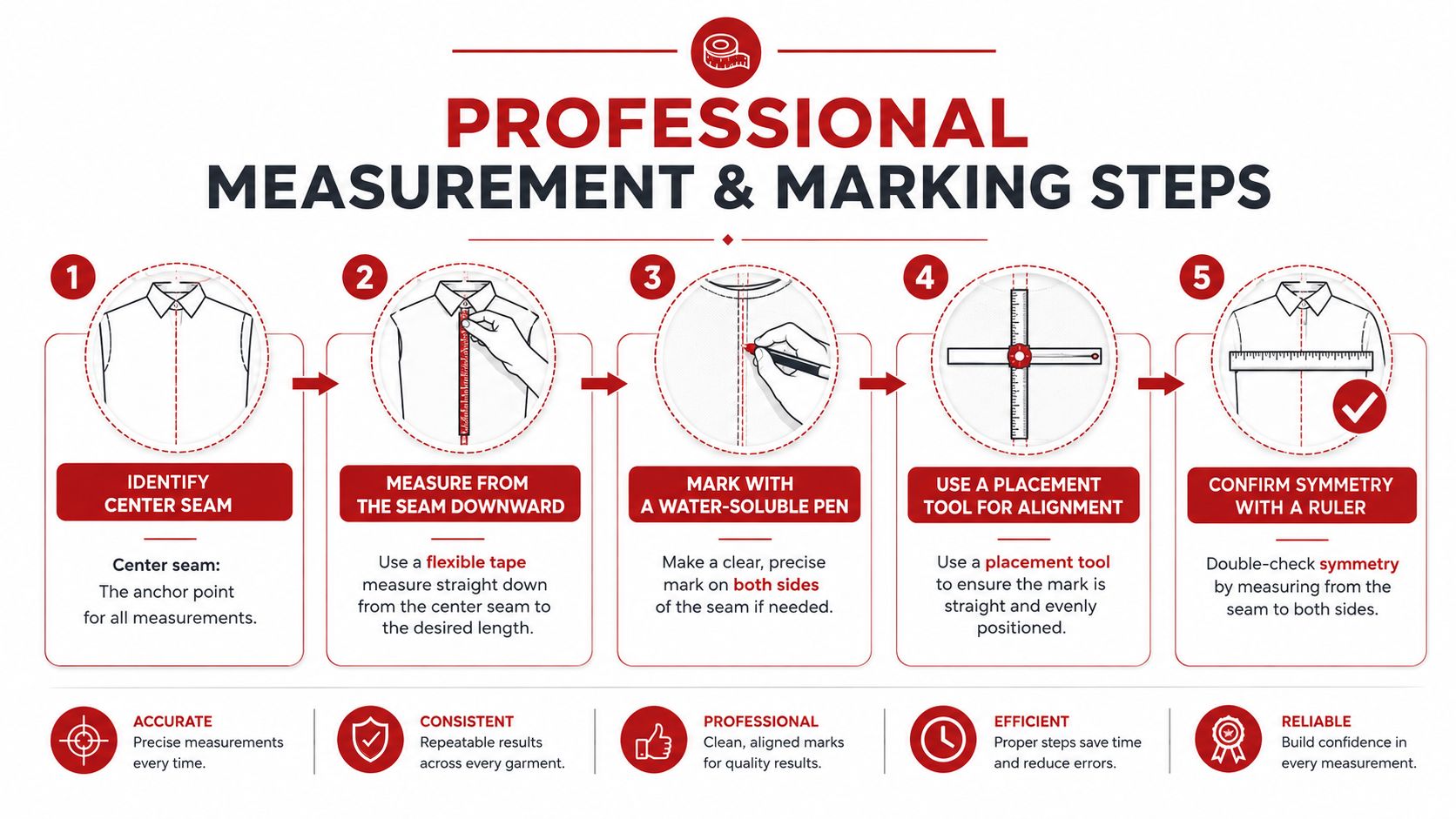
For hats, the center seam is the cleanest reference point. Find the midpoint of the front panel, or the seam structure that defines the hat's center, then mark your crosshair before you hoop anything. On shirts and jackets, the same method shows up as a measured centerline system, where decorators find the midpoint, add a guideline, and align the template's crosshairs before hooping Emblibrary placement guide.
Bill clearance matters just as much. Keep embroidery at least 1/2 to 3/4 inch above the bill on caps so the art clears the brim and the presser foot. If you miss that gap, the machine can fight the hat and the logo will read cramped even if the center point is technically correct.
Hat construction changes where that center point should live. A structured front panel holds shape and gives you a firmer target, while an unstructured cap can sag a little and make a centered design look low. Flat-front styles usually tolerate a more direct placement, but a strongly curved brim or a higher crown can make the same measurement read differently once the hat is on a head. On custom runs, I rely on custom stitching on hats notes before I commit a logo to a blank, because the body of the hat tells you more than the artwork alone.
Mark lightly, then verify twice
Use removable marks, masking tape, or a full-size template with crosshairs. A water-soluble pen works if you are careful, but the bigger win is checking the needle against the center mark before stitching begins. That one habit stops the off-center proof that looked close enough and later cost a full rework.
- Masking tape: useful for temporary reference marks on slick cap surfaces.
- Full-size template: helps you see how wide the logo feels on the actual crown.
- Crosshair alignment: keeps the eye from drifting to one side of the front panel.
- Needle check: confirms the stitch point lands exactly where the center mark sits.
Fit the measurement to the garment size
Size changes the read. A logo centered properly on a medium hat can sit too high on a larger one because the crown proportions shift. A low-profile cap and a taller structured crown will not read the same, even if the tape measure says they do. That is why you cannot trust a single proof without seeing how the actual blank behaves in hand.
If the hat is part of a repeat program, document the exact placement you approved. That is the difference between a one-off job and a system you can reorder without second-guessing every run.
Hooping and Stabilizer Choices That Protect Your Placement
Even a perfect mark can drift if the hat gets hooping treatment it wasn't built for. Structured caps, soft caps, and curved brims all react differently under tension, and the wrong setup will pull your placement off center before the machine starts stitching.
Match the hoop to the hat body
Structured caps usually tolerate firmer hooping because the front panel can hold its shape. Unstructured hats are less forgiving, since the fabric can collapse or distort if you over-tighten the setup. On those, a softer hold and better support are usually safer than trying to clamp the crown into submission.
Stabilizer choice matters too. Dense stitch designs need more support than a light logo, especially on headwear where the front panel is curved and the embroidery has less room to relax. Temporary backing or adhesive stabilizer can help keep the panel from shifting, and clean removal matters just as much as the stitch quality itself.
Don't let the stitching drag the hat
A lot of placement problems aren't really placement problems, they're distortion problems. The file may have been centered correctly, but the material stretches under stitching and the logo migrates a little off the intended line. That's especially frustrating on structured caps, where the shape looks rigid but the front still moves enough to throw off a tight design.
Practical rule: if the fabric can flex, the stabilization has to do more than just hold the hat in place.
For hat production, the setup should keep the front panel flat enough to embroider cleanly without crushing the crown. If the design is heavy, especially with raised detail or compact lettering, make sure the support matches the stitch load. Dirt Cheap Headwear's page on custom stitching on hats is a useful reference point if you're comparing decoration approaches and want to think through construction before the run starts.
Remove temporary materials without leaving evidence
Adhesive stabilizer and backing can leave residue if you rush the cleanup. That's one of those small details that turns into a customer complaint later, because the embroidery might be clean while the finish feels sloppy. I've seen otherwise solid orders get dinged over the last 5 percent of the process, not the first 95.
The fix is simple. Use the least aggressive support that still keeps the hat stable, and remove it carefully once the run is done. If you need extra hold, use it on purpose, not by default.
File Prep and Digitizing Notes for Headwear
A hat file is not a shirt file with the corners trimmed off. The crown curves, the front panel is smaller, and the stitch behavior changes once the art has to live on a rounded surface. If the file isn't built for that reality, the placement can look correct and still finish badly.
Simplify before you chase detail
Small front panels don't reward clutter. Tight text, tiny icons, and overworked shading often collapse once they hit a curved crown, especially if the logo is competing with seam lines or a shallow panel. Simplifying the file usually helps the placement read cleaner, because the eye can track the design without fighting the shape of the hat.
This is also where 3D puff has to be handled carefully. Raised embroidery creates a stronger visual block, so it can make a design feel larger than the measured width. If you're using it, the placement has to leave enough breathing room around the mark so the raised area doesn't run into the brim or the panel edge.
Ask for the right technical choices
Underlay is the quiet part that keeps stitches from pulling on curved surfaces. If the underlay is too aggressive, the front can pucker. If it's too weak, the design may lose clarity and hold. Stitch density has the same trade-off, because too much thread on a small panel can make the logo feel bulky instead of crisp.
If you're converting artwork and want to see how a logo behaves on a full wrap or a 360-style presentation, Sculpty logo to 360 conversion can be a useful reference for visualizing how the mark wraps in space before you commit to a production file. It's not a replacement for a proper hat proof, but it does help when you're thinking through surface behavior.
- Reduce micro-details that won't survive on a front panel.
- Check stitch direction so curves don't fight the shape of the crown.
- Confirm the available embroidery area before locking in text size.
- Keep 3D puff elements separated enough to read cleanly on the hat face.
For a deeper production-minded walkthrough, Dirt Cheap Headwear's how to digitize a logo for embroidery guide is worth keeping nearby when you're handing a file off for headwear work.
The Proofing Checklist Before You Commit
A proof can look polished and still hide a bad decision. I've approved files that were technically centered and still had the logo reading too low once the hat was worn, so the safe move is to check the proof like a decorator who's had to eat a bad run before.
Read the proof as a production document
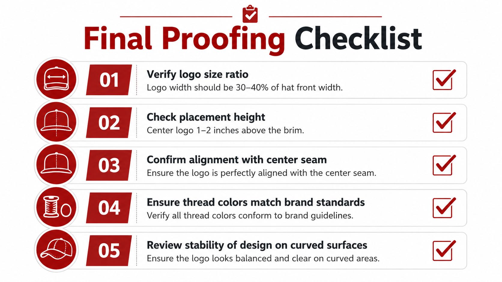
Start with alignment. The logo should sit on the center seam or the agreed placement axis, not “look centered” in the mockup. Then check the height against the bill and crown shape, because a proof that floats too close to the brim will feel crowded in person.
Next, look at proportion. The front of a hat only gives you so much visual real estate, so the logo has to leave enough breathing room around the edges and seams. Thread color should match the brand standard, but the bigger issue is whether the design still reads clearly when the hat curves around the head.
Ask for a sample if the proof feels off
If anything about the placement feels questionable, request a physical sample before full production. A screen proof can hide scale issues that only show up on a real crown, and that's especially true with structured caps and curved-brim styles. If the sample is off, adjust the placement now, not after a box of hats arrives.
Use a simple checklist:
- Verify alignment against the center seam or chosen axis.
- Confirm height relative to the bill and front panel shape.
- Review size ratio so the logo fits the hat style.
- Check stitch direction for curves, seams, and raised elements.
- Approve the exact version you want saved for repeat orders.
When you're ordering through a vendor with a broad hat catalog, like the program options at Dirt Cheap Headwear, proofing becomes easier when the same placement notes can be tied to the same blank every time.
Don't approve a placement just because the mockup looks clean. Approve it because the hat, the logo, and the crown shape all agree.
Getting the Most from Your Wholesale Embroiderer
The easiest way to get a clean run is to over-communicate before the order leaves your hands. Tell the embroiderer the hat style, the construction, the placement target, and any special finish like 3D puff or fine-detail stitching. If you leave those pieces vague, you're handing them the freedom to make a judgment call you may not like later.
Give them the language they need
A good order note should say more than “front logo” or “centered.” It should tell the shop whether the hat is structured or unstructured, whether the crown is low or high, and whether the logo needs to sit above the bill line or higher on the front panel. If there's a repeat order coming, document the approved placement so the next run doesn't rely on memory.
That matters because different blanks don't behave the same. A snapback, a dad hat, and a trucker cap all want slightly different treatment even when the artwork is identical, and that's where many wholesale relationships get messy. Clear notes stop the guessing before it starts.
Ask the questions that prevent rework
Before you place a large order, ask what the shop wants for placement confirmation, what they need for sample approval, and how they handle repeat runs on the same blank. If the vendor has a guide for apparel and team orders, like the SoccerWares customisation guide, use it as a model for the kind of detail you should expect from any production partner. The point isn't the product category, it's the discipline of specifying what goes where.
- Confirm the blank style before the file is finalized.
- Specify the placement notes in writing, not just in a call.
- Ask for proof approval on the exact hat construction.
- Save the approved measurement for every repeat order.
- Flag special decoration like puff, patching, or fine-detail embroidery early.
The best wholesale relationships feel boring in the right way. Orders land in the same spot, proofing is predictable, and nobody has to argue over whether the logo sits where it was supposed to sit. That only happens when the placement conversation starts early and stays specific.
If you're ready to stop guessing where logos belong on hats, Dirt Cheap Headwear can help with blanks, embroidery, and repeatable placement on the styles brands order. Browse Dirt Cheap Headwear to line up the right cap construction, send a clean placement note, and get your next run started with fewer surprises.