You have artwork sitting on your iPad, in Procreate, or in a sketchbook. You can already see it on a tee, maybe on a black hoodie, maybe on a hat your friends would wear. The hard part isn't the idea. It's turning that idea into something that looks clean, holds up after washing, and doesn't feel homemade in the bad way.
That's where screen printing for artists makes sense. It sits in the sweet spot between studio craft and real product. You keep control over the image, the ink, and the finish, but you also get repeatability. One strong design can become posters, shirts, tote bags, and eventually merch that people buy because it looks legit, not because they know you.
Turning Your Art into Wearable Products
The jump from art print to merch usually happens for a simple reason. Someone asks, “Can you put this on a shirt?” Then someone else asks for a hat. Then you realize your work needs a production method, not just a mockup.
Why artists keep coming back to screen printing
Screen printing has staying power because it gives artists a very specific mix of control and punch. You can print bold shapes, crisp edges, and ink that sits with intention on the garment. Digital methods have their place, but screen print still gives you that deliberate, designed feel.
It also has real artistic roots. Screen printing originated in China during the Song Dynasty (960–1279 AD) and was later legitimized as a fine art form in the 1930s, when artists working within the U.S. WPA founded the National Serigraph Society and used the term serigraphy to separate artistic printmaking from industrial production, as documented by the history of screen printing at WNY Book Arts.
That matters more than people think. If you're an illustrator, painter, or designer, you're not stepping away from art when you learn to print merch. You're working in a medium with a serious visual tradition.
Practical rule: Treat the shirt or hat like a substrate, not a souvenir. The minute you think that way, your decisions get better.
What works when you're starting small
The first good move is to keep your product line narrow. Start with one or two strong designs, one garment color, and one print placement. A front chest print on a tee is easier to control than trying to launch five shirt colors, sleeve prints, and a hat program all at once.
If you also work in sewing, quilting, or mixed media, it helps to compare methods before you commit. Some artists realize certain designs are better handled with transfer materials instead of ink, especially for one-offs and craft-heavy workflows. A useful side resource is this guide to the best infusible ink sheets for sewists, which can help you decide when screen printing is the right call and when another process makes more sense.
Where merch changes your art practice
Wearables force clarity. A poster can get away with subtle texture and tiny detail. A shirt usually can't. A hat definitely can't. Merch asks you to simplify without flattening your style.
That's a good thing.
A strong print-friendly design often becomes stronger everywhere else too.
Your Essential Screen Printing Starter Kit
Beginners usually waste money in one of two ways. They either buy the cheapest kit they can find and outgrow it immediately, or they buy shop-level gear before they've printed a single usable shirt. The better route is a lean setup with a few solid tools you won't hate after a month.
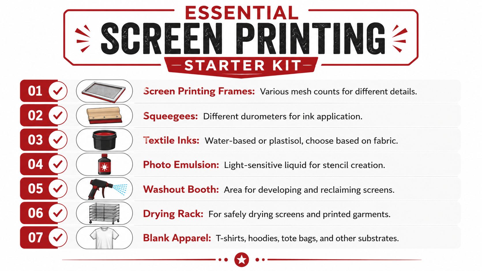
The gear you actually need
Start with the pieces that affect print quality the most:
- Screens and frames. Get a couple of sizes that fit your most common artwork. Use a lower mesh count for bolder prints and a finer mesh for more detail.
- Photo emulsion and scoop coater. This is what turns your artwork into a reusable stencil. Cheap coating jobs create uneven exposure and pinholes.
- A decent squeegee. One good squeegee beats a drawer full of bad ones. The blade should feel straight, clean, and predictable in your hand.
- Ink. Pick one system and learn it before experimenting.
- Transparency film or film positives. Your stencil quality starts here. If the black areas aren't dense enough, your exposure suffers.
- A washout area. It doesn't need to be fancy, but it does need running water and enough room to rinse a screen without wrecking the room.
- Blank garments or paper. Test on the actual substrate, not the cheapest substitute you can find.
Water based or plastisol
This is one of the first real trade-offs you'll make.
| Ink type | What it does well | What trips people up |
|---|---|---|
| Water-based ink | Softer hand feel, great for artists who want the print to feel integrated with the fabric | Dries in the screen faster, demands cleaner workflow |
| Plastisol ink | Forgiving on press, easier for beginners during longer print sessions | Heavier print feel, curing mistakes can ruin otherwise good prints |
Water-based ink rewards discipline. If you pause too long, it can start drying in the mesh. Plastisol is more forgiving during printing, which is why many beginners get cleaner early results with it. But if you don't cure it properly, the print won't hold up.
Buy ink based on your workflow, not on forum loyalty. The “best” ink is the one you can print and cure consistently in your actual space.
A small workspace beats a chaotic one
You don't need a professional studio to begin, but you do need separation between tasks.
Set up three zones if possible:
- A light-safe prep area for coating and drying screens.
- A print area with stable table space.
- A washout area where mess is expected.
If all three happen in one cramped corner, contamination starts fast. Wet screens, dust, stray light, and open ink containers don't mix well.
Optional upgrades worth adding later
Some tools become useful only after you've got the basics under control:
- Exposure unit if you're tired of inconsistent burns
- Flash dryer for smoother multi-color workflow
- Drying rack when shirts start piling up
- Registration aids once you move beyond single-color work
- Hat platens if wearable merch becomes part of your regular lineup
A simple setup can produce very strong work. A cluttered expensive setup can produce junk.
Prepping Your Design from Digital to Stencil
Most beginner print problems start before ink touches fabric. The artwork wasn't built for print, the film wasn't opaque enough, or the screen coating was uneven. People blame the pull when the actual problem happened an hour earlier.
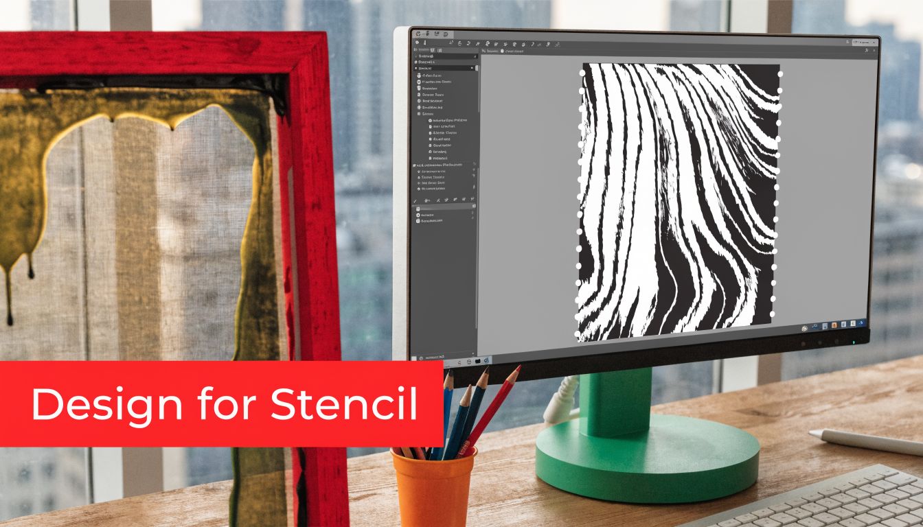
Build the design for ink, not for a screen
A monitor forgives a lot. Fabric doesn't. Thin gray textures, tiny type, and low-contrast detail often disappear or break apart once they become a stencil.
For early prints, keep the art clean:
- Use solid black shapes for the areas you want to print
- Simplify tiny details that won't survive mesh and ink spread
- Separate colors intentionally if you plan to print more than one layer
- Reverse text before output when needed for stencil workflows
Vector artwork helps because it scales cleanly and makes separations easier. Raster art can still work, but it needs discipline. If your file looks muddy at the design stage, it usually prints muddy too.
If you want a simple refresher on cut-and-paint stencil logic before jumping into photo emulsion, this walkthrough on how to create stencils with Quote My Wall is a useful companion.
The exposure process that beginners overcomplicate
Think of photo emulsion like a light-sensitive mask. You coat the screen, let it dry in a light-safe area, place your dark artwork on the screen, expose it to light, and then wash out the parts protected by the black image. Those open areas become the path for the ink.
That process only works when each step is boringly consistent.
A thin, even coat matters. A dust-free drying area matters. Good contact between film and screen matters. If any of that goes sideways, you get fuzzy edges, blocked detail, or stencil breakdown during the print run.
If your stencil keeps failing, stop changing five variables at once. Lock down one film, one emulsion, one exposure method, and test from there.
Where AI can help and where it can't
AI tools are becoming part of some artists' prep workflows, especially for separations, cleanup, and proofing. Used well, they can remove tedious setup time without replacing your eye.
One verified data point is worth noting here. A 2025-2026 Printwear magazine survey found that 62% of fine artists experimenting with AI tools for screen prep reported a 40% faster turnaround time, according to this Printwear-related reference hosted by ScreenPrinting.com.
That doesn't mean AI magically makes good prints. It means it can speed up repetitive prep tasks. You still need to judge line weight, color order, and whether a design belongs on fabric in the first place.
Your first stencil should be boring
Don't make your first exposure a six-color illustration. Make it a one-color design with obvious shapes and enough open space to wash out cleanly. You're learning process, not proving ambition.
Once your screen washes out cleanly and survives the first print session, you're ready for the fun part.
The Art of the Pull Printing and Curing
Printing looks simple from a distance. Ink on screen, squeegee across, done. In practice, tiny changes in pressure, angle, and setup decide whether the print looks sharp or sloppy.
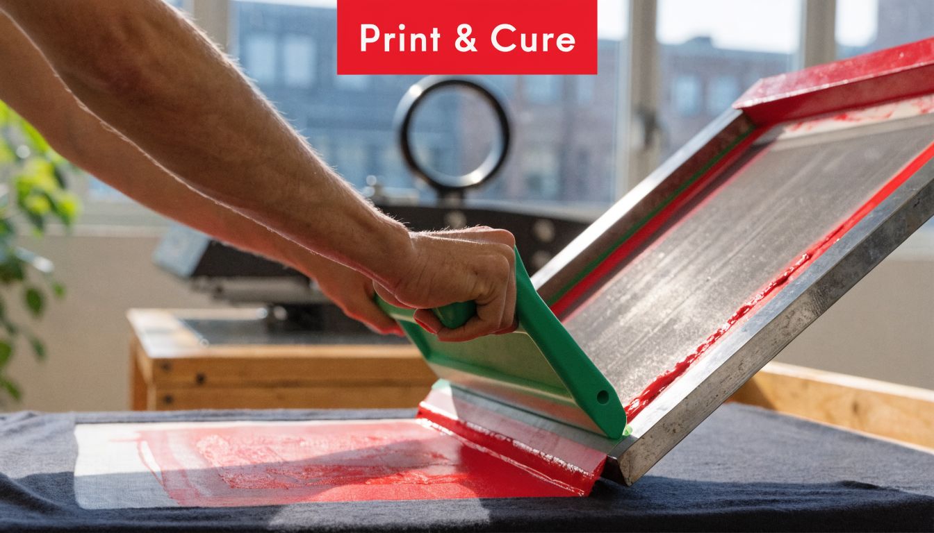
The pull that gives you a clean print
Set the garment flat. Make sure it doesn't shift. Place the screen where the print should land, then flood the screen with ink before the actual print stroke.
The best early habit is consistency, not force. Hold the squeegee at a controlled angle, keep your pressure even, and complete the stroke in one smooth motion. Don't scrub back and forth unless the print requires it.
Successful registration in multi-color work depends on four critical factors: level pallets and screens, proper screen tension, minimal off-contact distance, and a precise 45-degree squeegee angle. If you miss the alignment by even a fraction of an inch, the print can be unusable, as explained in this article on registration challenges in screen printing.
A simple print sequence that works
For most beginners, this order keeps things under control:
- Load the shirt cleanly. Smooth fabric matters more than people admit.
- Check placement before adding ink.
- Flood the screen so the mesh is ready.
- Make the print stroke with steady pressure.
- Lift and inspect before repeating.
- Cure properly instead of guessing.
If you want a broader look at how different setups and decoration approaches compare, this guide to screen printing methods is a useful side read.
Here's a visual walkthrough that helps if the hand motion still feels abstract:
Curing is where a lot of good prints die
A print can look perfect fresh off the press and still fail after washing if you didn't cure it correctly. Beginners tend to focus on the image and rush the finish.
Use the curing method that fits your ink system. Follow the ink manufacturer's directions closely. Then test a print before selling anything. Stretch it a bit. Wash it. See what happens.
A print isn't finished when it looks good. It's finished when it survives use.
What usually goes wrong
If the print looks patchy, check contact and pressure before blaming the ink. If the edges look blurry, look at off-contact, movement, and stencil quality. If the second color won't sit where it belongs, registration is the issue until proven otherwise.
Good printing feels repetitive. That's a compliment.
Printing on Hats and Other Tricky Surfaces
Many artists find the process humbling at this stage. A shirt lies flat and forgives a lot. A hat doesn't. Seams, curved panels, structured fronts, and inconsistent surfaces turn a decent print setup into a problem fast.
The gap is real. Artists moving into wearable merch often find that most tutorials focus on flat items, while techniques for curved hat surfaces, including mesh tension adjustments and hat-specific platens, are rarely covered, as noted in this discussion of hat-printing challenges on YouTube.
Why hats fight back
The front panel of a hat isn't just smaller than a shirt. It's also shaped, sometimes stiff, sometimes soft, and often interrupted by a seam right where you want the art.
That changes everything:
- Contact becomes inconsistent because the surface curves away from the screen
- Pressure gets uneven because your squeegee wants a flat path
- Smudging shows up faster around seams and crown transitions
- Multi-color work gets harder because every pass has to land on a shape, not a plane
A good overview of the process itself helps here. This explanation of the silk screen technique is worth reading if you're trying to connect flat-print fundamentals with headwear applications.
What improves your odds on headwear
Use a hat-specific platen if you can. It supports the hat in a way a flat board never will. Without that support, the print surface shifts and the screen can't make reliable contact.
Then adjust your expectations. Hat art usually needs to be bolder, cleaner, and more centered than shirt art. Fine detail that looks beautiful on paper can become a fuzzy argument on a structured trucker cap.
A few practical habits help:
- Choose simple artwork for your first hat runs
- Avoid placing key details over the center seam
- Test on the exact hat style you plan to sell, not “something similar”
- Watch your ink load because too much ink exaggerates smears on curved panels
- Print fewer colors until your placement is repeatable
Hats reward restraint. The cleaner the design, the better the result usually looks.
Other awkward surfaces follow the same logic
Sleeves, tote bag pockets, and oddly placed garment panels all behave like mini hat problems. They restrict access, shift during printing, and punish overcomplicated art.
The fix is usually the same. Simplify the image, support the substrate better, and stop trying to force a flat-print mindset onto a non-flat object.
Scaling Up When to DIY versus Outsource
At some point, printing your own merch stops feeling scrappy and starts feeling inefficient. That's not failure. That's a business decision waiting to happen.
The artists who build strong merch programs usually separate two questions. First, can I print this myself? Second, should I?
Keep DIY for the work that benefits from your hands
DIY makes sense when the print run is small, the design changes often, or the whole appeal is that it came directly from your studio. Limited editions, event drops, and test releases often fit that model well.
There's history behind that instinct. The 1960s Pop Art movement, especially artists like Andy Warhol, used screen printing for its commercial-style precision and mass-reproduction potential, blurring the line between fine art and merchandise, as outlined in this piece on screen printing's historical evolution.
That model still holds. The print method can be artistic and commercial at the same time.
Outsource when repetition starts stealing your time
If your best hours are disappearing into reclaiming screens, curing test prints, packing orders, and fixing avoidable mistakes, outsourcing starts to look smart. It's especially useful when the product line expands beyond what a home setup handles cleanly.
Use this quick decision lens:
| Situation | Better move |
|---|---|
| Small run, experimental design, art-led drop | DIY |
| Repeat orders of the same item | Outsource |
| Premium hat with fine-detail logo | Often embroidery |
| Broad catalog with many SKUs | Outsource or hybrid |
For headwear in particular, screen printing isn't always the winner. Some hat designs look stronger with embroidery because the texture adds perceived value and fine logo work often reads cleaner in thread than in ink on a curved front.
If you're comparing margins and setup realities, this breakdown of screen printing cost helps frame the decision more practically.
Hybrid models are often the smartest move
A lot of artists don't need an all-or-nothing setup. They print special releases themselves, outsource steady sellers, and use a separate partner for products that need a different decoration method or fulfillment model.
If you're building an online store and want another option in the mix, services like PuppetVendors for Shopify print on demand can help when you need fulfillment support without manually handling every order.
The mature move isn't doing everything yourself. It's protecting your time for the work only you can do.
The shift from artist to merch seller usually happens without fanfare. You stop asking whether your art belongs on products. You start deciding which products deserve your art, and which production path keeps the work sharp.
If you're ready to move from test prints to finished headwear, Dirt Cheap Headwear makes that step easier with wholesale blank hats, low-minimum decorated options, and in-house embroidery for brands, events, teams, and creators who want clean, reliable results without overcomplicating the process.
Pingback: Trendy Graphic Tees Tampa: Design & Print Your Style – T-Shirt Envy Co.