
Artwork Approval Process for Custom Hats
You've got the hat order in, the logo looks fine on the product page, and now everyone's staring at the inbox waiting for a proof. That pause is where most frustration starts, because the order feels simple from the customer side, but the artwork approval process on the shop side is a chain of checks, handoffs, and version control. If you've ever wondered why a proof takes longer than “just dropping the logo on a cap,” this is the part people rarely see.
What Happens After You Hit Submit on Your Logo
A customer submits a logo, then sits there refreshing email while the order appears to vanish into a black hole. On our side, it never disappears, it gets queued, checked, and routed to the right person so the proof doesn't come back wrong on the first pass.
That first pass usually starts with file intake. Someone confirms whether the artwork is usable as-is, whether it needs cleanup, and whether the order notes tell the full story, like cap style, placement, and the exact imprint method. If the submission is missing something obvious, the proof artist doesn't guess, they ask for clarification before building the proof.
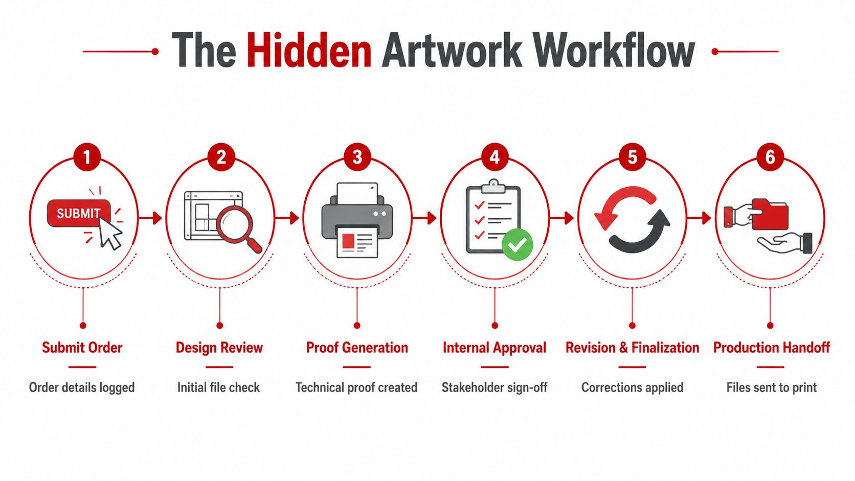
The sequence is usually straightforward once you strip away the inbox noise. A clean workflow looks like this:
- Order details get logged.
- The file gets checked for format and readability.
- The proof artist prepares the layout.
- A reviewer confirms technical details.
- The customer checks placement and copy.
- Production gets the approved file.
Practical rule: if the order details are vague, the proof gets slower. If the file and placement notes are clear, the process usually moves without extra back-and-forth.
The part most customers don't realize is that the proof isn't just about making the logo look good. It's about making sure the artwork can be produced without a surprise at sew-out or print. That's why a good submission shortens the time between “submitted” and “approved,” and why a sloppy one turns into a string of emails.
If you're still figuring out what to send up front, the submission checklist in how to submit hat logo files is worth keeping open while you place the order.
Preparing Your Artwork Before You Submit It
A clean handoff saves more time than almost anything else in the artwork approval process. Most delays start before the proof exists, because the file that lands in the shop's inbox is missing the source format, the color spec, or the placement notes the production team needs.
For embroidery, vector art is usually the safest starting point. AI, EPS, and clean PDF files give the digitizer a file they can work from without tracing a blurry image or guessing where edges should land. For print or simple proofing, a high-resolution PNG can work for a visual reference, but that's not the same thing as a production-ready source file.
What to send with the file
A good submission includes the logo, the garment color, the cap style, and the exact placement request in the same message. If the front panel, side, or back placement matters, say so clearly instead of assuming the proof artist will infer it from the artwork alone. That small step keeps the proof aligned with what manufacturing will do.
Color is another easy place to create avoidable churn. PMS color codes beat screen guesses every time, because RGB on a monitor doesn't tell a stitch technician what thread or ink to use. If your brand guide uses specific thread colors, include them with the art file instead of expecting the reviewer to translate a web image into production instructions.
A few common mistakes trigger an immediate back-and-forth:
- Flattened JPG only: the shop can see the logo, but can't reliably rebuild it.
- No source vector: the proof artist has nothing clean to digitize from.
- Missing font names: text may need substitution if the lettering isn't outlined.
- Color guesswork: “make it match the website” is not a production spec.
- No placement note: the logo might be proofed in the wrong spot.
Practical rule: if you wouldn't trust a printer to guess it, don't leave it out of the submission.
For a tighter handoff, the hat logo file requirements guide is the kind of reference that keeps one bad upload from turning into three extra emails.
Reading Your Stitch Proof Like a Production Pro
A stitch proof is not a finished hat. It's a technical preview of how the embroidery will be built, which means the right eye isn't looking for glamour, it's looking for whether the design will sew cleanly and land where it should. The best reviewers focus on the parts that affect production first, then worry about appearance.

What matters on the proof
Start with placement. The mockup should show exactly where the logo sits on the crown, side, or back, and the size should make sense for the cap style you ordered. A logo that looks balanced on a flat art board can land too high, too low, or too wide once it's mapped onto a structured or unstructured hat.
Then check the technical notes. Thread colors should be labeled, and the proof should show how the design handles curves, overlaps, and tight corners. If a proof artist notes that a tiny detail has been simplified, that usually means the artwork had elements too small to sew cleanly at the chosen size.
What gets simplified in embroidery
Some details survive beautifully on a screen and fail on fabric. Thin lettering, tiny inner shapes, and fragile outlines often need to be enlarged or simplified so the finished sew-out doesn't turn into a blob. That gets even more important with 3D puff, where foam lifts the stitch and fine lines can disappear faster than people expect.
A good proof also tells you what changed and why. If the artist adjusted stitch direction, reduced dense overlap, or widened a detail, that's usually a production decision rather than a design mistake. The trick is to compare the proof to the original logo with your actual decoration method in mind, not with a graphic designer's eye.
If the proof looks slightly less delicate than the source file, that's often on purpose.
For a deeper look at how that technical file gets built, the how to digitize a logo for embroidery guide helps explain why stitchability matters more than flat artwork perfection.
Comparing Digital Mockups to Physical Stitch Proofs
A digital mockup and a stitch proof don't answer the same question. One shows how the logo should look on the hat, the other shows how the machine will build it, and confusing the two is where a lot of approvals get messy.
A mockup is best for placement, color placement, and overall presentation. It helps a buyer see whether a red logo sits correctly on a black cap, whether the front panel feels crowded, and whether the decoration choice matches the blank hat. A stitch proof is better for production review, because it exposes how the artwork behaves as stitches, not pixels.
| Proof Type | Shows | Best For |
|---|---|---|
| Digital Mockup | Flat visual placement, general color presentation, overall look on the hat | Early approval, brand review, quick layout decisions |
| Stitch Proof | Stitch direction, technical simplification, production-ready layout | Embroidery sign-off, production verification, technical review |
When a screen is enough, and when it isn't
For a straightforward order, a digital mockup can be enough to confirm the basic look. That works when the artwork is simple, the cap style is standard, and nobody is asking for a fragile detail that might not sew well.
A physical sample matters more when the order is high stakes or technically touchy. A white thread logo on a heathered cap can look different than it does in a render, and a raised 3D puff design can sit differently on a structured crown than the screen suggests. Those are the kinds of things only a real sample or a very careful stitch proof can expose.
The safest habit is to compare the mockup and the stitch proof together. The mockup tells you whether the concept fits the hat. The stitch proof tells you whether the design can be made that way without creating a production problem.
The Revision Round Triggers Nobody Warns You About
Revisions don't usually pile up because someone is being picky. They pile up because the proof revealed a mismatch between what the customer pictured and what the production file says. Once that gap opens, every extra comment creates another round of work.
The six most common triggers
Color mismatch is the obvious one. Someone approves a thread swatch in one email, then changes their mind after seeing the mockup on a different screen. The file didn't fail, the decision moved.
Placement shift is another common cause. Moving a logo a little higher on the front panel sounds small until the proof artist has to rework the layout to fit the new position correctly.
Sizing changes can be deceptively expensive. A logo that needs to be scaled up or down may also need the stitch density adjusted so it still sews cleanly.
Illegible detail shows up when the original art is too fine for the chosen technique. Fine lines that looked sharp in the source file may need redigitizing or simplification before the shop can run them.
File version mix-ups happen when one reviewer comments on an older file while another approves the latest proof. That's not a design issue, it's a workflow issue.
Conflicting feedback comes from unconfirmed approvers. One person wants a larger logo, another wants it smaller, and nobody knows which note is final.
For embroidery, revisions can be more than a cosmetic edit. 3D puff changes can require foam rework, and fine-detail stitching may need the file rebuilt from scratch if the detail doesn't hold at the new size. In print, color-profile issues sometimes don't show up until the first pull, which is why a screen approval isn't always enough on its own.
The cheapest revision is the one caught before anyone assumes the file is final.
The cleanest way to keep revision rounds from snowballing is to treat the proof like a production document, not a casual design preview. The more loosely feedback is handled, the more likely the next round is to repeat the same issue in a different email.
Running Approval Like a Mini Project, Not an Email Thread
The biggest slowdown in any artwork approval process is usually not the artwork. It's the way comments arrive, get forwarded, and change shape as they move through different inboxes. Once that happens, nobody is sure which version is current or who has final say.
One owner solves more than people think
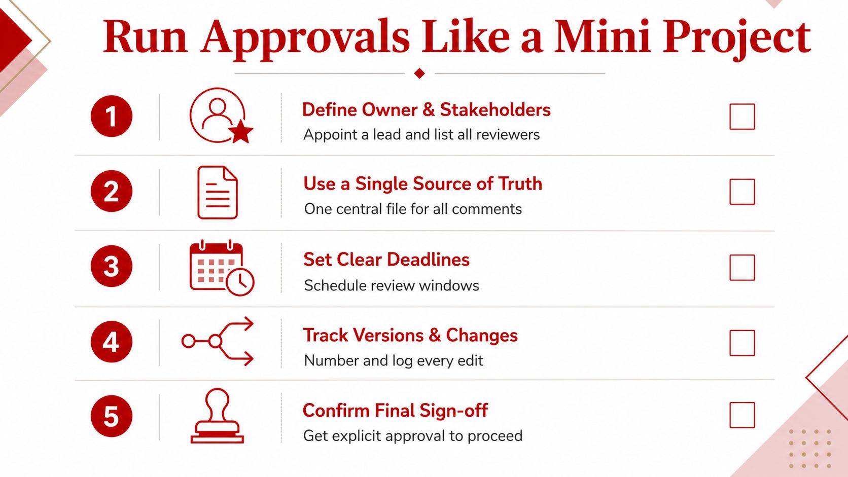
Approval works better when one person owns the final yes. That doesn't mean other people get ignored. It means the brand owner, designer, and any legal reviewer all comment in the same place, and one person closes the loop so the production team isn't waiting on a split decision.
A simple approval note can look like this:
- Logo placement: front left panel
- Logo size: approved as shown
- Thread or print colors: match the approved proof
- Garment style: cap SKU confirmed
- Quantity: as ordered
- Final sign-off: production may begin
That kind of wording matters because it removes ambiguity. If a later change comes in after sign-off, the team can tell whether it's a fresh revision or a new order decision.
How to keep the file version straight
The safest workflow uses one shared proof, one comment thread, and one final approval. Cloud-based collaboration with time-stamped notes and defined approvers keeps the conversation attached to the right version instead of scattered across forwarded messages. That's especially useful when marketing, legal, design, and a vendor all want input but don't all respond at the same speed.
Dirt Cheap Headwear, like other decorated-headwear shops, uses proof review on custom orders so the customer can confirm placement, scale, colors, and copy before production begins. That kind of checkpoint only works when the approval itself is clear and final.
A clean approval is a decision, not a discussion that keeps reopening.
Realistic Timelines and a Final Pre-Ship Checklist
The average packaging artwork approval cycle sits at 24 days in the Cway benchmark, with 6.8 stakeholders and 6.2 revision rounds involved before final sign-off, and email-based approval workflows take about 32 days on average versus 18 days for structured workflow software. Cway also notes that each additional revision round adds 2.3 days on average, which is why approval governance shapes launch timing more than most buyers expect. See the 2026 packaging artwork approval benchmark for the benchmark context.
For headwear orders, the practical timeline depends on the file quality and how fast the approver responds. A clean submission with one decision-maker moves quickly, while weak files, conflicting comments, and version confusion stretch everything out. Cway's ROI guidance also frames top-tier approval operations as completing standard SKU approvals in 3 to 5 business days, compared with 10 to 15+ days for unstructured processes, with 1 to 2 revision rounds instead of 4 to 5+ in weaker workflows, which is a useful yardstick for how disciplined review changes throughput.
What to confirm before you hit approve
Before signing off, keep this list in front of you:
- Thread color numbers: confirm they match the proof.
- Placement dimensions: check that the logo sits where you want it.
- Cap style SKU: make sure the proof matches the actual hat.
- Final quantity by size or style: verify the order details haven't drifted.
- Artwork version: confirm you're approving the newest file.
- Decoration method: embroidery, 3D puff, or print should be clear.
A disciplined workflow should also include controlled brief intake, role-based review routing, centralized comments, revision control, final sign-off, and archive logging, with technical validation focused on things like vector versus raster suitability, CMYK or PMS color specification, 300 dpi minimum for print, font embedding, bleed and trim zones, and PDF/X compliance before release, as laid out in the artwork approval process guide from Ziflow. That's the checklist mindset that keeps the order from moving into production on a bad assumption.
The cleanest habit is simple. Review the proof against the same specs the shop will use, approve only when one person owns the decision, and keep the file trail tidy enough that nobody has to guess later. If you want a smoother next order, start with a better file handoff, a single approver, and a proof review process that matches the way decorated hats get made.
If you're ready to place custom headwear without the usual proof chaos, Dirt Cheap Headwear can help you work from the same kind of approval process described above, with embroidery, blank hats, and proof review built into the order flow. Visit Dirt Cheap Headwear to submit your next logo order and keep the review step clean before production starts.
Pingback: 10 Quality Assurance Tips for Decorated Headwear | Dirt Cheap Headwear