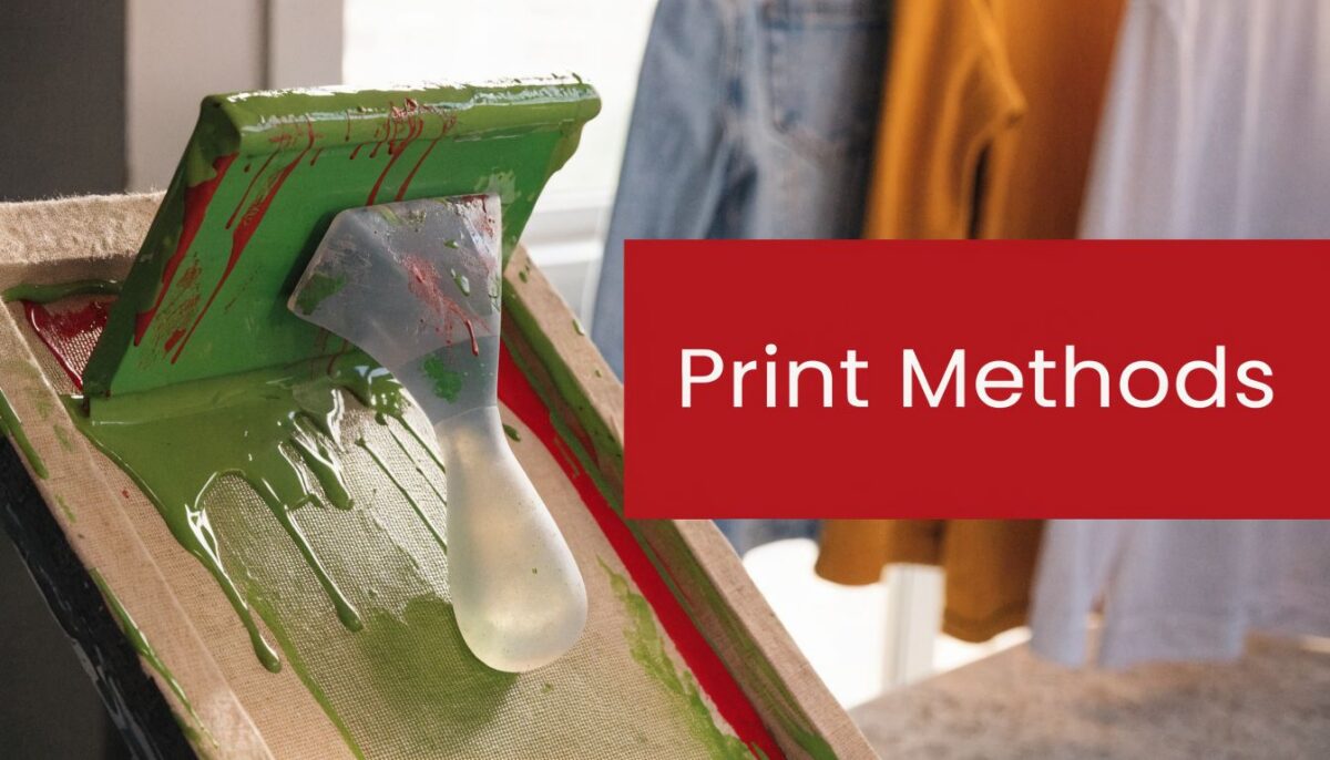
You’ve got a design file ready, a deadline creeping up, and a simple goal: get good-looking merch without wasting money on the wrong print method. Then the printer replies with a list of options that sounds like shop talk. Plastisol. Water-based. Discharge. DTG. Sublimation. If you’re ordering shirts and hats at the same time, the confusion gets worse fast.
Most buyers don’t need a chemistry lesson. They need to know what will look sharp, what will last, what feels soft, and what falls apart when the design gets too detailed or the garment choice is wrong. That’s where the method of screen printing matters.
A lot of print guides stop at t-shirts. That leaves out one of the hardest products to decorate well: headwear. A flat tee is forgiving. A structured cap isn’t. A mesh trucker is even less forgiving. If you’re comparing methods for both shirts and hats, you need practical answers, not broad claims.
So You Want Custom Merch Now What
The usual starting point is simple. You want staff shirts, brand merch, event giveaways, or a run of hats for your team. You send over the art and expect a quote. Instead, you get questions about ink type, garment material, print size, and whether the hats are structured or unstructured.
That’s normal. Good printers ask those questions because the same design can print beautifully one way and poorly another.
For example, a bold one-color back print on cotton tees gives you room to choose based on budget and feel. A small shaded graphic on a trucker cap doesn’t. On hats, the decoration method can decide whether the design looks clean or slightly off from the start. If you’re also building out supporting promo items, it helps to keep branding consistent across formats. A lot of brands pair apparel with vehicle branding, and Custom Sticker Shop's car stickers are a practical option when you want the same logo working beyond shirts and caps.
If your main project is headwear, start by seeing what cap layouts allow. A design that works on paper may need to be resized, simplified, or shifted for the front panel of a baseball cap. Tools that let you design your own baseball caps help you spot those issues earlier, before you approve art that only works on a flat mockup.
Practical rule: Don’t choose a print method first. Choose your garment, your design style, and your order size first. Then match the method to the job.
That order matters. It saves money, prevents bad expectations, and cuts out a lot of back-and-forth with your printer.
The Core Concept How Screen Printing Actually Works
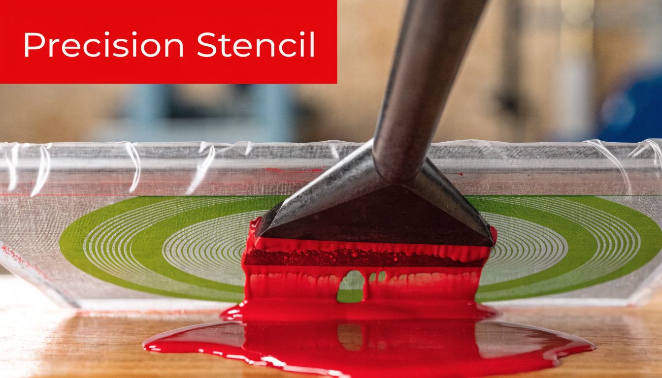
At its simplest, screen printing is a controlled stencil process. Ink only goes where the screen allows it to go.
A mesh screen gets stretched over a frame. That screen is coated with emulsion, which hardens when exposed to light. The design blocks part of that light, so after washout, the open areas of the screen match the artwork. Ink is then pushed through those open areas with a squeegee and pressed onto the garment or substrate.
The parts that matter in the shop
The screen does more than hold a design. It controls how much detail the printer can hold and how the ink flows. The emulsion creates the stencil. The ink creates the look and feel. The squeegee controls deposit, pressure, and consistency.
Change any one of those, and you change the result.
A heavy ink deposit can make a print bolder, but also thicker. A finer screen can help detail, but may reduce coverage on darker garments. A squeegee pass that works on a shirt may not work on a hat panel with seams, buckram, or curve.
Why this method stuck around
Screen printing has old roots, but the commercial version came later. The process traces back to ancient China during the Song Dynasty, 960 to 1279 AD, and modern commercial screen printing emerged in 1907 when Samuel Simon of Manchester patented the process. It later became more accessible when Naz-Dar distributed complete screen printing kits as early as 1925 with the slogan “Easy to do, easy to learn,” as noted in this history of screen printing.
That history explains why the method of screen printing is still everywhere. It scales well, handles bold color cleanly, and gives printers tight control over repeat jobs.
Screen printing lasts because it solves production problems, not because it’s old-school.
What screen printing does best
Here’s where it shines:
- Bold spot colors: Great for logos, event graphics, and clean brand marks.
- Repeatable runs: Once screens are set, the process is efficient for volume.
- Durable decoration: Properly printed and cured designs hold up well in regular wear.
- Versatility: The process works across shirts, paper, glass, metal, and more.
That last point matters. Screen printing is not just a t-shirt process. But apparel, especially decorated apparel, is where most buyers run into it first.
The Big Three Inks Plastisol Water-Based and Discharge
Ink choice changes everything. Two prints can use the same artwork and the same press, but feel completely different in hand and wear differently over time. For most apparel jobs, especially shirts, your decision comes down to plastisol, water-based, or discharge.
Garment printing became the center of the trade after Michael Vasilantone’s 1960 patent for a rotatable multi-color garment screen printing machine. It was first made for bowling garments and then adapted to t-shirts. Today, printing on garments accounts for over 50% of all screen printing activity in the United States, according to the screen printing overview on Wikipedia. If you want a deeper rundown of apparel-focused options, this guide to screen printing methods gives a useful side view of the category.
Plastisol
Plastisol is the workhorse. If you’ve handled a classic concert tee, school fundraiser shirt, or promo shirt with strong opaque color, you’ve probably handled plastisol.
It sits more on top of the fabric than inside it. That gives it strong color, solid coverage, and dependable consistency across many garment colors.
Where plastisol wins
- Dark garments: It covers well.
- Bold logos: Clean edges and strong pop.
- Large runs: Shops can repeat it reliably.
- Special effects: Puff, high density, and other effect-driven looks usually start here.
The downside is feel. A heavy plastisol print can feel like a layer on the shirt, especially with large solid areas. That isn’t always bad. Some brands want that vintage merch feel. But if you want the print to disappear into the shirt, plastisol usually isn’t the first choice.
Shop advice: If your design has big solid blocks and you need color accuracy on dark cotton, plastisol is often the safest answer.
Water-based
Water-based ink goes for a softer result. Instead of sitting heavily on top, it tends to absorb more into the fabric. On the right shirt, that can look cleaner and feel lighter.
This is often the better pick for retail-style tees where comfort matters as much as the graphic. It’s especially appealing for soft cotton garments where you want the shirt to stay breathable and not feel coated.
What buyers like about it
A good water-based print feels less intrusive. If the garment is nice to begin with, the decoration doesn’t fight it. That’s why fashion brands and premium merch lines often lean this way for straightforward graphics.
But there are trade-offs. Water-based printing can be less forgiving on certain dark garments, and some artwork that prints easily in plastisol becomes trickier here. If the printer isn’t dialed in, coverage can look weaker than expected.
Discharge
Discharge is a specialty move, but when it works, it produces one of the best-feeling prints in apparel.
Instead of laying all the color on top, discharge removes the shirt’s dye in the printed area and replaces it with the new color. The result can feel almost like there’s no print there at all. On the right garment, it’s excellent.
The catch with discharge
Discharge depends heavily on the garment dye and fabric. Some blanks react well. Some don’t. That means consistency can vary by shirt brand, dye lot, and color.
For a buyer, the practical takeaway is simple: discharge can look and feel premium, but it isn’t the method to choose casually just because the sample sounded cool. The printer has to know which blanks behave well.
Quick comparison
| Ink type | Best for | Feel | Strength | Common drawback |
|---|---|---|---|---|
| Plastisol | Bold logos, dark shirts, larger runs | More noticeable on fabric | Opaque and reliable | Can feel heavier |
| Water-based | Soft retail tees, lighter hand feel | Softer | More natural finish | Less forgiving on some garments |
| Discharge | Soft premium prints on compatible shirts | Very soft | Excellent hand feel | Garment-dependent results |
What works and what wastes time
Some jobs are easy to call.
If you’re printing event shirts, team merch, or promo tees where bright color and consistency matter more than softness, plastisol is usually the practical choice. If you’re building a nicer apparel line and the shirt quality is part of the sell, water-based or discharge may be worth the extra planning.
What wastes time is forcing an ink style onto the wrong garment because the phrase sounds premium. A cheap blank won’t magically turn into a premium retail shirt because you used discharge. And a highly detailed print that needs easy repeatability may not be the right candidate for a softer but fussier ink system.
Specialty Methods Sublimation and DTG Explained
Not every decorated shirt is screen printed. Buyers often hear sublimation and DTG in the same conversation, but they solve different problems.
Sublimation
Sublimation uses heat to turn dye into gas so it bonds with polyester fibers. The major appeal is coverage and complexity. It handles full-coverage graphics, gradients, and all-over looks that would be awkward or inefficient in traditional screen printing.
This is why it shows up on performance wear, athletic pieces, and designs that need edge-to-edge color. But it’s picky. It’s not the method for every blank in your catalog.
If you want a cotton tee with a bold chest graphic, sublimation usually isn’t the answer. If you want a polyester performance garment with a graphic integrated into the fabric, it can be exactly right.
DTG
DTG stands for direct-to-garment. Think of it as an inkjet-style process for apparel. It’s useful when the design has lots of colors, photo detail, or artwork that would be inefficient to separate for screens.
That makes DTG attractive for tiny orders, sample runs, and one-offs.
DTG is great when setup time matters more than per-piece speed.
The trade-off is production efficiency. For larger runs, DTG usually loses the speed and cost battle to screen printing. It’s also not the first method most shops reach for when the goal is a classic bold merch print with strong repeat consistency.
A simple way to separate them
Use this rule of thumb:
- Choose screen printing when you need repeatable logos, strong spot colors, and better value on larger runs.
- Choose DTG when the art is detailed and the order is small.
- Choose sublimation when the garment and design demand that specific polyester-based process.
A lot of wasted budget comes from trying to make one method do every job. Good production starts by accepting that each method has a lane.
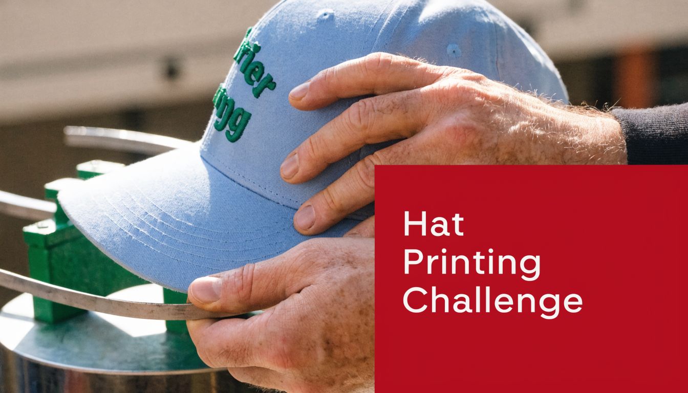
Printing on Hats and Headwear Specific Challenges
Headwear is where a lot of general print advice breaks down. A shirt lies flat. A cap doesn’t. That one difference changes setup, artwork choices, ink behavior, and what counts as a realistic expectation.
Curved surfaces change the print
Flat-substrate guidance doesn’t transfer neatly to hats. Industry guidance recommends halftone angles for flat work, but that advice doesn’t directly solve the problem on curved headwear. On a cap crown, the dot orientation shifts relative to the viewer’s eye, which can increase the risk of moiré. There are no documented best-practice standards for adjusting screen angles or dot frequency specifically for this curvature, according to this discussion of halftone angles and headwear limitations.
That matters more than most buyers realize. A design with subtle shading may look clean on a digital mockup and still print awkwardly on a structured cap if the panel shape fights the art.
A strong printer doesn’t just ask for the logo. They ask what kind of hat it’s going on.
Fabric changes the result too
Cap materials vary a lot more than shirt buyers expect. Structured cotton twill, soft washed cotton, foam-front truckers, mesh backs, technical synthetics, and beanies all react differently during decoration.
Standard squeegee guidance also comes from flatter, more uniform garments. It doesn’t account well for the variable weave density and tension found in many cap materials. On hats, those differences affect ink penetration and dot clarity. That’s one reason headwear decoration leans so hard on operator experience instead of generic settings.
If you want a technical breakdown of setup thinking from the hat side, this overview of the silk screen technique is worth reviewing alongside your art proof process.
A hat can make a simple logo harder to print than a complicated shirt graphic.
What usually works on headwear
The safest printed hat designs tend to share a few traits:
- Cleaner shapes: Bold marks hold better than delicate textures.
- Limited fine shading: Tiny halftones get risky on curved panels.
- Panel-aware placement: Seams, crown height, and structure matter.
- Material match: Solid fronts behave differently than mesh sections.
What doesn’t work well is pretending all hats are just small shirts. They’re not. A six-panel structured baseball cap with a firm front has different limits than a floppy dad hat or a knit beanie.
Here’s a useful visual example of how cap printing setup and handling look in practice:
When screen printing on hats makes sense
Screen printing can look excellent on headwear when the design is graphic, the placement is realistic, and the printer understands the substrate. It tends to make sense for larger front graphics, casual branding, event merch, and styles where you want a flatter printed look instead of raised stitching.
If the logo is small, highly detailed, or expected to read as polished corporate branding, embroidery often wins. On hats, decoration quality depends less on the idea and more on whether the method respects the shape of the product.
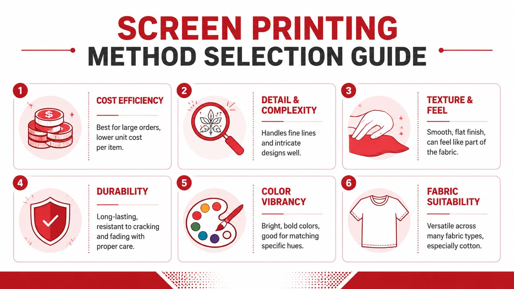
Choosing Your Method A Comparison Guide
The right method depends on what you care about most. Some buyers want the softest possible print. Some want color that punches from a distance. Some just need an affordable run that arrives on time and survives heavy use.
Use those priorities to narrow the decision.
Start with the real priority
If your first priority is cost on bigger runs, screen printing usually rises to the top. If your first priority is a soft premium hand feel, water-based or discharge may deserve the extra effort. If your first priority is photo detail on a tiny order, DTG becomes more attractive. If you need all-over graphics on polyester, sublimation has a clear lane.
Fast decision table
| Priority | Best fit |
|---|---|
| Bright spot colors on tees | Plastisol screen printing |
| Soft fashion-style print | Water-based or discharge |
| Small order with complex art | DTG |
| Polyester all-over look | Sublimation |
| Graphic print on select hats | Screen printing, if art and cap style cooperate |
| Small detailed logo on cap | Usually not screen printing |
What buyers get wrong
The most common mistake is trying to optimize for everything at once. Softest feel, lowest cost, fastest turnaround, most detail, and broadest fabric compatibility usually do not all live in one method.
Bottom line: Pick the result you care about most, then accept the trade-offs that come with it.
Another mistake is using shirt logic on hats. A method of screen printing that looks easy on cotton tees can become a production headache on curved headwear. If the order includes both shirts and caps, it’s often smart to split methods instead of forcing one process across every item.
Screen Printing vs Embroidery Making the Final Call for Headwear
For hats, this is usually the final fork in the road.
Screen printing gives you a flatter, more graphic look. It works well when the design is broader, the vibe is casual, and the logo doesn’t need the texture or raised presence that stitching gives. It can be a smart choice for event caps, streetwear-inspired looks, and larger front graphics that would feel too heavy in thread.
Embroidery gives hats dimension. It reads more traditional, more polished, and often more premium. For small chest-style logos adapted to the front of a cap, team branding, company marks, and classic retail headwear, embroidery is usually the safer call.
![]()
If the logo has tiny details, narrow lines, or needs to sit cleanly on a structured cap, embroidery often wins before the conversation even gets far. If the art is bold and the hat style supports printing, screen printing can absolutely work. The deciding factor is rarely trend. It’s whether the decoration method matches the design and the cap.
If you’re ordering custom headwear and want help choosing between print and stitch, Dirt Cheap Headwear makes that process a lot easier. You can source blank hats, compare decoration options, and get guidance on what will look right on the specific cap style you’re buying, whether you need a small test run or a bigger branded order.