
3D Puff Embroidery Patches Explained for Custom Hats
You've found a logo that looks fantastic on a screen, and now you're trying to picture it on a real hat. The bold initials seem perfect for a raised finish, but the small slogan underneath already looks crowded. That's the moment many first-time buyers discover that 3D puff embroidery patches aren't a universal upgrade. Puff can make a simple mark look sculpted and unmistakable, but forcing every detail into foam can turn clean artwork into a cramped, uneven badge.
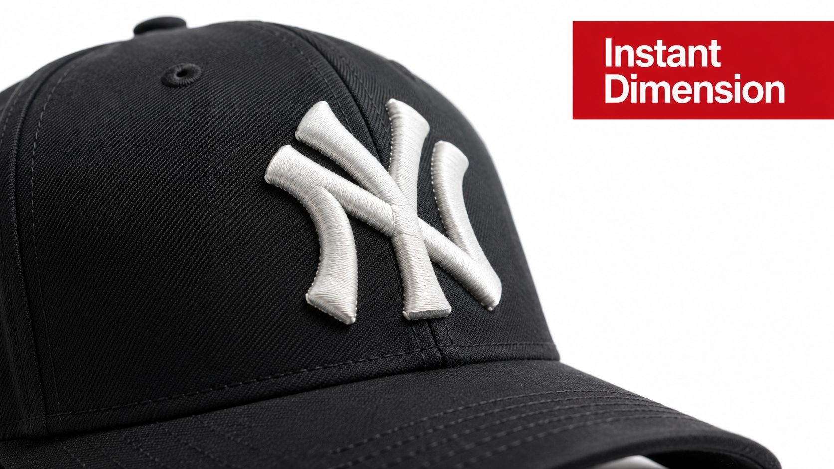
Introduction to 3D Puff Embroidery Patches That Pop
3D puff embroidery creates raised sections by stitching over foam rather than laying thread directly against the fabric. The finished surface catches light, creates a noticeable shadow, and gives a hat logo more physical presence than ordinary flat stitching. It's especially well suited to bold initials, block lettering, large numbers, and simple symbols that need to stand out from a distance.
The strongest results usually come from restraint. A raised brand name can become the focal point while a small slogan, fine outline, or detailed illustration stays flat. That combination gives the eye a clear primary message without sacrificing the supporting information that puff may obscure.
Practical rule: Puff the part people should notice first. Keep the parts they need to read second flat whenever possible.
This distinction matters because puff has physical limits. Narrow strokes may not hold enough foam coverage, tight letter spacing can close up, and sharp corners may lose their shape after stitching. A design that looks crisp as vector artwork still needs to work at the finished patch size and on the curve of a cap.
The wider patches category has become commercially significant. The global embroidered badges and patches market reached about USD 3.21 billion in 2024 and is projected to reach roughly USD 5.67 billion by 2033, with a projected 6.8% CAGR, according to embroidered patch market statistics from Quality Woven Labels. That scale gives buyers access to established production methods, but it doesn't remove the need for good artwork decisions.
This guide focuses on the decision that gets skipped most often: which elements should be raised, and which should remain flat. You'll see how the foam process works, how puff compares with flat embroidery and patches, what artwork survives the technique, and what to check before approving production.
How 3D Puff Embroidery Actually Works
Think of flat embroidery as drawing with thread directly on a surface. The stitches cover the fabric, but the design remains close to the original plane. Puff embroidery adds a compressible layer underneath selected areas, so the thread forms a small raised dome instead of a flat fill.
The usual material is closed-cell foam. It sits under the satin stitches in the places chosen for the raised effect. As the needle moves across the foam, the thread presses it down and covers it. Once the excess foam is removed, the covered area keeps its lift because the dense stitching has shaped the surface.

The process becomes easier to understand in four stages:
- The decorator prepares the artwork. The digitized file identifies which areas will receive foam and which will remain flat.
- Foam is placed beneath the selected shapes. It acts like a temporary, thin pillow under the embroidery.
- Satin stitches compress and cover the foam. The thread pulls the foam down while creating the raised outer surface.
- The exposed foam is removed. Clean edges and adequate coverage leave the thread standing above the base material.
The foam doesn't make every part of a design rise equally well. A wide letter has room for enough stitches to cover the material, while a narrow line may leave exposed foam or lose its profile when the needle perforates it repeatedly. That's why puff favors strong geometry and generous spacing.
The finished height also depends on the foam selected and the way the design is digitized. A visual guide for the technique describes a typical maximum puff height of 3 to 5 mm depending on foam thickness, as shown in the required process graphic. That range is a design consideration, not a promise that every logo will reach the same height.
A shop's machine setup matters too. If you're comparing equipment or production capabilities, this overview of a 3D embroidery machine can help you understand why specialized setup and digitizing affect the final result. The key point is simple: the relief comes from a coordinated foam, stitch, and artwork system, not from adding a raised material to an otherwise unchanged file.
Puff vs Flat Embroidery vs Patches and When to Choose Each
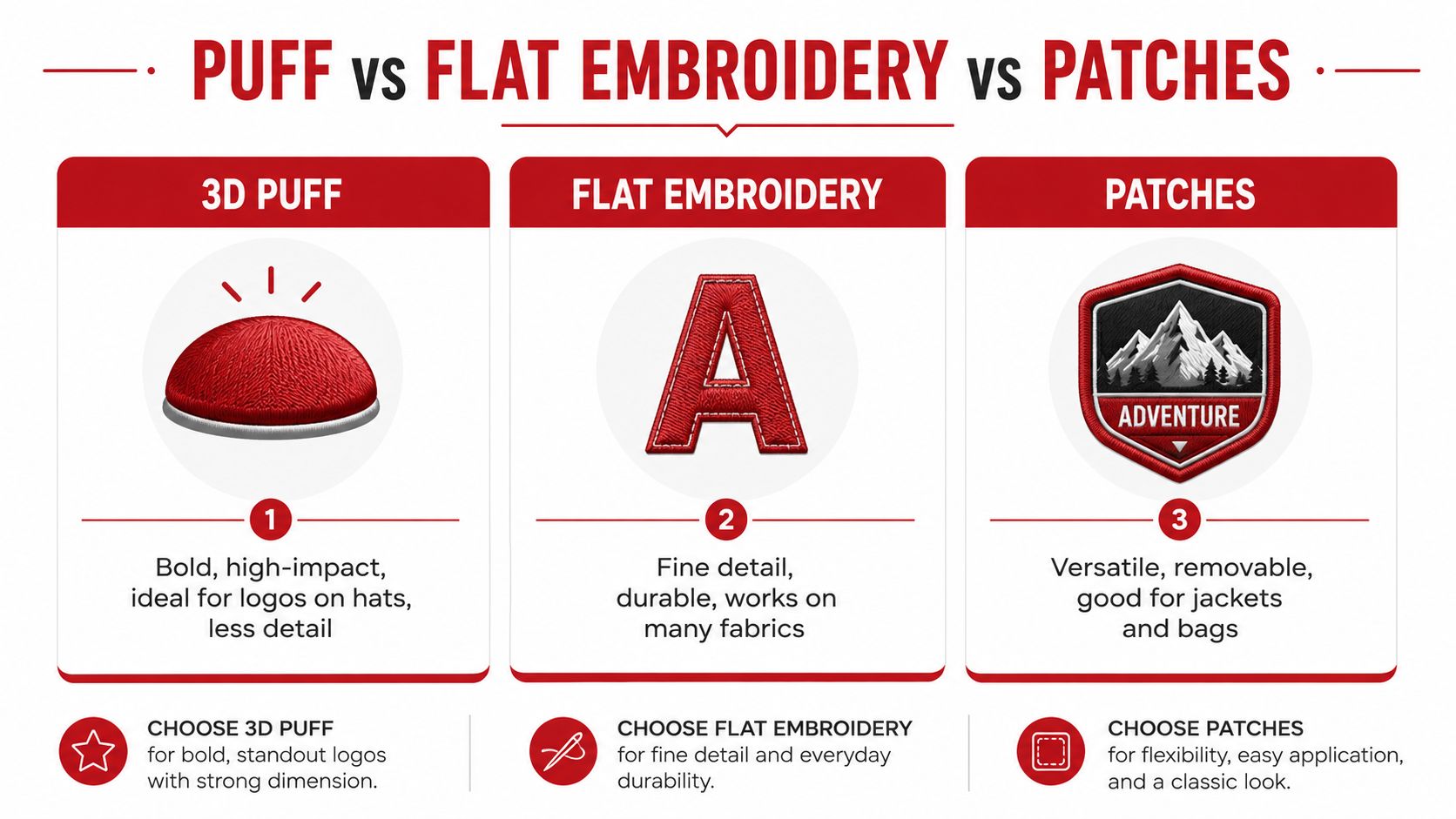
A raised finish looks impressive, but visual impact is only one buying criterion. Flat embroidery handles detail better, while patches offer construction flexibility because the decoration can be made separately and applied to a hat, jacket, bag, or other product.
Puff is a strong choice for a structured cap with a prominent front logo. Its raised surface gives large initials or athletic lettering a crisp, tactile character. It's less forgiving for tiny wording, narrow scripts, and illustrations that depend on fine internal detail.
Flat embroidery is the safer route when legibility matters more than height. A small company name, thin line drawing, or compact slogan can remain cleaner without foam underneath. It also works well as the supporting layer in a mixed design, where the main mark receives puff and the secondary information stays flat.
An embroidered patch changes the production approach. Instead of stitching the logo directly into the hat, the decorator builds a separate badge with its own border, backing, and surface treatment. That makes patches useful for branding that may move between products or for designs that benefit from multiple textures.
| Decoration Type | Best For | Limitations |
|---|---|---|
| 3D puff | Bold hat logos, initials, large numbers, and simple symbols | Less suitable for small text, thin lines, and dense detail |
| Flat embroidery | Fine lettering, intricate artwork, and supporting information | Creates less physical height |
| Embroidered patches | Removable branding, jackets, bags, and layered constructions | Adds a separate patch and attachment decision |
A practical example is a sports logo with a large team initial, a mascot outline, and a small season slogan. The initial could use puff, the mascot could use flat stitching, and the slogan might need simplification or removal at a small finished size. Treating all three areas identically would make the design harder to read.
For a visual demonstration of how raised embroidery differs from other stitched decoration, this embroidery comparison video offers useful context. Watch for the way shadows and stitch direction change the perceived shape, not just the height.
Artwork Rules That Make or Break Your Puff Design
Good puff starts before the machine runs. Review the artwork as a physical object, not just as a digital logo. Ask whether each raised shape has enough width for coverage, enough space from neighboring shapes, and enough visual weight to remain recognizable on a curved hat.
Industry guidance places common minimum column widths around 5 to 7 mm, and cap lettering often needs to begin near 0.4 inches in height to preserve legibility, according to 3D puff embroidery artwork guidance from White Cotton. These are practical benchmarks, not guarantees. Font design, patch size, foam thickness, stitch direction, and spacing still affect the result.

Start with a puff audit
Mark each part of the logo as primary, supporting, or decorative. The primary element is the strongest candidate for puff. Supporting information usually belongs in flat stitching, and decorative detail may need simplification.
Use these checks before sending the file:
- Choose broad forms: Thick block letters and wide geometric symbols give satin stitches room to cover foam.
- Open the spacing: Increase gaps between letters and inside enclosed shapes when the artwork feels crowded.
- Protect small wording: Keep short slogans, web addresses, and fine supporting text flat unless the finished size clearly supports them.
- Simplify sharp detail: Remove hairline outlines, tiny notches, and narrow interior cuts that may close during stitching.
- Check the cap curve: A design that reads on a flat screen may look different when placed across a structured crown.
Letter counters deserve special attention. The openings inside A, D, O, P, and R can shrink when nearby stitches compress the foam. If a counter is essential to the word, keeping that portion flat or widening the opening may produce a clearer result.
For font selection, these 3D puff embroidery fonts provide a useful reference point. Bold sans-serif styles generally offer more reliable shapes than delicate scripts or fonts with narrow serifs.
Design decision: Don't ask whether the whole logo can be puffed. Ask which single element deserves the raised treatment.
A hybrid layout often solves the problem. Raise the brand initials, leave the small company descriptor flat, and use a flat stitched border or background to frame the focal point. The result can feel more intentional than a patch where every surface competes for height.
Digitizing and Production Details Behind Clean Puff
The digitized file controls how the machine handles the foam. Two logos can share the same vector artwork and still produce different results because stitch direction, density, underlay, corners, and edge coverage change the physical outcome.
For 3D puff, technical guidance commonly targets satin stitch density around 0.16 to 0.20 mm. Some production recommendations call for roughly 50% higher density than standard embroidery, while capping stitches may target about 0.25 mm to cover foam edges, according to this guide to 3D puff embroidery technique and troubleshooting.
Density creates a balance. If stitches are too loose, the foam can show through or remain visible around the edges. If they're too dense, repeated needle penetrations can punch through the foam, flatten the raised surface, and increase the risk of tearing. The decorator may also reduce machine speed so the needle and thread can form cleaner coverage around corners and transitions.
What a professional proof should reveal
A useful proof isn't only a color preview. It should help you evaluate the physical plan:
- Raised areas: The file should clearly identify what receives foam.
- Flat details: Supporting wording and fine artwork should remain separate where needed.
- Stitch direction: Satin columns should follow the shape rather than create awkward gaps.
- Capping coverage: Outer stitches should close the foam edge cleanly.
- Cleanup plan: Excess foam should be removable without pulling the surrounding stitches.
Corners require special care. A narrow, sharp turn can collapse or expose foam even when a wide straight section looks perfect. Rounded corners, widened strokes, and slightly simpler letterforms often survive production better than an exact but fragile reproduction of the original artwork.
If you're sending a logo for review, this guide to digitizing a logo for embroidery explains why a production file needs more than a traced outline. Ask to see a sew-out or sample when the design includes small text, tight spacing, or multiple construction types.
Pricing Turnaround and Ordering Custom Puff Hats
A raised logo can look simple on a screen, yet production involves several separate decisions. The decorator reviews the artwork, prepares the digitizing, selects the hat and decoration method, builds the foam-backed areas, removes excess foam, and checks stitch coverage. A bold single-color mark may need less setup than a hybrid patch with some elements raised and others kept flat.
For patches, typical pricing can run around USD 2 to 5 per patch at quantities of 100, as noted in Quality Woven Labels' patch pricing and market overview. Treat that range as a reference, not a guaranteed quote. Puff treatment, patch size, backing, edge style, thread count, and the item receiving the patch can all change the final cost. Keeping a small border or background flat may also simplify construction compared with raising every part of the artwork.
Dirt Cheap Headwear lists low minimums starting at six pieces per logo, with options for puff and fine-detail stitching. That can let a buyer test a design before ordering a larger run. Stock availability, proof approval, artwork revisions, and hat style affect the schedule. A structured cap may support a raised front logo, while an unstructured style can require different placement and visual balance.
Build your order around decisions
Send the decorator details that define the finished piece:
- Artwork file: Include the cleanest version available, along with font and color references.
- Puff instructions: Mark the exact letters, symbols, or logo areas that should rise.
- Flat areas: Identify wording, outlines, or small artwork that should stay level for clearer reading.
- Finished size: Review the mark at its actual hat or patch dimensions, not only on a large monitor.
- Hat selection: Confirm crown structure, panel layout, color, and available stock.
- Sample expectations: Ask how the proof or sew-out will show the raised profile, foam coverage, and flat details.
- Quantity plan: Decide whether you are testing a small run or preparing for repeat production.
Clear puff-versus-flat instructions reduce revisions after digitizing starts. Approval can take longer when the buyer changes the artwork during setup, especially if the change affects borders, spacing, or the balance between raised and flat sections.
After delivery, photograph the hat so viewers can read the design and see its height. The guide on how to shoot hats that boost sales covers lighting and angles that reveal texture without obscuring the logo.
Choosing the Right Look for Your Brand and Next Steps
The best puff design usually has a clear hierarchy. One feature gets the height, another carries the supporting message, and the background provides contrast without crowding the main mark. That hierarchy works for a startup logo, a team cap, an event hat, or a streetwear patch because viewers can understand the focal point quickly.
Puff is especially effective when your artwork has bold lettering, wide shapes, and generous spacing. Flat embroidery is the better home for fine text, narrow lines, detailed illustrations, and information that must remain precise. A patch adds another option when you want a separate badge, a removable application, or a layered surface with more than one texture.
Recent trend coverage points toward custom contours, layered appliqué, and raised embroidery as part of a broader move toward multi-texture patch design in 2026, according to embroidered patch trend coverage for 2026. The useful lesson isn't to add texture everywhere. It's to combine materials and stitch treatments where each one contributes a specific visual job.
Use this final review
Before ordering, confirm:
- The focal element: Which exact part should stand above the rest?
- The readable details: Which text or fine artwork should remain flat?
- The finished scale: Does the logo still have open spaces at hat size?
- The hat structure: Will the decoration sit naturally on the chosen crown?
- The production proof: Does it show clean foam coverage, clear counters, and consistent edges?
- The test plan: Can you begin with a small run before scaling the design?
A selective approach gives you more control than treating 3D puff as a blanket effect. Start with the strongest logo element, keep the supporting information clean, and let the sample decide whether any area needs widening or simplification.
Dirt Cheap Headwear offers blank hats, custom embroidery, 3D puff decoration, and custom patches with low minimums starting at six pieces per logo. Visit Dirt Cheap Headwear to choose a hat style, submit your artwork, and request a proof that shows which parts of your design should be raised or kept flat.