
Vintage Distressed Caps Sourcing Guide
Most advice about vintage distressed caps starts with the wrong question. It asks how to make a hat look older, as if fading and frayed edges were the whole job. For a brand, team, event, or reseller, the harder question is whether the cap will still hold its shape, accept embroidery, survive handling, and remain consistent across the order.
A single beautifully worn sample can hide weak sweatbands, distorted panels, uneven dye release, and decoration problems. More distress doesn't mean more authenticity. It can mean less usable product. Treat the vintage finish as a controlled manufacturing specification, not as permission for a factory to abrade fabric until the cap looks interesting.
The Reality of Sourcing Vintage Distressed Caps
Vintage distressed caps sit between two purchasing categories. They look like individual finds, but businesses buy them as repeatable products. That conflict creates most sourcing failures. Natural variation gives a cap character, while bulk programs need a recognizable silhouette, stable color family, dependable closures, and an embroidery area that behaves consistently.
A buyer may approve one washed six-panel cap because the crown feels relaxed and the brim has the right softness. The production run can still arrive with panel shapes that don't match, uneven fading around the eyelets, or sweatbands weakened by aggressive treatment. Those defects become especially visible when a logo is added. Dense stitching can pucker a soft crown, while a weakened seam can pull when the wearer adjusts the closure.
Practical rule: Approve the production behavior, not just the sample photograph.
The operational risk rises when a supplier describes a cap with broad language such as “authentic vintage finish.” That phrase doesn't tell you whether the color comes from pigment dye, washing, abrasion, enzyme treatment, or a combination of methods. It also doesn't tell you what the factory considers acceptable variation. Ask for the exact blank, the intended distress level, close-up photos of stress points, and a preproduction sample decorated with your actual artwork.
What fails when the order scales
For small brands, the first mistake is treating a distressed blank like a standard promotional cap. A crisp blank often has predictable panel tension and a clean embroidery field. A distressed blank may have a softer crown, irregular surface texture, and less material support beneath the needle. The decorator must account for those conditions during digitizing and hooping.
Event planners face a different problem. A group order needs visual unity in photographs, yet distressed finishing naturally introduces differences. If the caps are for a short event, some variation may be acceptable. If they're staff uniforms or a retail item that needs replenishment, the tolerance must be defined before purchase.
The broader business lesson is useful here: moving from perfection to market strategy means deciding which imperfections support the product story and which ones create avoidable operational costs. For distressed headwear, the answer is simple. Keep visible irregularity intentional, but reject structural damage, unstable color, and decoration surfaces that can't support the logo.
Historical Roots of the Distressed Aesthetic
The visual language of a vintage cap didn't appear from nowhere. It comes from athletic uniforms, repeated wear, changing construction methods, and later fashion movements that turned signs of use into design features.
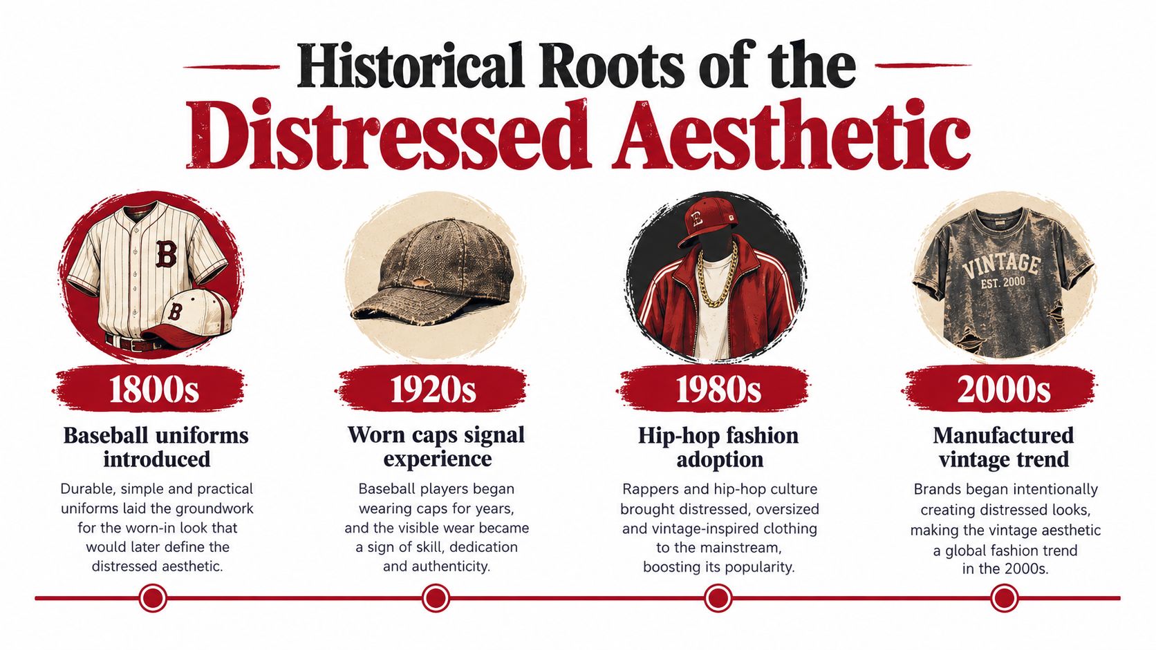
From merino crowns to athletic silhouettes
In the nineteenth century, teams including the New York Mutuals and Brooklyn Excelsiors adopted merino caps with a crown and bill. Those two elements still define the basic ballcap. The Brooklyn-style cap later gave way to the Philadelphia cap in the early 1900s, when a stitched brim offered greater durability. Earlier eight-panel construction eventually shifted toward the six-panel format that dominates modern baseball caps, and brims became longer during the 1920s and 1930s. These milestones are documented in the MLB history of the baseball cap.
That history explains why particular details feel convincingly vintage. A softened six-panel crown, a gently faded athletic mark, and a brim with a worn edge all refer to established sportswear forms. They aren't random signs of age. A factory can reproduce the vocabulary, but it must do so without turning the cap into a fragile costume piece.
New Era became the official cap supplier for Major League Baseball in 1993, strengthening the link between fitted caps, professional sports, and licensed fan apparel. In 2007, the company replaced wool with a polyester blend for the official on-field cap, shifting that product toward performance fabric. The modern vintage look therefore draws from both earlier woolen athletic imagery and later standardized sports production.
Why visible wear became desirable
Distressing also follows the logic of personalized denim. University College London's Global Denim Project identifies the 1970s as a key period when jeans became highly individualized and were often worn until they naturally deteriorated, especially in hippie and countercultural communities. Wear communicated that the owner had lived in the garment, rather than just bought a polished object.
The same research found that, in 2008, respondents across selected countries wore jeans an average of 3.5 days per week, while Germany recorded 5.2 days weekly. 62% said they loved or enjoyed wearing denim, with positive responses reaching 72% in Brazil and falling to 27% in India. Quality mattered too, with 39% selecting denim quality as a primary reason for choosing jeans, compared with 22% who cited cost. Those figures don't measure cap demand, but they show how wear, familiarity, identity, and perceived quality can coexist in fashion.
That distinction matters for design. Ask for controlled fading on the crown, a softened brim, and a selectively aged graphic rather than uniform damage across every surface. The best vintage distressed caps look used in the places a wearer would naturally handle them, while retaining enough structure to function as headwear.
Manufacturing Techniques and Material Trade-offs
A distressed finish is a process, not a filter. Factories use mechanical abrasion, chemical treatment, dye release, or combinations of these methods to change the cap's hand, color, and surface. Every method consumes some of the material's performance margin.
Stone washing uses pumice to rub the fabric mechanically. The stones create friction, remove some surface dye, and soften the hand. Cellulase enzymes work differently. They chemically weaken and remove protruding cotton fibers, which releases dye and produces a worn appearance. The result can feel authentic, but it isn't free. Increased treatment can reduce fabric mass and abrasion resistance.
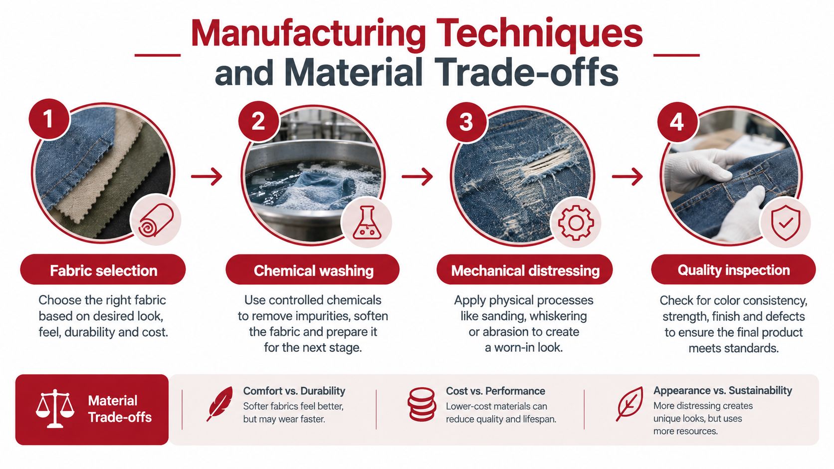
Where the finish costs performance
A 2024 cotton study reported reduced fabric mass after stone-enzyme processing across dark, medium, and light treatments, with shrinkage remaining within 3%. The researchers connected weight loss to enzyme activity and mechanical abrasion in the published processing analysis. Caps aren't interchangeable with denim garments, but the production principle applies directly. More aggressive treatment can create a deeper fade and softer hand while leaving less material to resist daily friction.
That trade-off is most dangerous at stress points. Inspect the sweatband seam, adjustment opening, rear panels, eyelets, brim attachment, and any area where embroidery backing will sit. A cap can look perfectly aged across its crown while the closure or seam has already lost useful strength.
Use the material guidance for hat fabric and material selection before you choose the wash recipe. Cotton-rich fabrics may deliver the most convincing fade, while polyester blends can behave differently under heat, abrasion, and dye treatment. Don't let a supplier substitute a different fiber blend because it produces a similar photograph.
Specify the recipe, not just the mood
A workable purchase specification should describe the target appearance and the limits. State whether you want an even wash, localized abrasion, softened brim edges, faded graphics, or a combination. Then define what isn't acceptable, such as holes, broken seams, warped brims, exposed backing, or panel distortion.
Request preproduction samples from the exact colorway and construction. A black distressed cap and a washed olive cap won't necessarily release dye or respond to abrasion in the same way. Test the decorated version too, because the embroidery process adds another source of stress.
The factory needs room to create variation, but not room to change the product category. A vintage finish should make a cap appear lived in. It shouldn't make the buyer responsible for repairing it before the first wear.
Condition Grading and Colorfastness Testing
Distressed caps need two separate evaluations. Condition grading tells you whether the cap is structurally and cosmetically acceptable. Colorfastness testing tells you whether the finish behaves safely when friction and moisture enter the picture. A strong appearance score can't compensate for a failed sweatband or dye transfer.
For secondhand inventory, don't describe every visible mark as intentional patina. Sweat degradation, odor, seam weakness, closure damage, and counterfeit branding are defects, not design features. For factory-distressed blanks, document the intended finish so inspectors can separate approved variation from production error.
Use a photo-based condition scale
A simple grading system makes supplier conversations clearer than adjectives such as “nice,” “authentic,” or “heavy vintage.”
- Light wash: The color is softened, the fabric remains stable, and the crown and brim retain their intended shape.
- Authentic wear: The cap shows localized fading or abrasion that supports the vintage story without compromising seams, closure, or embroidery placement.
- Heavy distress: The cap has pronounced fading, fraying, or surface wear. Approve it only when the decoration area and high-stress zones remain sound.
- Functional defect: The cap has a distorted brim, loose stitching, damaged sweatband, unreliable closure, serious odor, or another problem that affects wearability. Reject it or list it separately as defective stock.
Photograph the front, side panels, underside of the brim, sweatband, closure, and logo area under consistent lighting. For resale, keep provenance records for branded graphics and compare labels, construction, and stitching. Buyers value condition clarity and trusted authentication, so vague listings create unnecessary disputes.
Test dry and wet rubbing
AATCC TM8 evaluates colorfastness to crocking with a crockmeter and can be performed before or after washing, shrinkage, ironing, or finishing. The AATCC colorfastness data sheet reports independent cotton testing with a dry-crocking rating of 5, indicating no visible transfer, and a wet-crocking rating of 4.5, indicating minimal transfer. Washing caused moderate color loss in that testing.
Those results illustrate why a supplier's verbal assurance isn't enough. Dark pigment-dyed caps can transfer dye onto light clothing, sweatbands, or pale embroidery thread when moisture and friction combine. Require documented results for the final distressed colorway after the planned treatment, not for an unrelated base fabric.
Quality-control standard: Test the cap after distressing and after any wash or finishing step that will occur before shipment.
Record the test method, fabric color, treatment state, and pass criteria in the purchase file. If the cap is for uniforms, test the actual decorated sample against light garments and light thread. If it's for resale, disclose meaningful color-transfer or care limitations instead of hiding them behind the word “vintage.”
Embroidery Implications for Distressed Blanks
A distressed blank changes the embroidery equation. Soft fabric, uneven dye, and reduced surface stability can make a logo look less crisp and place more stress on the crown. The decorator must choose the production sequence carefully, because embroidering before distressing and embroidering after distressing produce different results.
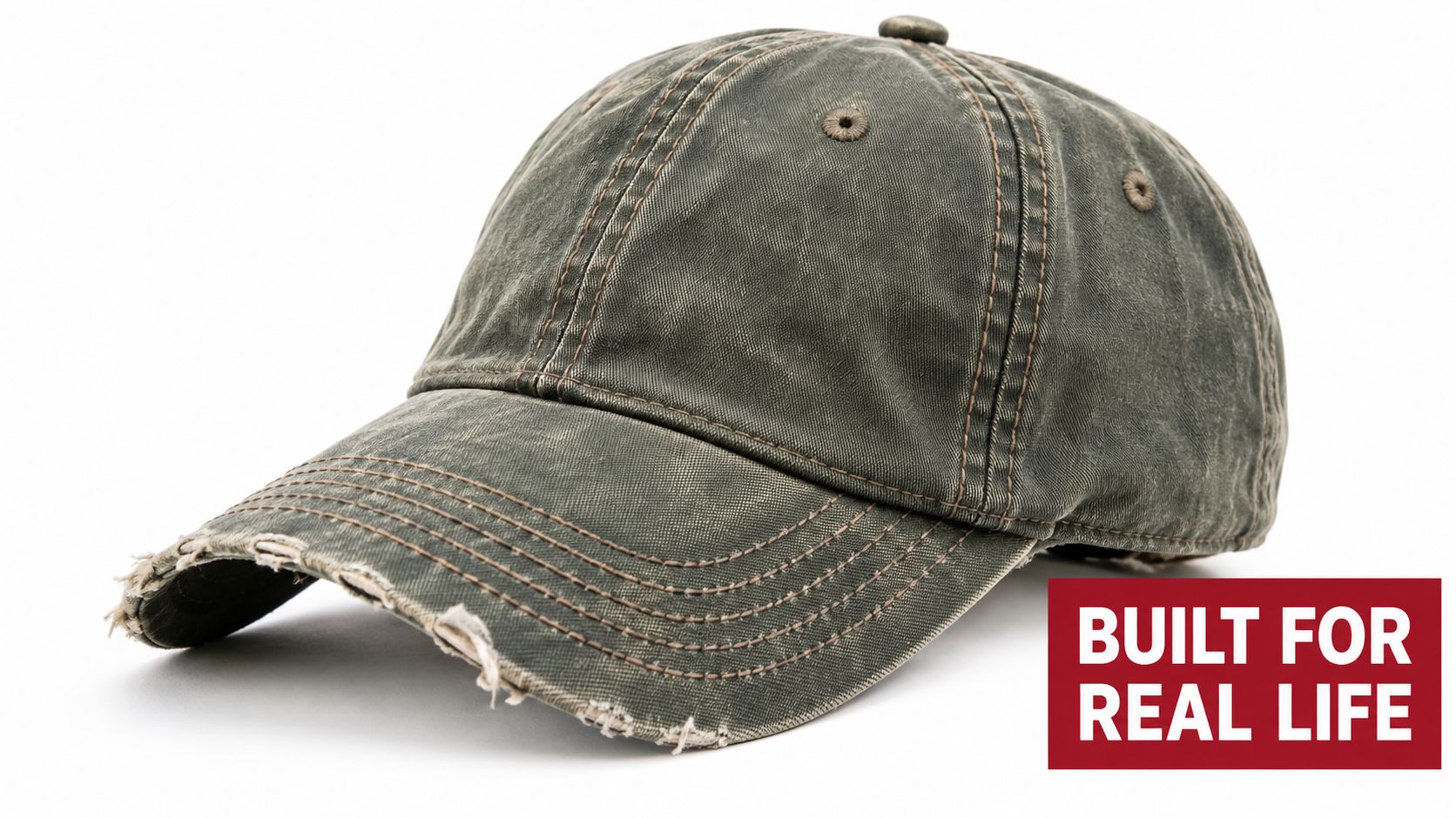
Embroider first, then distress
Decorating before the wash or abrasion treatment gives the logo and cap a unified aged appearance. The thread can fade or soften along with the fabric, which avoids the pasted-on look that a pristine logo may create on a heavily worn crown.
The downside is exposure. Mechanical abrasion can roughen thread, while chemical treatment can alter thread color or reduce its visual contrast. Adhesives, backing, and structured components may also respond poorly to the treatment. This route works best when the entire product is meant to look naturally aged and the brand accepts controlled loss of crispness.
Distress first, then embroider
Decorating a finished distressed blank gives you better control over logo color, edge definition, and placement. It also lets the decorator inspect the final crown before committing thread. For branded teams, events, and retail replenishment, that consistency usually matters more than a perfectly integrated artificial age effect.
The logo may look newer than the cap, however. Match thread selection to the distressed colorway instead of automatically choosing bright white or saturated brand colors. A lightly muted thread can preserve legibility without fighting the washed surface.
Use the principles in this guide to digitize a logo for embroidery before sampling. Reduce unnecessary density, avoid oversized fill areas on weakened fabric, and use underlay that supports the crown without creating a stiff patch. Fine lettering needs enough contrast and spacing to survive the cap's texture.
Decoration decision: If brand consistency is the priority, distress the blank first and approve the embroidered sample. If integrated aging is the priority, test the complete wash-and-decoration sequence before ordering production.
Never approve embroidery from a flat artwork proof alone. Stitch the actual logo on the actual distressed cap, then inspect the front, underside, sweatband, and rear closure for distortion or snagging.
Balancing Authenticity with Operational Scale
Vintage and secondhand clothing have become important reference points for buyers who want products with history, reuse value, and visible individuality. The business challenge is that the traits customers like in one-off pieces can make a repeatable merch program harder to manage.
Secondhand clothing grew nearly four times faster than new clothing in 2025, and 60% of consumers identified resale value as an important factor when purchasing new apparel, according to the broader market context reported by Quartz on resale and clothing quality. Those figures concern clothing overall, not caps specifically. They still point to a clear commercial opportunity for headwear that feels durable, personal, and worth keeping.
Choose the supply model by business need
Factory-distressed blanks are the practical choice for teams, staff uniforms, recurring events, and retail programs that need repeatable construction. You can approve a defined wash, establish an acceptable variation range, and reorder a known style. The finish won't be perfectly identical from piece to piece, but it can remain within a controlled visual family.
Responsible secondhand sourcing suits limited drops, curated resale, and one-off collaborations. It offers genuine age and construction history, but matching sizes, colors, labels, and decoration surfaces becomes difficult. Hygiene, odor, stain disclosure, and authentication require more labor than a standard wholesale blank program.
Post-production distressing gives a brand the most direct creative control, but it also puts process responsibility on the decorator or manufacturer. Washing after embroidery can affect thread, backing, and shape. Abrading around a logo requires careful handling, and repeatability depends on documented recipes and inspection.
Natural variation is useful when the product is sold as a limited piece. It's a liability when an event planner needs every staff member to match in group photos or when a startup expects to replenish a best-selling logo. Define the use case first, then choose the sourcing model.
Treat durability as part of the story
A vintage appearance shouldn't excuse poor washability or weak construction. If customers will wear the cap repeatedly, preserve the areas that carry load even if you add visual wear elsewhere. If the product is a uniform, prioritize hygiene, color stability, closure function, and replacement availability over dramatic abrasion.
Authenticity is a controlled range of variation. It isn't a license for every cap to become a different product.
Write a reorder policy that identifies the approved silhouette, base color, distress level, logo placement, thread palette, and acceptable variation. That document lets a supplier reproduce the product without promising impossible uniformity.
Your Wholesale Sourcing and Ordering Checklist
A reliable order starts before you compare unit prices. Build a specification that a supplier, decorator, and receiving team can all interpret the same way. The finish, construction, artwork, and inspection criteria should appear in writing.
Use this sequence for a new vintage distressed caps program:
- Define the job. Decide whether the caps are for uniforms, retail merchandise, a limited drop, a fundraiser, or a one-time event. That choice determines how much variation you can accept and whether reorders matter.
- Choose the construction. Select a structured or unstructured crown, five-panel or six-panel format, closure type, brim profile, and fabric blend. Don't approve a style from a lifestyle image without checking the actual product specifications.
- Request the exact blank. Ask for the precise distressed colorway, not a similar shade from the same catalog. Confirm whether the finish is factory-applied or added after sourcing.
- Write the distress specification. Describe fading, abrasion, fraying, brim softness, and graphic treatment. List rejected conditions, including warped panels, holes outside the approved design, loose seams, damaged sweatbands, and unreliable closures.
- Submit production artwork. Provide the final logo, thread colors, placement, dimensions, and any limitations on density or fine detail. A decorator should test the design on the distressed surface, not assume a standard blank will behave the same way.
- Approve a decorated preproduction sample. Inspect the cap in hand. Check crown shape, logo legibility, thread tension, backing visibility, brim alignment, closure operation, and the relationship between the logo and the aged finish.
- Request testing records. For dark or pigment-dyed caps, ask for dry- and wet-rub results after the relevant treatment. Confirm care instructions and whether washing can alter the approved appearance.
- Set an inspection plan. Photograph approved samples and define the acceptable range for color, distress, stitching, structure, and odor. Give the receiving team a simple pass or hold process.
- Plan the reorder. Record style identifiers, supplier details, artwork files, thread references, approved sample images, and variation limits. Vintage-style products need this trail because a reorder may not look identical without clear controls.
For first purchases, use a manageable test quantity before committing to a major event or retail launch. A small run reveals whether the cap supports the logo and whether the supplier can reproduce the approved finish. The bulk blank-hat buying guide can help you organize style selection, quantities, and supplier questions before the purchase order is issued.
Dirt Cheap Headwear supplies distressed and vintage-inspired blank caps, plus in-house custom embroidery, patches, printing, and low-minimum decorated orders starting at six pieces per logo. Visit Dirt Cheap Headwear to compare distressed styles, request a proof, and build a sourcing plan that protects both the vintage look and the cap's working life.