

If you've ever opened a cap mockup, loved the script, and then watched the stitched version turn muddy or cramped on the front panel, you already know the trap. The file looks like typography, but the machine treats it like a stitch plan, and the front of a hat is a lot less forgiving than a flat sweatshirt.
That gap is why machine embroidery designs fonts live or die on production choices, not taste. The font style matters, but so do the finished height, the stitch type, the density, the underlay, the thread, and the cap itself. On a curved structured front, a beautiful font can fail fast if the letters are too thin, too tight, or too ambitious for the space.
What You're Really Choosing When You Pick a Font
The first mistake is treating a font like a graphic asset. In embroidery, the font in the file is only the starting point, because the machine still has to turn it into a stitch path that survives thread, fabric, and hoop tension. The workflow starts with a digitized design file, then it gets converted into a machine-specific embroidery format before stitching begins, which is why digitizing can take hours depending on complexity and why the operator still has to hoop, load, and monitor the run Machine embroidery workflow.
That matters most on hats. A cap front panel gives you less usable real estate than a flat garment, and the curve changes how letters sit once the needle starts punching holes. A script that looks elegant on screen can become a pile of thread jumps on a structured crown.
The three decisions that actually control the result
Font style decides whether the letters have enough visual mass to survive thread. Finished size decides whether the detail can physically fit. Stitch type decides whether the lettering reads cleanly or turns bulky and distorted.
Practical rule: if you're choosing a font for a hat order, don't ask, “Does it look good?” Ask, “Can this survive at the size the cap allows?”
That's the mindset shift. You're not selecting a typeface for print. You're engineering a readable stitch plan for thread behavior, hoop size, and the practical constraints of production.
If you're new to that production mindset, the basic embroidery-name workflow is worth reviewing before you commit to a font choice, especially if the order includes small front text or curved placement on hats: how to embroider a name.
Font Styles That Survive the Needle

Start with stroke behavior, not aesthetics. A clean sans-serif or block font usually gives the machine predictable paths, which is why these styles hold up better when the text gets small. A widely cited production rule puts the minimum text height at 5 mm (0.2 inches) for legibility, and clean sans-serif shapes with medium stroke weight generally embroider better than ornate serif styles because thin strokes can disappear and fine details can distort Embroidery font minimums and style guidance.
What works best in production
Sans-serif fonts are the safest default because the stroke widths stay more even through stitching. Block fonts are even better when the text has to read at a glance on a cap front, a left chest, or a small logo mark. Simple scripts can work, but only when the tails are controlled and the letters don't tangle into each other.
The ones that cause trouble are easy to spot once you've seen a few bad stitch-outs. Ultra-thin lines vanish. Heavy serif edges fray visually. Decorative terminals turn into little thread nests when the needle starts compensating for detail that was never realistic in the first place.
The quick test I trust
Shrink the font until the letter height is about 6 mm, then squint. If the design collapses into a blur on screen, it'll usually collapse faster in thread. That check doesn't replace digitizing, but it filters out the fonts that were never meant for small headwear work.
Thin strokes are the first thing to die. If the font only looks good because of delicate detail, it's probably a bad embroidery font.
The question isn't whether a font is pretty. It's whether the important shapes remain distinct after the machine adds thread width, pull, and fabric movement. That's the whole difference between a mockup-friendly font and a production-safe one.
Reading Size Thresholds on a Hat Front Panel
Cap text lives under a different size ceiling than flat-garment lettering. Public guidance often starts with a 5 mm minimum for legibility, but cap-specific advice is more cautious. Independent embroidery guidance points to a practical floor of about 0.25 inch (6.35 mm) for clear readability in some contexts, while another technical guide recommends 0.5 inch (12.7 mm) for block embroidery fonts to avoid thread breaks and loss of detail Cap font size guidance. Those numbers aren't contradictions, they're reminders that fabric, stitch type, and size target control the final answer.
How I think about hat sizing
If the front panel is structured and you need a crisp brand mark, larger block lettering is the safer path. If the cap is unstructured or the wording is short, you get a little more flexibility, but the letters still need enough height and spacing to stay readable. Curved fronts make tight spacing feel tighter once the stitch line settles.
When text gets small, the stitch choice matters as much as the font. Satin stitches are great for smooth filled letters, but very tiny lettering can be better served by a lighter approach, especially when the forms are narrow and the machine has no room to build a clean satin column. As a rule, open the spacing before you shrink the letters too far. Crowding is what turns legible text into a clump.
| Font style | Recommended minimum height | Preferred stitch type |
|---|---|---|
| Bold sans-serif | 5 mm or larger | Satin stitches |
| Block font | 0.5 inch or larger for safest production | Satin stitches |
| Simple script | 6.35 mm or larger, with extra spacing | Satin or simplified running details |
| Fine lettering | 4 mm or larger for lowercase detail | Running stitches or very light satin |
The cap-specific trap
The front panel is not just small, it's shaped. That curve compresses the bottom of letters and can expose spacing problems that looked fine in a flat preview. If a customer wants a tiny slogan across the front of a structured cap, the safest answer is often to simplify the font rather than force detail into the space.
On hats, readability beats font personality every time.
If you need a deeper file-type comparison before you approve a small cap order, this guide is a useful companion: what file type for embroidery logo.
Preparing and Digitizing the Font for Production
A clean embroidery font starts as vector art, not a screenshot. In the shop, I convert the lettering in digitizing software, set the stitch type, adjust density, add underlay, and run a test sew before anything goes to production. That is the difference between a font that looks good on screen and one that survives a cap front in real stitching conditions Digitizing workflow and stitch settings.
The settings that matter most
Use satin stitches for clean filled letters, then tune density to the fabric under the needle. A practical starting point is about 4 to 6 stitches per cm, with 2 to 3 mm stitch length for fine detail and 4 to 6 mm for fills, as outlined in the digitizing workflow guide. Add underlay stitches so the fabric stays anchored and the lettering does not sink into the cap front Digitizing workflow and stitch settings.
That underlay is doing more work than the final look suggests. It steadies the surface, helps control push and pull, and gives the top stitches something stable to sit on, especially on structured caps where the front panel still moves more than a flat sample would suggest.
Why the test stitch is required
Software previews hide problems. They do not always show puckering, thread breaks, or weak color changes. A test stitch on scrap material shows the true result and exposes trouble before it reaches a customer.
If you digitize in-house, this is the point where a logo file stops being artwork and becomes production data. A practical walkthrough for that setup is here: how to digitize a logo for embroidery.
The file still has to live inside your software in a way that lets you control it. If you are checking how a working file behaves before the first stitch-out, the AI Photo Generator image processing blog can help frame that workflow thinking: AI Photo Generator image processing blog.
Rule of thumb: digitize for the fabric you are actually using, not the clean-looking mockup on your screen.
File Formats and How They Behave in Your Software
Most font headaches start with format mismatch, not bad design. Recent embroidery workflows are less about finding a pretty alphabet and more about getting the right file into the right software and making it stitch correctly. The common formats include BX, ESA, TrueType, and stitch-file fonts like DST and PES Format and workflow overview.
Which format fits which job
BX fonts are useful when you want a native embroidery alphabet that can resize on the fly. ESA fonts fit the same general use case in embroidery-focused environments. TrueType and OpenType are familiar typographic formats, but they still need to be converted before they become stitchable. DST and PES files are already digitized, so they behave more like final production assets than flexible working fonts.
For a small shop, that usually breaks down like this. BX works well for repeat orders where you want consistent resizing without rebuilding the lettering every time. TrueType is handy for one-off names or quick custom text that still needs proper digitizing. DST/PES make the most sense when the design is already finalized and you want a locked-in production file.
Getting the font into the software
If you use Embrilliance, the practical move is to install the embroidery-native font first, then test how it behaves when you resize or place text on a curve. That's where a lot of users discover that the file installed correctly, but the stitch behavior still needs adjustment. Software compatibility and installation workflow matter as much as the font itself.
A useful side note, if you care about the way software interprets visual data, is the broader conversation around machine learning in image processing, which shows how digital systems can still need human review before output is trustworthy. That's covered well in this AI Photo Generator image processing blog.
The best practical choice
Pick the format based on how often the text changes and how final the artwork already is. If the wording changes constantly, flexible embroidery-native fonts help. If the logo is locked, a stitch file saves time. The wrong format forces extra cleanup, and that's how simple name orders turn into software support tickets.
Machine Settings That Prevent the Usual Failures
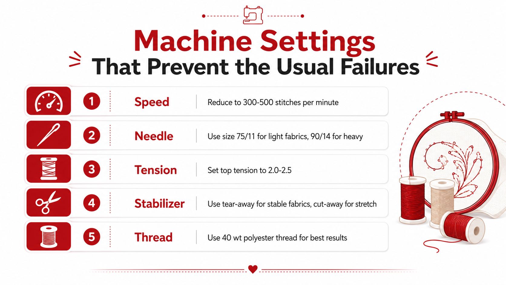
A small font can look fine in the file and still fall apart on the machine. On caps, I usually check speed first, because a fast run hides thread control problems until the letters start crowding the front panel. For small or intricate lettering, slowing the machine to 30 to 50 percent of maximum speed gives the needle more control, and one expert guide recommends 60-weight thread for small letters, 75/11 sharp needles for standard fabrics, and 90/14 for heavier materials Needle, thread, and speed guidance.
What to check before you run the order
The failures I see most often are tension imbalance, thread jams or snaps from low-quality or old thread, and digitizing errors such as too much stitch density in one spot. Dense lettering makes those problems show up faster, especially on caps where the fabric is already resisting the stitch path. A clean-looking font can still fail if the machine is forced to push too much thread into too little space.
The back of the design gives a quick read on whether the machine is behaving. A satin-stitch quality benchmark is that the bobbin thread should occupy about one-third to one-half of the back of the design. If the back looks too heavy or too sparse, tension needs attention before the design goes live. The same holds for the rest of the setup, including the practical guidance in the infographic showing five essential sewing machine settings to help prevent common embroidery project failures.
The practical diagnosis loop
Run the stitch-out on scrap, then inspect three things. First, look for tight spots where the thread is stacking instead of laying cleanly. Second, check for broken or fuzzy edges that suggest the needle or thread is not matched to the fabric. Third, look at the back, because that bobbin ratio gives you a quick read on balance.
Fix thread problems by changing the machine settings first. Revisit the font only if the structure still fails.
That does not make a weak font usable, but it does keep a good font from failing for avoidable reasons. On production work, that difference saves rework, keeps cap runs moving, and stops a simple lettering order from turning into a problem order.
Pre-Production Checklist and Common Questions
Before approving any font for a cap order, run the same quick checklist every time. Does the style stay readable when shrunk to the actual size? Does the stitch type match the lettering thickness? Are density and underlay set for the fabric? Was a test stitch run on scrap? Did the back of the piece show balanced bobbin coverage? If any of those answers is shaky, the font isn't ready.
A simple go or no-go filter keeps the shop moving.
- Style fit: Choose a font with clean shapes, not decorative detail that only works in mockups.
- Size threshold: Confirm the letters clear the practical minimum for the cap and the stitch type.
- Spacing: Open up tight letter spacing before you shrink the text further.
- Underlay and density: Verify the file has stabilization built in, not just visual fills.
- Test stitch: Always run one on scrap before production.
- Machine check: Inspect tension, needle choice, thread quality, and speed before the final sew.
Common questions that come up fast
Can I charge extra for custom lettering? If the request needs resizing, cleanup, or a fresh digitize, it's a production task, not a drag-and-drop change. What about curved text on a cap? Keep it short, keep it bold, and avoid delicate scripts unless the spacing and size are generous. What if the customer sends a font nobody has? Convert the look into a workable stitch plan instead of chasing the exact typeface.
The fastest path is usually the simplest one. For hats, that means a font with enough stroke weight, enough height, and enough room to stitch cleanly without fighting the panel.
If you're choosing fonts for hats right now, send the artwork through a production check before you promise a finish. Get the size, stitch type, and file format right first, then run a test sew and compare it to the mockup. If you want a second set of eyes on a cap logo or need a clean embroidery-ready headwear order, reach out to Dirt Cheap Headwear and keep the approval process simple.