You’re probably staring at a blank cap right now and doing the same mental math every brand owner does. Will this logo look clean on a structured front panel? Will the print crack on a beanie? Is screen printing hats worth learning in-house, or is this one of those jobs that sounds simple until you ruin a stack of blanks?
That’s where the silk screen technique gets interesting. On paper, it’s straightforward. Push ink through a stencil, cure it, move on. On headwear, it gets fussy fast. Curves fight you. Seams fight you. Soft knits stretch. Structured crowns push back. A setup that prints beautifully on a flat tee can fall apart on a trucker cap.
Still, when it’s done right, screen printing on headwear has a look that embroidery can’t fake. It lays down bold color, handles graphic fills well, and gives small brands a way to make hats that feel more like merch and less like giveaway swag.
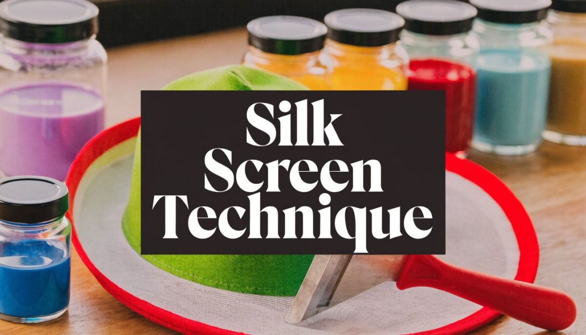
Why the Silk Screen Technique Rocks for Headwear
The reason screen printing has lasted this long is simple. It solves a real production problem. The method goes back to China’s Song Dynasty, then kept evolving until it became a true commercial workhorse. One milestone that still matters to any print shop is the 1930s WPA silkscreen department, which could produce up to 600 posters per day with 8 colors according to this history of screen printing. That tells you what the process does best. It scales.
For headwear, that matters more than people think. Hats are awkward items to decorate, but once a job is dialed in, the silk screen technique gives you repeatability. A one-color front hit on a visor, a bold side print on a camp cap, or a simple logo on a knit beanie can all look sharp without turning every unit into a hand-crafted science project.
Where it beats other decoration methods
Screen printing shines when the artwork is graphic, bold, and meant to read from a distance. Team marks, event logos, block text, badge-style branding, and high-contrast artwork all benefit from ink coverage that sits visibly on the surface.
It also works well when you want:
- A flatter visual finish that doesn’t have the raised texture of embroidery
- Clean fills of solid color that would take a lot of stitches to imitate
- A different price logic for simple art and repeat runs
- A more poster-like look on fashion or promo headwear
The trade-offs are real
Not every hat should be screen printed. A heavily structured cap with a tough center seam can make fine detail miserable. A lofty beanie may swallow small text. A curved crown can distort circles, badges, and horizontal lines if the setup is lazy.
Headwear punishes shortcuts faster than shirts do. If the print path, platen fit, and squeegee angle aren’t right, the hat tells on you immediately.
That’s why general T-shirt advice only gets you halfway there. Hats demand a print strategy that respects shape first, artwork second.
Gathering Your Screen Printing Gear for Hats
A cap order goes sideways fast when the gear is built for shirts instead of headwear. The print looks centered on the platen, then rides uphill on the crown. The side panel shifts on the stroke. A knit beanie drinks the ink and turns small type into mush. Good hat printing starts long before the screen hits the fabric.
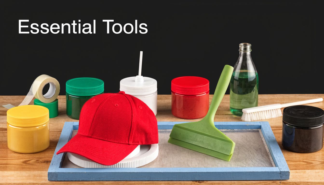
If you need a broad shop overview before you buy hat-specific tools, this complete screen printing set up guide covers the press, exposure, curing, and support equipment in plain terms.
Start with the press and platen, not the ink
New printers often spend too much on screens and accessories, then try to force hats onto a flat shirt setup. That works for a few tests. It wastes time in production.
The platen decides whether the item stays stable and whether the print face sits where your screen expects it. For structured caps, curved cap platens support the crown and reduce distortion. For soft camp caps and side hits, the main issue is hold-down. If the item creeps even a little, your edges will tell on you.
Look for:
- Cap platens shaped for the profile you print
- Micro adjustment if you plan to register more than one color
- A hold-down system that keeps the hat from lifting during the pull
- Space for smaller screens, which are easier to control on compact print zones
One hard lesson from the shop floor. A decent press with the right platen beats a nicer press with the wrong support every time.
Buy screens and mesh for the fabric, not just the art
Mesh choice on hats is more sensitive than on tees because the print area is smaller and the surfaces vary more. Foam truckers, brushed cotton twill, acrylic knits, and performance visors do not want the same ink deposit.
Here is the practical version:
| Hat type | Artwork style | Better mesh direction |
|---|---|---|
| Beanies | Bold logos, simple text | Lower mesh for a heavier deposit |
| Foam truckers | Thick graphics | Mid mesh that still releases ink cleanly |
| Smooth twill snapbacks | Cleaner logos, smaller detail | Higher mesh if the surface is even |
| Visors | Straightforward front graphics | Mid mesh for control and coverage |
Lower mesh helps on textured knits and thirsty fabrics because it lays down more ink. The trade-off is softer edges and a print that can feel heavy. Higher mesh sharpens detail and keeps the print cleaner, but it can leave weak coverage on rough or absorbent surfaces.
If you are testing logo size and placement before you commit to screens, a baseball cap design tool helps catch proportion problems early, especially on low-profile fronts and narrow visor zones.
Use smaller squeegees than your shirt instinct wants
Hat printing rewards control. Wide shirt squeegees encourage too much pressure across a small, curved area, and that usually means distortion, smearing, or ink pushed into seams.
Keep a few dedicated hat squeegees on hand:
- Short blades for front logos and side prints
- Stiffer durometers for sharper edges on smooth caps
- A separate flood tool if you run repeat jobs
- Clean, nick-free edges because tiny defects stand out on hats
On beanies, I usually back off pressure and let the mesh do the work. On structured caps, I care more about a clean, controlled pass than brute force.
Ink choice affects print quality and production speed
Ink is not just a visual decision. It changes how easy the job is to run, cure, and repeat.
Plastisol is the safer production ink for many hat jobs. It sits on top of the fabric, handles mixed materials well, and gives you more forgiveness on structured caps, promo headwear, and repeat orders.
Water-based ink can look excellent on the right headwear, especially when the customer wants a softer finish. It also dries faster in the screen, reacts poorly to slow setups, and can become irritating on long runs or dry shop days.
My rule is simple:
- Use plastisol for consistency, broad material compatibility, and easier production
- Use water-based when the fabric and artwork suit it, and the shop can keep pace with the ink
- Test first on knits, ribbed beanies, and textured headwear because those surfaces can surprise you
Do not forget the support gear
The print gets the attention. Prep and cleanup decide whether the shop stays efficient.
You need:
- Photo emulsion that matches your exposure unit
- A scoop coater for even stencil thickness
- Degreaser so emulsion bonds properly
- Emulsion remover for reclaiming screens
- Screen tape for edges, pinholes, and quick fixes
- Adhesive or a cap hold-down method that fits the platen
- A flash unit or curing setup matched to your ink system
Cheap support tools create expensive mistakes. Uneven coating, weak adhesion, or poor curing can ruin a small hat run faster than a bad print stroke.
Build your setup around the hats you plan to sell
A small brand testing one-color logos on dad caps does not need the same setup as a shop printing foam truckers, visors, and beanies every week.
Starter setup
- One-color or low-detail artwork
- A small group of hat styles with similar profiles
- One cap platen that matches those styles
- A couple of mesh counts
- Basic exposure and curing equipment
- Sampling before every real run
Production setup
- Multiple platens for structured, unstructured, and knit headwear
- Screens ready for both bold and fine-detail art
- Better registration controls
- A consistent reclaim and exposure workflow
- Reliable curing for repeat orders
- Approved print samples for each hat category
That last point matters for the DIY versus outsourcing decision later in the article. If your brand sells a narrow range of hats and the art stays simple, a small in-house setup can make sense. If your line jumps between cap profiles, fabrics, and print locations, the gear list gets expensive fast.
Preparing Your Artwork and Burning Your Screen
A cap can look fine on screen, then fail the second it hits a curved crown. The art was too wide, the text sat on the seam, or the stencil never had a chance because the screen was burned soft. That is why headwear pre-press has to be tighter than shirt pre-press.
Bad prep shows up fast on hats. You see it in broken letters over the center seam, muddy small type on knit beanies, and logos that looked balanced in a mockup but ride too high once the hat is on a platen.
Build the artwork for the print zone, not the flat file
Headwear punishes designs that only work in Illustrator.
A front panel on a structured trucker gives you a different usable area than a soft dad cap. A visor gives you width but not much height. A beanie stretches when worn, so the print can open up or distort depending on the knit and how tight the customer pulls it on. Good artwork accounts for that before film output.
Vector art is still the safest starting point for most hat jobs. Clean edges separate better, and edits are faster when you have to widen a letter, thicken a stroke, or shift detail away from a seam. Halftones can work, but on hats they need a reason. If the image can be turned into bolder shapes and still read well, that version usually prints better.
A few rules save a lot of remakes:
- Use thicker strokes than you would on a tee
- Keep letter counters open so texture does not fill them in
- Avoid tiny details at the center seam
- Shorten wide logos so they fit the panel instead of wrapping into trouble
- Simplify gradients unless you have already tested that hat style and mesh
If you are still deciding placement, a realistic mockup tool helps catch proportion mistakes before you burn film. This design your own baseball caps page is useful for checking whether the same logo belongs on the front, side, or visor.
Color separations need discipline on hats
Every extra color raises the chance of a bad day.
On flat goods, you can sometimes muscle through a fussy separation. On headwear, especially structured fronts, a slightly awkward registration setup becomes obvious right away. The print area is smaller, the surface is less cooperative, and small shifts look bigger than they do on a shirt.
I trim color count aggressively on caps. If two shades are doing the work of one stronger spot color, I combine them. If a shadow effect only shows up in the proof but disappears at normal viewing distance, I cut it. Small brands doing short runs should pay attention here. A cleaner one-color or two-color print often sells better than a complicated design that only looks good in the mockup.
For delicate materials and smaller-format prints, this guide on how to print on fabric for silk accessories is a useful reminder that the fabric should shape the print plan, not just the final look.
Match the screen build to the hat and ink
Mesh choice on hats is a balancing act. Lower mesh helps you lay down more ink for bold logos and rougher surfaces. Higher mesh holds finer detail, but it can starve the print on textured material or leave you fighting weak coverage on dark caps.
In practice, I keep it simple. Bold athletic lettering on foam truckers usually wants a more open setup than fine side-panel branding on a smoother cotton twill cap. Beanies need extra caution because knit texture can swallow detail and make a clean stencil look worse than it is.
Coating matters just as much. Uneven emulsion gives you uneven exposure, and uneven exposure gives you soft edges or stencil breakdown. A screen for headwear has to release cleanly while holding enough stencil strength to survive a run where pressure is rarely as even as it is on flat stock.
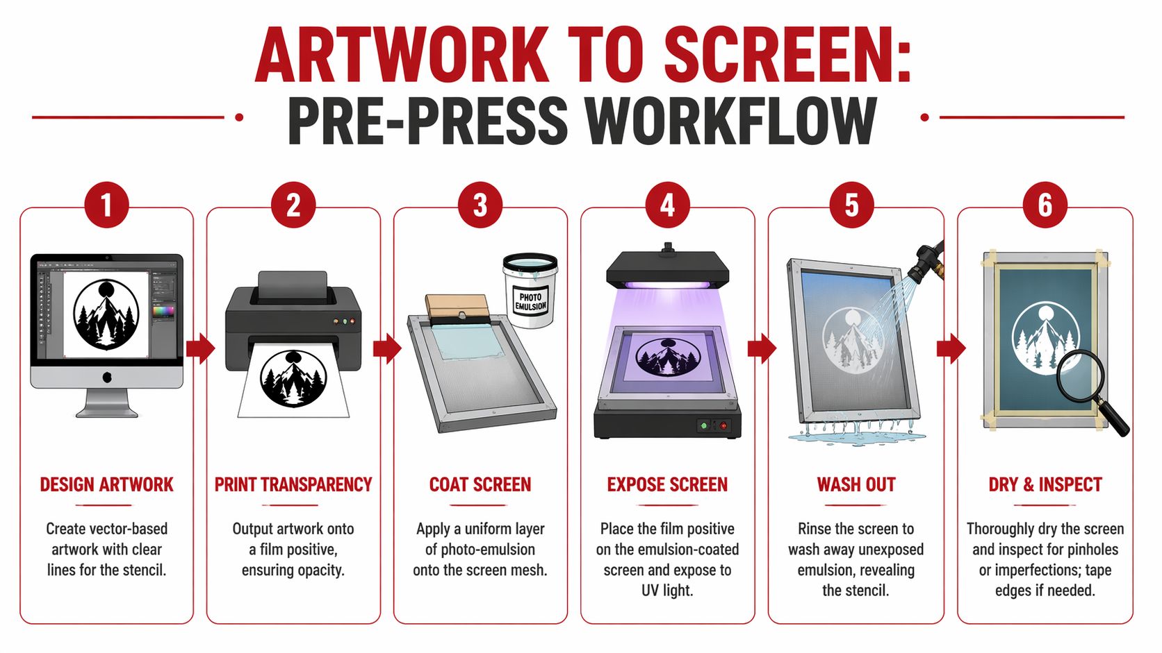
Exposure control decides whether the screen is usable
A lot of beginners blame the print stroke when the actual problem started in the exposure unit.
An underexposed stencil may wash out easily and even print a few test hits. Then the edges start softening, small details break down, and the image loses shape halfway through the run. On headwear, that failure shows up sooner because the contact is less forgiving and the print surface is not flat.
An overexposed screen creates a different headache. Fine detail refuses to open, small text plugs up, and you end up forcing ink through a stencil that never washed out correctly in the first place. Neither problem gets fixed at press side.
Use an exposure test instead of guessing. Keep notes on your mesh, emulsion, coating pass, humidity, and unit settings. Shops that get consistent hat prints usually have boring pre-press records, and that is a compliment.
Burn checklist
Degrease the screen first.
Coat evenly on both sides.
Dry in a light-safe space with good airflow.
Use a dense, opaque film positive.
Run an exposure test when anything changes.
Wash out with enough pressure to open the image, not enough to damage the stencil.
Dry the screen fully and inspect it before taping and setup.
Common pre-press misses on caps, beanies, and visors
A technically clean screen can still be wrong for the product.
The most common mistake on caps is sizing art by eye instead of by actual panel limits. That is how logos end up crowding the seam or falling into the crown curve where they distort. On beanies, printers often approve art at rest, then forget the hat will stretch on a head. On visors, the shape looks simple, but the curve can still make square-looking placement feel off if the art was centered for a flat proof instead of the actual item.
Watch for these problems before press setup:
| Problem | What it causes on hats | Fix |
|---|---|---|
| Art too wide for the panel | Logo wraps into seams or curved edges | Resize and re-balance for the actual print zone |
| Tiny text over a center seam | Broken letters and poor legibility | Move copy off the seam or increase size |
| Halftones on textured headwear | Muddy detail and weak tonal range | Simplify to solid shapes or retune the separation |
| Thick, uneven stencil | Heavy ink deposit and poor release | Recoat with better control |
| Pinholes or soft edges | Random dots and fuzzy outlines | Block out, or reburn if the stencil quality is weak |
Inspect the screen like production depends on it
Because it does.
Hold the screen up dry under good light. Look for pinholes, ragged edges, half-open details, and any area that feels weak before ink gets involved. If the screen is questionable, remake it. That call feels annoying on one sample, but it is cheaper than burning time and blanks on a 48-piece cap order.
This is also the point where DIY shops need to be honest with themselves. If your brand keeps changing hat styles, placements, and art complexity, pre-press becomes the part that eats time and profit first. Small runs with simple logos are manageable in-house. Mixed headwear lines with detail-heavy art usually expose every weak spot in your setup.
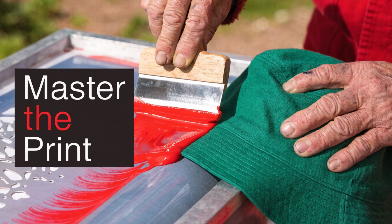
Mastering the Print on Flat and Curved Headwear
The actual print stroke is the part everyone wants to jump to. Fair enough. It’s also the part where headwear exposes every lazy decision you made earlier.
A visor and a structured trucker cap may both count as headwear, but they don’t print like cousins. One behaves almost flat. The other acts like a shaped object that only pretends to be printable.
Printing a flat visor
A visor is the closest thing to a break you’ll get in hat printing. The print area is more stable, and you usually don’t have to fight a center seam.
For a one-color logo on a visor, the flow is simple:
- Mount the visor so it can’t shift.
- Set the screen with a small, consistent gap off the surface.
- Flood cleanly.
- Make one controlled print stroke.
- Check edge definition before committing to the run.
The temptation is to overprint because the surface feels easy. Don’t. Too much pressure can still squash ink outward and make edges fuzzy.
Printing a structured 6-panel cap
The silk screen technique becomes less forgiving. Structured fronts resist flattening, and the center seam can break the image if the artwork lands in the wrong place.
For curved hat surfaces, the squeegee technique changes. This headwear printing and squeegee angle discussion notes that while general guides suggest 45° to 60°, experienced headwear printers often work at a 70°+ angle with a flood stroke to reduce ink shear and distortion on flexible panels.
That higher angle helps because it keeps the stroke more deliberate. On hats, a low lazy pull can smear ink across texture and seams instead of driving it where it belongs.
What works on curved surfaces
On a structured cap, I look for three things before the first real print:
- The crown is fully seated on the platen
- The artwork avoids the seam when possible
- The squeegee width matches the image area
Then I print with restraint. One clean stroke often beats two enthusiastic ones.
On a cap front, force is not your friend. Control is.
If the print looks underfilled, don’t automatically lean harder. First check whether the screen is making even contact and whether the hat is mounted correctly.
Flat versus curved print habits
| Situation | Better habit | Habit that causes trouble |
|---|---|---|
| Flat visor | Moderate pressure, smooth pull | Repeated strokes “just in case” |
| Structured cap | Higher squeegee angle, firm control | Low-angle drag across the crown |
| Beanie | Stabilize fabric first | Printing on loose stretch with no support |
| Side panel print | Keep image compact | Oversized art that wraps awkwardly |
Multi-color registration on hats
Registration on hats is less forgiving than on many shirts because the print area is smaller and visual misalignment jumps out faster. If you’re printing two colors on a cap front, build your setup around consistency, not speed.
A few habits help:
- Use simple registration marks that make sense on a compact screen
- Run test prints on the actual hat style
- Keep the hat loading method identical every time
- Reduce unnecessary colors if the design can survive it
A two-color logo on a smooth cap is manageable. A highly detailed multi-screen job on a seam-heavy crown is where quality starts slipping unless the setup is excellent.
A short visual demo helps here because hand position and body mechanics matter more than people expect.
Curing and final handling
A print that looks good fresh off the press can still fail later if it isn’t cured properly. For this reason, small brands underestimate the process. They think the graphic is done because it’s dry to the touch.
Dry isn’t cured.
Use a curing method that suits your ink system and your hat shape. Be careful with heat exposure on synthetic panels and structured caps. Too much heat in the wrong place can warp the blank, gloss the print, or create uneven finish.
For fit and construction differences that affect how the print surface behaves, this breakdown of structured vs unstructured hats is worth reviewing before you lock in a production method.
What I’d print on each style
- Visors handle cleaner graphic front prints than many people expect
- Foam truckers suit bold, simple art
- Structured twill caps reward careful alignment and controlled squeegee work
- Beanies are better for strong, compact marks than fussy details
- Unstructured caps can print well, but only if you support the panel properly and don’t overwork the stroke
The best headwear prints usually look simpler than the original concept. That isn’t a compromise. It’s good judgment.
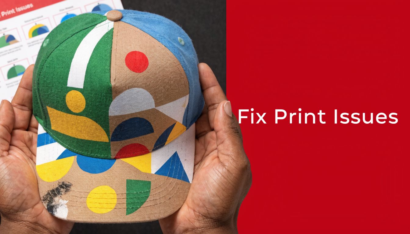
Fixing Common Headwear Printing Problems
Most headwear print failures are mechanical, not mysterious. If ink is bleeding, the hat shifting, or the image looking warped, the problem usually comes from contact, support, angle, or artwork choices that didn’t respect the surface.
That’s good news. Mechanical problems can be fixed.
Problem edges look fuzzy or bleed outward
This usually points to one of a few issues:
- Under-exposed stencil
- Too much pressure on the print stroke
- Poor contact between hat and platen
- Ink deposit too heavy for the fabric texture
If the print is on a curved front panel, check your stroke mechanics before blaming the ink. A sloppy angle on a cap often creates edge bleed faster than it would on a shirt.
If the edges are soft, stop increasing pressure. Pressure hides setup mistakes for one print and magnifies them for the rest of the run.
Problem the image shifts on structured crowns
Registration drift on hats often comes down to movement. The crown wasn’t loaded consistently, the hold-down method was weak, or the screen was set up for a flatter object than the one being printed.
Try this checklist:
| Symptom | Likely cause | Better move |
|---|---|---|
| Color layers don’t land the same way twice | Hat placement changes each print | Standardize loading position |
| Artwork leans to one side | Crown isn’t seated squarely | Refit the hat to the platen |
| Bottom of logo prints stronger than top | Uneven contact across curve | Adjust support and stroke path |
Problem center seam wrecks the print
Some designs should never cross a center seam. That isn’t defeatist. It’s professional.
If the seam is unavoidable:
- Use bolder shapes
- Avoid tiny text
- Expect some visual interruption
- Test before the run, not during it
For many logos, moving the art slightly above, below, or beside the seam creates a cleaner final product than forcing perfect symmetry.
Problem moiré appears in detailed multi-color jobs
Moiré is one of the most annoying issues in headwear printing because it can make a technically correct job look cheap. According to this halftone angle guide for screen printing, it’s a wavy pattern caused by misaligned halftone dots. The same source notes that on headwear, where 35 to 65 LPI is common, forgetting to account for panel seams or using standard angles on curved surfaces can lead to 15 to 25% rejection rates on detailed jobs.
That’s a strong argument for simplifying the art before production.
When moiré shows up, look at:
- Your halftone angles
- Whether the hat texture is fighting the dot pattern
- If the panel seam is amplifying interference
- Whether the design should be converted to a simpler spot-color approach
Problem polyester caps behave unpredictably
Synthetic hats can create their own headaches. Ink can sit differently on slick faces, and some blends just don’t reward aggressive printing.
Usually the fix is process discipline:
- Cleaner setup
- Better screen choice
- More controlled deposit
- Testing on the exact blank before you promise results
A lot of “bad hats” are really bad assumptions.
DIY vs Outsourcing Your Custom Hat Printing
This is the question that matters if you’re running a brand, a merch line, or a side hustle. Can you learn the silk screen technique for headwear yourself? Yes. Should you always do it yourself? No.
The answer depends on what kind of business you have, not what kind of shop setup you fantasize about having.
DIY makes sense when your needs stay narrow
If your artwork is simple, your volume is predictable, and you’re printing a limited range of hat styles, in-house production can make sense. Especially if you enjoy process work and can afford some trial and error while you learn.
DIY is strongest when:
- You’re printing simple one-color marks
- You use a small number of blank styles repeatedly
- You want fast sample control
- You have time to build skill through waste and rework
That last part matters. Learning hat printing means sacrificing blanks, screens, and hours. If you treat your own labor as free, DIY always looks cheaper than it really is.
Outsourcing makes sense sooner than people admit
The second your jobs get more varied, outsourcing starts looking smarter. Structured caps, mixed fabric runs, detailed multi-color work, and short deadlines all expose the weak spots in a small in-house setup.
You’re not only paying a shop for equipment. You’re paying for fewer ruined hats, cleaner proofs, steadier registration, and a team that already knows which designs shouldn’t be forced onto which blanks.
A practical decision filter
Use this table properly:
| If this sounds like you | Better path |
|---|---|
| Same logo, same blank, simple print area | DIY can work |
| Multiple cap styles in one order | Outsource is safer |
| You need polished results for retail | Outsource usually wins |
| You’re still learning art prep and screen exposure | Outsource while you test concepts |
| You want to offer hats as one category among many products | Outsource unless hats are becoming a core line |
The hidden cost is attention
Screen printing hats in-house doesn’t just require tools. It requires focus. Someone has to prep art, expose screens, test placement, run production, cure, inspect, and reprint mistakes. If your brand’s real strength is marketing, sales, or design, then a print setup may become a distraction dressed up as independence.
For brands that do keep production in-house, presentation still matters after the print is done. If you’re selling at pop-ups or retail tables, these display stands for hats are worth reviewing because good display can make average merch look better and good merch sell faster.
Run the decision through real variables
Ask yourself:
- How many designs will I really print every month?
- How many hat shapes am I trying to support?
- Can I handle screen prep and troubleshooting without delaying orders?
- Will lower consistency hurt my brand more than outsourcing costs?
If you need a clearer picture of pricing logic before choosing a path, this screen printing cost breakdown helps frame how setup, complexity, and volume affect the economics.
Bottom line: DIY works best when you want control and can keep the offering simple. Outsourcing works best when you want consistency and need the freedom to focus on growing the brand.
The biggest mistake is sitting in the middle. That’s where people buy partial equipment, take on jobs that are too complex, and still end up sending rush orders to a shop after losing time.
If you’d rather skip the trial-and-error phase and get clean custom hats done right, Dirt Cheap Headwear can help with blank headwear, low-minimum decoration, and custom orders for brands, teams, events, and resellers.
Pingback: Screen Printing Methods: A Guide for Custom Headwear | Dirt Cheap Headwear
Pingback: Custom Screen Printing: Your Guide for Hats & Merch | Dirt Cheap Headwear